Interview with artist Mark Jackson
Mark Jackson is a photographer, sculptor and designer based in Fayetteville, Arkansas. His multidisciplinary art explores his unique vision with extraordinary execution and style. His work has been exhibited throughout the US and in Europe. Mark has also worked as a commercial photographer for nearly 100 major brands, many of them international. More of Mark’s work can be found at Chauvet Arts in Nashville, TN, I.D.E.A. Gallery in Atlanta, GA, Aberson Exhibits in Tulsa, OK, several other galleries around the country and in Arkansas, and at his website velesero.com. —2023

AAS: Mark, where did you grow up?
MJ: I grew up in a tiny town in Arkansas attending public schools followed by a college degree in accounting. I was too practical to attend art school. I moved away a couple of times, but Arkansas always felt right. After college, I lived in Kansas City for several years. It’s where I met my wife and got married. After my time in Kansas City, I moved back to Arkansas and fully started my own photography studio and have remained independent since. In 2007, I sold that studio and relocated my family to a sailboat and cruised the Caribbean and Bahamas for several years. After which, my wife and I decided to return to Northwest Arkansas and start a new studio in Fayetteville.
AAS: When did you discover your love of photography?
MJ: I got my first camera when I was 13 and began asking my friends to model for me. It’s painful remembering how terrible those images were, but also fascinating to think of it as the foundation for what I’ve done professionally for 31 years.
“I love beauty, but I’m never interested in making art that’s considered beautiful by popular standards.”
AAS: Before we get into some of your most recent work, tell me about your unique photographic/painting techniques and how these large pieces are created.
MJ: Traditional emulsion based photographic printing has always felt so tedious to me. I’ve seen many utilize it well, but I was never compelled to make images that way. I started experimenting with various alternative methods of getting the photographic image to surfaces. This led to my own proprietary method of making images on surfaces and sometimes at very large scale. I refer to it as my silver and ink suspension method and I don’t tell anyone how it’s done. The process is highly destructive. It creates a silvery sheen and a painterly quality that I’ve never seen before in image making. All photographs are hand made through this process, taking several weeks to complete one piece. I also build my own cradled wood panels that are traditionally used by painters. All of this comes together to make an image that blurs the line between representational photography and painting. And each work is a one of a kind original.
Those are the practical concerns for how I physically make the image, but I’m most concerned with what the image is. The idea. And then how does love, truth and beauty weave through that idea. I love beauty, but I’m never interested in making art that’s considered beautiful by popular standards. Rather, while I create each work, I’m thinking about what beauty is, and then how does that beauty look after it’s been handled by us, by humanity.
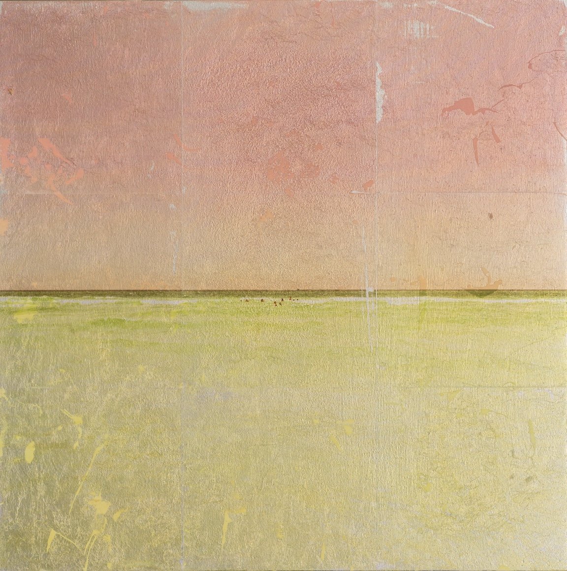
AAS: I want to ask you first about Summer Solstice. It is an extraordinary piece with a lovely Dutch Baroque feel. What was the inspiration for it?
Summer Solstice, 59” x 79”, gold and ink suspension on panel
Winter Solstice, 59” x 79”, silver and ink suspension on panel
MJ: Summer Solstice appears to be from a past generation, but simultaneously could appear to be a scene from now or a scene from 50 years in the future. It reflects the absurdities that follow wealth – a tablescape with the usual finery, coupled with the odd and grotesque, consumed by two women (sisters) who find little satisfaction in it.
This large work was made on a cradled wood panel where I utilized an artificial gold leaf substrate that tarnishes during my art process. The table is set with highly curated pieces I personally sourced or had in the studio. Its companion piece Winter Solstice is an image of the same sisters eating cake at a table adorned in large chunks of ice and the unfamiliar.
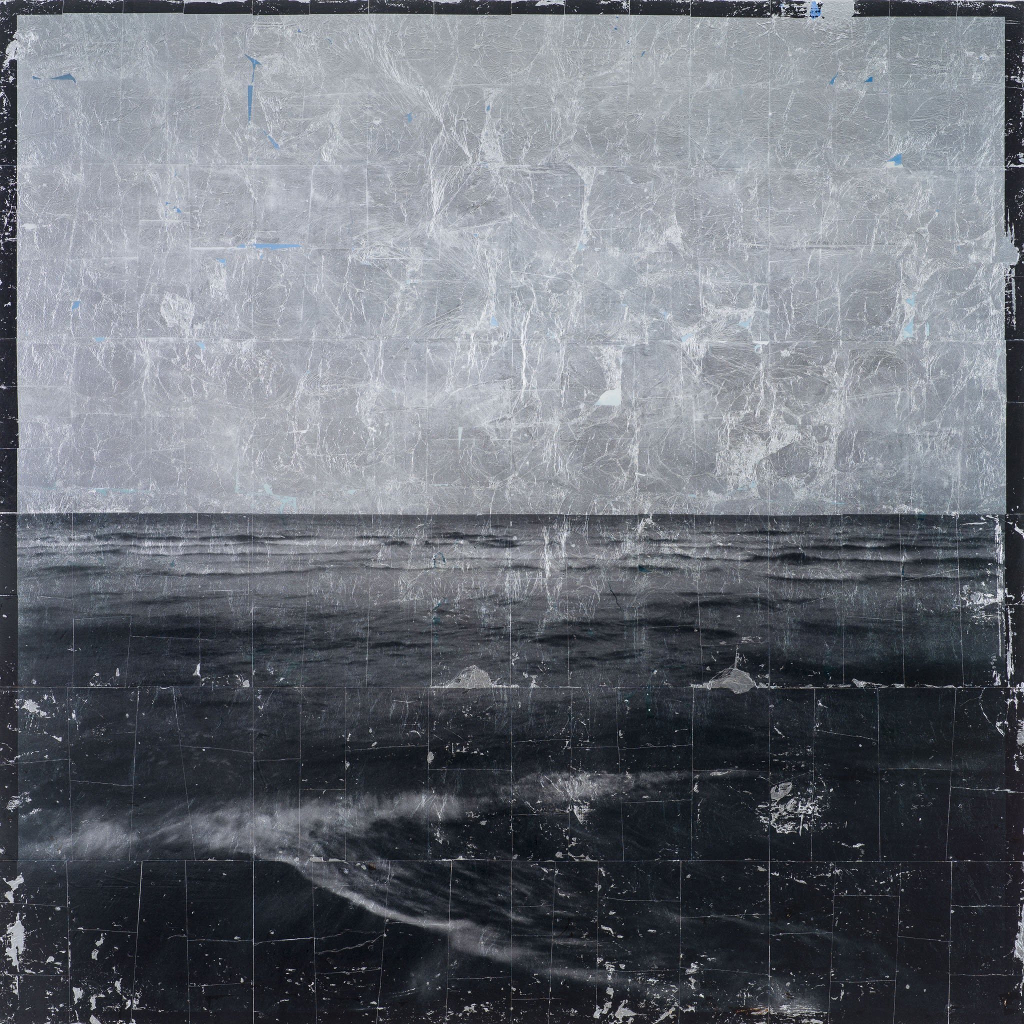
AAS: In contrast to Summer Solstice, there is Good Party/Bad Party, with more of a Mad Men 60’s feel. I think it is a wonderful example of your use of perspective and light.
Good Party/Bad Party, 79” x 59”, silver and ink suspension on panel
MJ: Good Party/Bad Party is a tablescape of “the aftermath”. No longer pretty, everything at the table is spent. Used up. The fingerprints of “us” are all over it. Lighting was carefully planned to be as basic and harsh as possible with no regard for a traditional “pretty”.
This piece is not a celebration, nor a condemnation. I wanted to make an artificial remnant of humanity. Good Party/Bad Party was meant to remind the viewer of past moments where they experienced this party, ate this cake, smoked these cigarettes… and experienced life and all its notes of boredom, richness, excitement, scandal, joy, and the feelings in-between.
AAS: In keeping with the food/cake theme, there is From Paris with Love. It is almost a performance piece in a way 😊. Tell me about it.
MJ: From Paris with Love is a love letter to myself. I love coconut so I made three 3-layer coconut cakes and permanently sealed them in individual clear acrylic boxes. I scribbled ‘From Paris with Love’ on the outside then drove them to Paris (Arkansas), applied the postage stickers directly to the outside of the acrylic boxes, and used the U.S. Postal Service to ship them back to my studio. It was like Christmas when they arrived. The cakes had been jostled and parts of the cakes had broken off and had smeared down the sides of the clear boxes. They are over a year old now and look exactly as they did after shipment. I think age will only make them better.
From Paris with Love, 10” x 10” x 10” each, plexiglass, resin, glass, 24 eggs, 4 cups of vegetable oil, 8 cups of water, 8 boxes of vanilla cake mix, 6 containers of vanilla icing, 2 bags of coconut flakes.
7. AAS: Your studio must be a crazy fun place to work and create. Tell me about your series Poison Berries of Arkansas.
MJ: A lot of work went into this series. A lot of handwork and multiple applications of all kinds of layers. From the way I photographed the images, to the lighting that I put on the subject, and the process to make the actual popsicles themselves. I molded and created each popsicle just for this shoot and shot them in my studio. The poisonous berries were picked around the studio actually. I love the idea that our daily consumption of common things is contaminated with dangerous artifacts around us.
Poison Berries of Arkansas, 89” x 59” each panel, silver and ink suspension on panel
AAS: Tell me more about your studio in Fayetteville.
Mark Jackson Studio, Fayetteville, Arkansas
MJ: I do most of my work in my studio in Fayetteville. I designed the structure myself with two distinct areas. Digital space and Analog space. Everything gets made at the studio. The digital side is clean and where I make/work on photographs. The Analog space is where messes are made - paint gets slung and saw dust scattered. I designed the space to be architecturally interesting and have views over Fayetteville. I invite people here for shows, and clients and collectors drop by often to spend time and share ideas.
I should mention VELESERO and what it is. VELESERO is an imaginary place I created. Established in 2056. The idea is it curates and represents the work I made in the 2020s and 2030s. This is a gentle nudge for me to be thoughtful and considerate about what work is made and the quality of that work. I want to make work today that I would have liked looking at 20 years ago, as well as 20 years from now. And I want the ideas to be clear and timeless. VELESERO is not a branding exercise, although I do use it as a name for my website and other outlets. But simple branding would be vulgar.
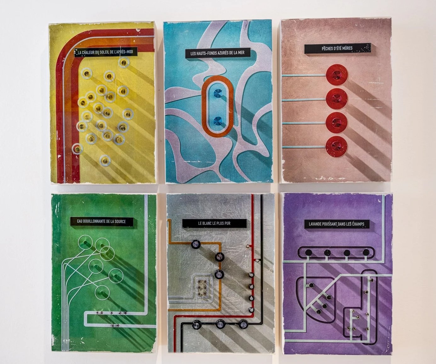
Also, within the world of VELESERO lives entities and ideas that generate and create art. Some of these things are purely for my personal curiosities and amusements. For instance, the “VELESERO Electric Corporation” is a “corporation” that constructed and generated the idea for the Control Panels for the Lovely series. The “VELESERO Avian Society” created the fundraising art featuring the gray bird on a limb that’s shown in several pieces. All of these corporations and societies are fictitious of course, but real enough in my head to spawn the art that I want to make.

AAS: You mentioned earlier your interest in exploring how beauty looks after it’s been handled by humanity. Does Aenea examine that concept? It is an extraordinary piece.
Aenea, 36” x 36”, gold and ink suspension on panel
MJ: This piece shows some very recent work that has my curiosity spinning. I’m loving the idea of these abstracted, feminine forms and unusual color. I think when photography can ride this line between abstraction and representation, the work moves towards a very interesting place.
AAS: To explore your multidimensional interests and the play of light even further, you created Ascend. Is it constructed of castings of cake slices?
Ascend, 96” x 60”, plaster
MJ: Ascend is the collection of 40+ castings I made from four original sculptures of partially eaten pieces of cake. I made the original sculptures in my studio using clay, followed by creating molds from those sculptures. The castings are made of plaster and have a hanging device on the back. Each individual piece is hung at random angles with the others and climbs the wall starting at 20” off the floor going to 9’ up the wall and 48” wide.
Each casting shows half eaten pieces of cake with fork marks running down them. Each slice of cake is sculpted with icing between the layers and on the top and sides. They are dull white and meant to hang on a white wall. Cast shadows create the art. This is another example of my work representing the remnants of us – remnants of humanity.
AAS: You also design and fabricate some unique furniture. I love your Tangle Chair. Tell me about your furniture designs.
Tangle Chair, steel
MJ: My curiosities extend into furniture design. I’m mostly interested in furniture that hopefully sits in a room as a piece of sculpture, “and oh yeah, you can sit on it too if you want, but…”
The Tangle Chair was designed with two sheets of metal and a single bolt. I currently have three new chair designs underway, along with an ultra-modern coffee table I have been working on for our Atlanta gallery.
AAS: You have worked with some major international brands like Covergirl and Bon Appétit Magazine. What has that experience been like?
MJ: I spent many years as an advertising photographer. Through that work, I’ve shot for well-known brands and the work has always been complex, fun and difficult. I still occasionally take on select assignments when I can work it into my schedule. I like the challenge.
The advertising work has greatly impacted my artwork and how I view the world. Advertising is all about clean and perfect - the goal being to show the material at their absolute best. With art, I’m never interested in this “perfection” – just the opposite.