Interview with artist David Bailin
David Bailin has been and continues to be a fixture in the Arkansas art scene since moving to Little Rock in 1986 to be the director of the [then] Arkansas Art Center Museum School, a position he held for ten years. His meticulous and always fascinating drawings have received high acclaim and are in prestigious corporate and private collections around the country. Over the years, David has received fellowship awards from the National Endowment for the Arts, the Mid-America Arts Alliance, and the Arkansas Arts Council. He also was given a solo show at the Arkansas Arts Center. More of his work can seen at Koplin Del Rio Gallery in Seattle, WA, Erdreich White Fine Arts in Boston, MA and M2 Gallery in Little Rock and at his website bailinstudio.com. —2022
AAS: David, where are you from originally?
DB: I grew up in Sioux Falls, South Dakota, I received my BFA from the University of Colorado at Boulder in 1976 and my MA from Hunter College, NYC, in 1983. The move from the east coast to Arkansas came in 1986 when my wife accepted a two-year clerkship with US District Judge G. Thomas Eisele. What began as a temporary setting become permanent after both of us realized how wonderful Little Rock was to raise a family. Amy later joined the Rose Law Firm, and I, the Arkansas Arts Center as their Museum School Director.
AAS: You have been a major part of the art scene in Arkansas for so long, but you very recently moved back to the northeast. Was this to be back closer to family or just a career move?
DB: Leaving Arkansas after 35 years at the end of 2021 was a tough, very tough decision. With my father’s death, my monthly drives to visit him in Des Moines ended. We decided, then, to find a place closer to the Boston area where both of our families are located. Amy’s mother is elderly and lives on Cape Cod so when a place became available nearby, we bought it.
I remain attached to Arkansas through strong artistic roots. I share my abreactions, creative ideas and new work with my friends Sammy Peters, Warren Criswell, Leslie Peacock and Hamid Ebrahimifar on zoom. And I don’t mind travel, so I come back for visits.
AAS: You were director of the Museum School at the [then] Arkansas Arts Center for many years. How did you get that position?
DB: After Amy accepted the Arkansas clerkship in 1985, we heard that the Arkansas Arts Center was looking for a bookkeeper and it was suggested that, as a part-time bookkeeper/full-time artist, I apply. I didn’t get the bookkeeping job but was told to fly to Little Rock immediately to prepare for the school’s Fall semester starting in two months as the Director of the AAC Museum School.
I arrived not only to work in a world-class art museum but to find a vibrant art scene-one night art exhibits, gallery walks, experimental theater and music venues–that brought me lasting friends and memories. Most importantly, the school, with its talented artist/instructor and extensive facilities, had the potential for enriching the cultural life of our community.
With the support of the instructors and the institution, I instituted collaborations between civic and community organizations to start art outreach programs in housing facilities, and shelters, and developed after-school art programs and special programs directed to underserved youth and adults. With the Arkansas League of Artists, we provided free tuition and supplies for talented rising seniors to develop strong portfolios for college. Working with the state education department, the school developed several state-wide interdisciplinary art-based curriculum workshops for art teachers and, during the first Gulf war, worked with the three local school districts to transport their students to the Arts Center to create Nevelson-inspired sculptures that focused on their thoughts, feelings, and fear about the war.
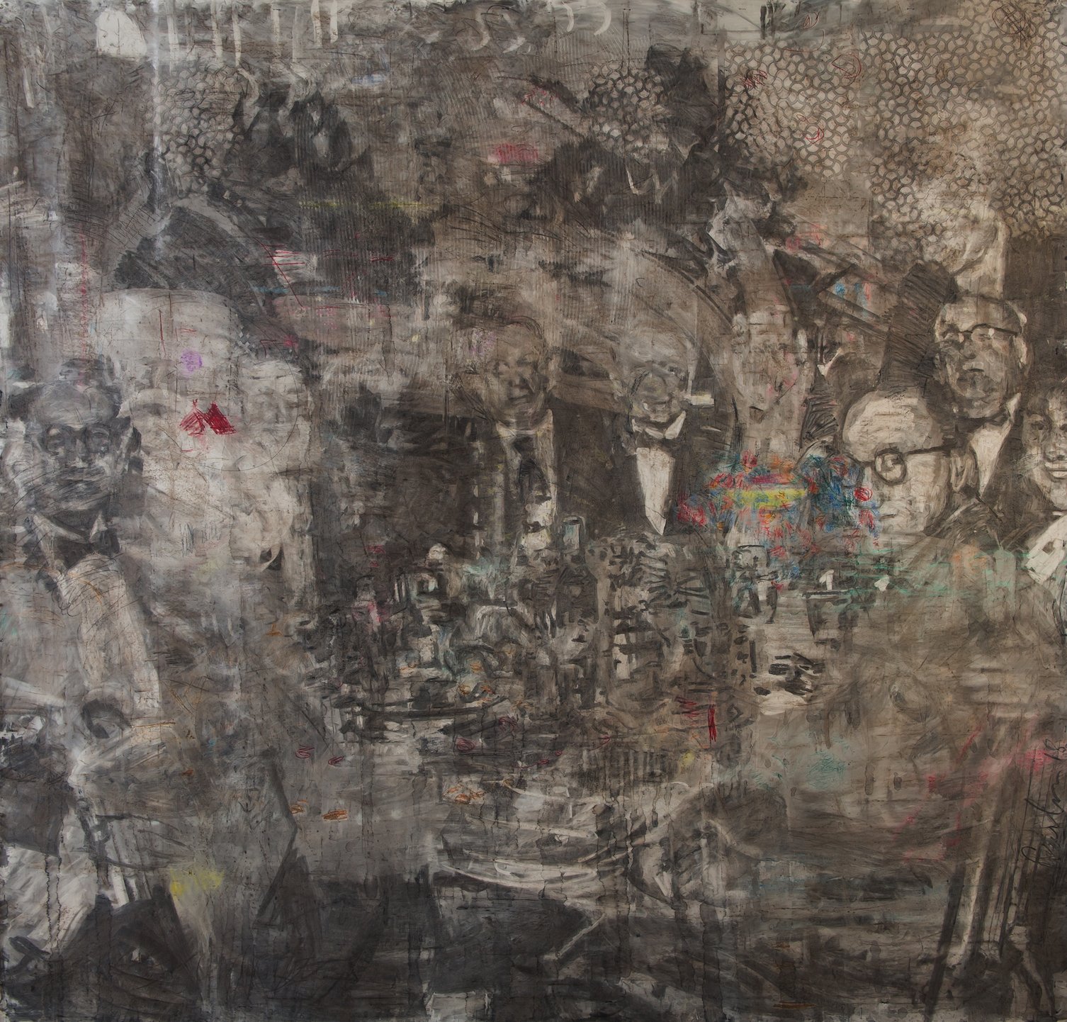
AAS: One of your earlier works is Voices of the Ancients (1988) done in oil on paper. It is stunning. You then revisited that image and created Breath (Expulsion) from your Midrash Series. It is a monumental and powerful drawing.
Voices of the Ancients, 37” x 42”, oil on paper
DB: Voices of the Ancients is typical of a series of works about the ancients – about landscape and memory, judgement and retribution, blood and sacrifice, homelessness, and search – biblical themes I have explored throughout my career. I had read a news story about a woman, so distressed, that she threatened her baby with a knife. I envisioned her emerging out of a rocky, lifeless field with her tongue pushed out and drawn-out like the knife she holds at her child. I painted several similarly themed paintings in the late 80s.
The Midrash series continued the Ancients theme but on a monumental scale. Having secured an 8’ wide roll of un-waxed milk carton paper from the paper mill in Pine Bluff, I finally began to resolve, for me, several bible stories that had bothered me since attending Sunday Hebrew school as a child. Midrash, rabbinic commentaries and interpretations that attempt to reconcile biblical contradictions, seemed appropriate for the title of the series.
In Breath or Expulsion, the woman’s knife in Voices of the Ancients becomes a rock hitting against her chest as she and the man emerge from the field. There is commotion everywhere– the woman yelling and burdened by a child and the man screaming while wrestling with a snake; in the distance, a cow bellows and leads a line of other beasts forward while a tree is ripped apart by wind and engulfed by fire and a screech owl flies over head. The landscape is littered with splinters and to the side of the man, a large boulder hovers overhead while in the lower right, a spiral maps out a continuum.
Breath (Expulsion), 96’ x 168”, charcoal and coffee on paper
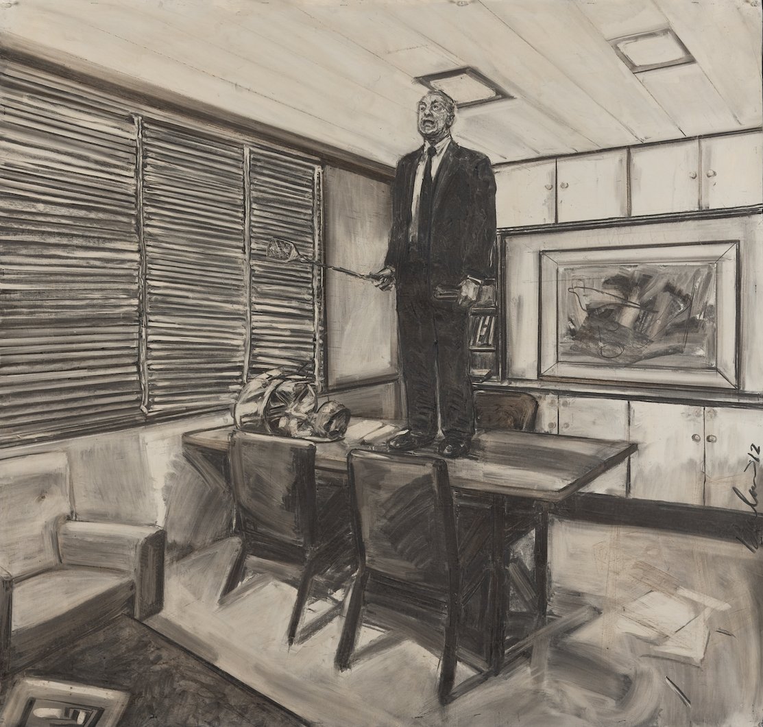
AAS: You created a series of works – the C series. These are also mysterious images drawn in charcoal. Revision and Hammer are two I especially like. Would you talk about those and what the series about?
Revision, 52” x 54”, charcoal and coffee on paper
DB: The C series (the title is an abbreviation for carbon, cubicle, and ‘c(s)eeing.’) was inspired by my experience as a part-time, full-charge bookkeeper in New York City in the early 1980s. I handled the books of two small midtown businesses. All day I entered numbers into the ledger, reconciled the bank statements, etc. As a job for an artist, it was great. Everything was in past tense, and everything balanced to zero. And zero was what I brought into the studio from my day’s work. That is, unless the ledger didn’t balance. Then the gentle dull routine of my day turned into a snarled and agitated scuffle as I poured over the bills, receipts, and columns of numbers to find the missing pennies. That was the cubicle - a mindless routine interrupted by the crisis of minutia. Our true nature is revealed in those moments and that was my hook.
In Revision, a guard stands helpless with his small pail of water as a fire ravishes his library or archive. I love archives–the collections of historical and tangible remnants of human activity that have survived generations. I imagine how much of our history will be forgotten, revised, and possibly perverted without that archive. And Hammer is straightforward Buster Keaton business. Until the character finds a stud, the pictures he has crowding his office give him no way out. For me, technically, the handling of the surfaces is spot on.
Hammer, 52” x 54”, charcoal and coffee on paper
AAS: You’ve said you never really finish drawings. You stop when you feel you have exhausted all the possible renderings. Is that frustrating or perhaps liberating?
DB: I think a lot about finding the ‘hook’ in a work. Until I find it, the drawing is in constant flux. I sketch a lot of preparatory thumbnails to make things go smoother, but all plans go out the window when confronted by a blank sheet of paper. This happens to all artists, I imagine. One day the work is going well, maybe even finished, and then the next day it’s a mess. I erase more than I draw, it seems. Even when the work is out the door, in an exhibit or at a collector’s house, something won’t feel right when I looked at it in that new environment–when I can look at it as an observer. I always carry with me a small satchel with charcoal, eraser, and a piece of cloth, just for those instances.
“I have always been a physical artist. I draw with the paper stapled on the wall so I can punch, stab and slash at the image.”
AAS: Your drawings are generally very large. Have you always drawn in a large scale?
DB: I have always been a physical artist. I draw with the paper stapled on the wall so I can punch, stab and slash at the image. I like to work from my shoulders as much as my hands to create a work. With large pieces I can create theater. But I have drawn smaller works when the idea required it. My first Los Angeles show required that I reduce the scale of my drawings (I was working then on 8’ wide paper) down to 26 x 30 inches. It took me six months to figure out how to translate from drawing with my shoulder to drawing with my wrist (the secret was priming the paper with eggshell acrylic paint).
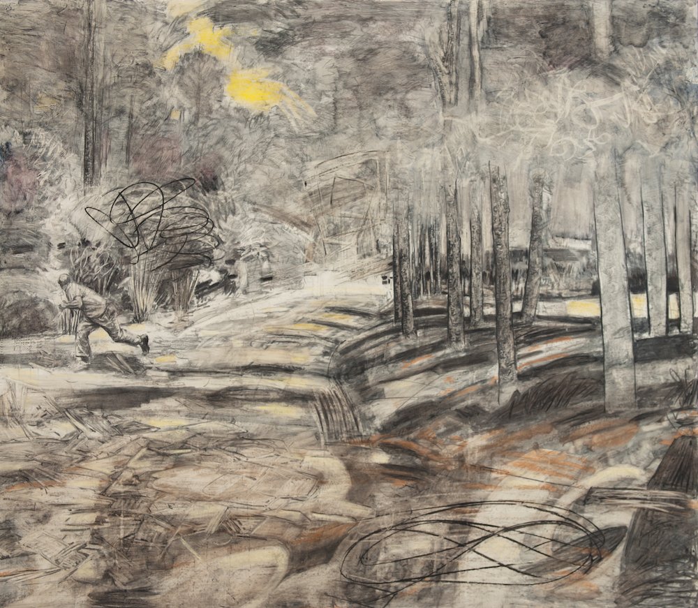
Recently, for the Fire series [see below], I reduced the size. In that series, the protagonist is running through a field or forest and is almost invisible in the landscape. The hook was the way in which the drawing coalesced in a series of tiny, discreet, and sharpened pencil lines so that every leaf, blade of grass and textures of the trees and road could be seen. The size had to be small to flesh out the idea. However, I don’t consider my work especially large as artwork goes. It’s only large because I work on paper. Paper that size is harder to place with collectors because of the framing and mounting issues. But not impossible. Even so, I have never, ever, considered marketability as a basis for selecting size or subject matter. I have had the luxury of pursuing my work on my terms.
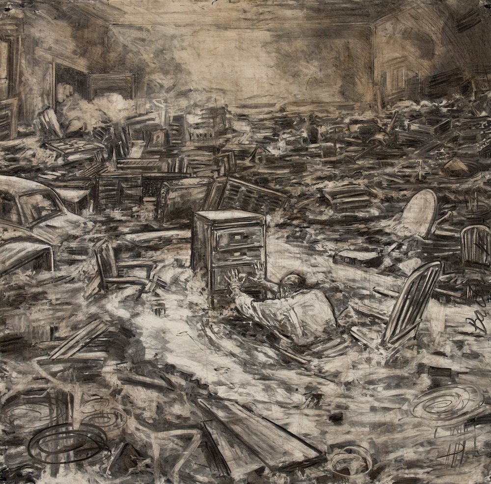
AAS: And you are known for your drawings on coffee-stained paper. They are warm and so complex. Forgotten from your Erasing series is extraordinary.
Forgotten, 83” x 85”, charcoal, pastel, colored pencil and coffee on paper
DB: The coffee came about as a way of toning the paper. Charcoal has a cool tone to it and coffee provided a subtle coloration to the image. Later, while experimenting with different grounds, I discovered when I erased the charcoal off an egg-shell acrylic light-colored ground, the heat of the erasing recreated a warming affect as well as left a ghost of the previous line. Instead of adding coffee to warm the surface, the effect can be made within the process of drawing itself. Much more elegant technically. Now I save the coffee to drink.
Forgotten, as part of the Erasing series, is a complex work having multiple strata. Like my father’s recollections which, during his Alzheimer’s, caused him to confuse and combine several memories within a single conversation, so the drawing contains ghosts of previous drawings under the final image. Each drawing layer was, for all practical purposes, complete and each day, the work began by erasing and wiping that layer off. Because of the way I drew and the receptiveness of the ground I work on, much of the previous drawing remained visible as I worked the new image onto the paper. As a result, the drawing became more abstract just like my father’s muddled memories.
The drawing continued until, erasing out day by day, the paper became so smooth, the texture of the surface so unresponsive, I couldn’t draw on it any longer. Forgotten is the result of this exhausting and, frankly, melancholy process. The final image shows my father sitting next to his best friend, of whom he later had no recollection.
Red Tie, 72” x 84”, charcoal, oil pastel and coffee on paper
Red Tie was the first drawing in this series. It was a ‘proof of concept.’ Like the work that followed, it contains personal recollections: the running girl is taken from art history (Rembrandt, Seurat, and De Chirico all depicted the running girl); and the interior recalled my high school classroom. While I was thinking about memory, I hadn’t yet linked the concept to my father’s failing memories or identity. When that link happened, I had a hook.
AAS: One of your works with so much color and energy is Cloud from your award-winning Dreams and Disasters Series. Would you talk about that piece?
Cloud, 78” x 75”, charcoal, oil, pastel and coffee on paper
DB: I have a complex relationship with color. I have many books on color mixing, pallets, history, and symbology. But I find I don’t use a lot in my work. For me, color is another way of defining an object or texture, to distinguish one form from another. Cloud was one of the last in the Dreams and Disasters series and an aggressively drawn work. It was drawn about at same time as Slippage, which won the Grand Award in the Delta. In Cloud two men are frantically digging or searching for something in a hole that is located on a highway. Strokes of robin’s-egg blue, reddish orange, and a spot of yellow surround a white cloud. Stop lights extend across the road. The white cloud emerges from a violent sky and is reflected in the ground near the workers while in the background cars and trucks pass. There are numbers, letters, and games of Latin square and tic-tac-toe scrawled on the drawing. Cloud is a summation of the series and of mark-making in general. At the time, I was searching for a way out of the series, and I think the drawing reflects that search.
AAS: You have been in the Delta Exhibition many times and won many awards including, as you said, the Grand Award for the 56th Delta Exhibition for Slippage. You also earned a number of fellowships and grants while you were in Arkansas. How important are local opportunities to foster and recognize local talent in Arkansas?
Slippage, 78” x 83”, charcoal, oil, pastel and coffee on paper, 56th Delta Exhibition Grand Award
DB: Local opportunities for artists–grants, awards, commissions, galleries–are all important. I was certainly given my share and more. But they benefit the artist temporarily and, while they open doors, they don’t assure success however that might be measured. There is no promotion track in the arts to measure your success. I’ve seen artists go into their studios day in and out, without the benefit of exhibitions, sales, or award and create masterful works because it’s what they do. And no amount of money or awards will compensate for facing a blank piece of paper.
I can face that blank wall because I have had great mentors that taught me how to work through the pit, and friends and family that encouraged me and keep me going. Little Rock gave me that foundation and I trust other artists will have the same opportunity there too.
What fosters local talent? Availability of mentors from whom young artists can learn. Also, for all, venues at which to share work and a cup of coffee. The awards and grants are important for reminding the community that art isn’t just in museums but next door, in run-down buildings, basements and attics and apartments. There is a difference between what happens in the studio and what is shown. What happens in the studio is living, breathing and vital; what’s shown is history.
AAS: David, when you look back over your career so far, what comes to mind?
DB: That’s easy. During the past 35 years, I have argued art criticism, theory and philosophy with my dearest friends, Sammy Peters, and Warren Criswell. We have shared our successes and studio frustrations, provided technical assistance and materials for each other and swapped books and magazines. The two of them are the finest contemporary artists Arkansas has and I’m a better artist because of them.
Two events shaped my concept about what is art and about making art. 55 years ago, I saw a Bugs Bunny cartoon in which Bugs, dressed in artist smock and beret, and dipping a large brush into a bucket of paint, paints the Mona Lisa in two passes of his hand. I was enthralled. Every time I lifted a brush it appeared to be so limited. But later I realized that every stroke had to have significance. An artist must create a work of art using the greatest amount of significance with the least amount of effort. You see it in the brush strokes of great masters. When you look at a great piece, it just seems like it appears fully formed and effortless because every element has significance, and none is out of place or redundant.
Later, while studying art history in Italy, as a very young man, I visited the Convent of San Marco in Florence. Walking into a dark cell from a long sun-drenched corridor, it took a while my for my eyes to adjust. As I waited for the image to fully appear l was able to make out a crown of thorns, and then a stick, and a bloody gash. And then, when my eyes fully adjusted to the dark, to my astonishment, I realized that there was no complete image. I had filled in the spaces with my own version of the picture- a picture that wasn’t there. Fra Angelico had created a painting [The Mocking of Christ] that every sister could complete in her own way. He had produced the most devotional piece of art I have ever seen.
Both of those events came to define my approach to art. For me, that meant finding out what was extraneous to image making, and discovering how far I could go towards developing a story without losing an image.