Interview with artist René Hein
René Hein is a Little Rock painter originally from Wisconsin. Before coming to Arkansas, she earned degrees in studio art and worked as a museum curator and graphic designer. These experiences influence her most recent body of work, as does her love of pets. More of René’s painting can be found at Cantrell Gallery in Little Rock and at her website reneheinart.com. —2024
AAS: René, are you originally from Arkansas?
RH: Thank you for this opportunity. I’ve followed AAS on Instagram and have enjoyed reading the interviews and learning more about other local artists. I’m originally from Wisconsin. I was raised on a farm in southern Wisconsin. I received my bachelor’s degree from the University of Wisconsin, Madison and my graduate degree from the University of New Mexico, Albuquerque. I moved to Arkansas with my now ex-husband when he attended medical school at UAMS. It was a second career for him, so we were both older when we moved here
AAS: Was being an artist something you always wanted to do?
RH: I remember as a child drawing and feeling like it was some kind of magic. The process captured my imagination. I didn’t grow up around artists, but I would call them makers. People who sewed, cooked, built fireplaces, carpentry projects, gardened. Making something feels natural. I went to a very small high school that only offered three art classes. What I knew about being an artist was that I loved the process of drawing. I also read as much as I could about art and artists and looked at reproductions in books and magazines. It just occurred to me how different it must be now for people who want to see art given the availability of art collections and galleries on the internet. When I began college at the University of Wisconsin it was the first time I was around people who had the same level of interest as I did in art. It was a fascinating time in my life.
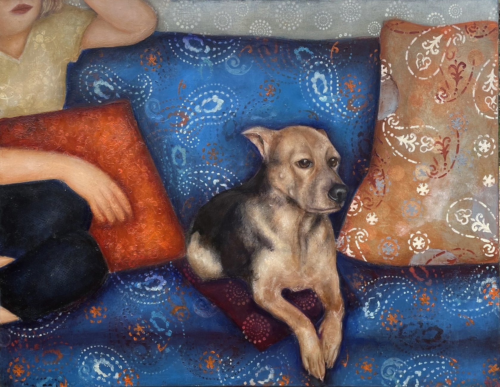
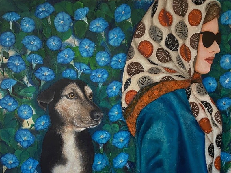
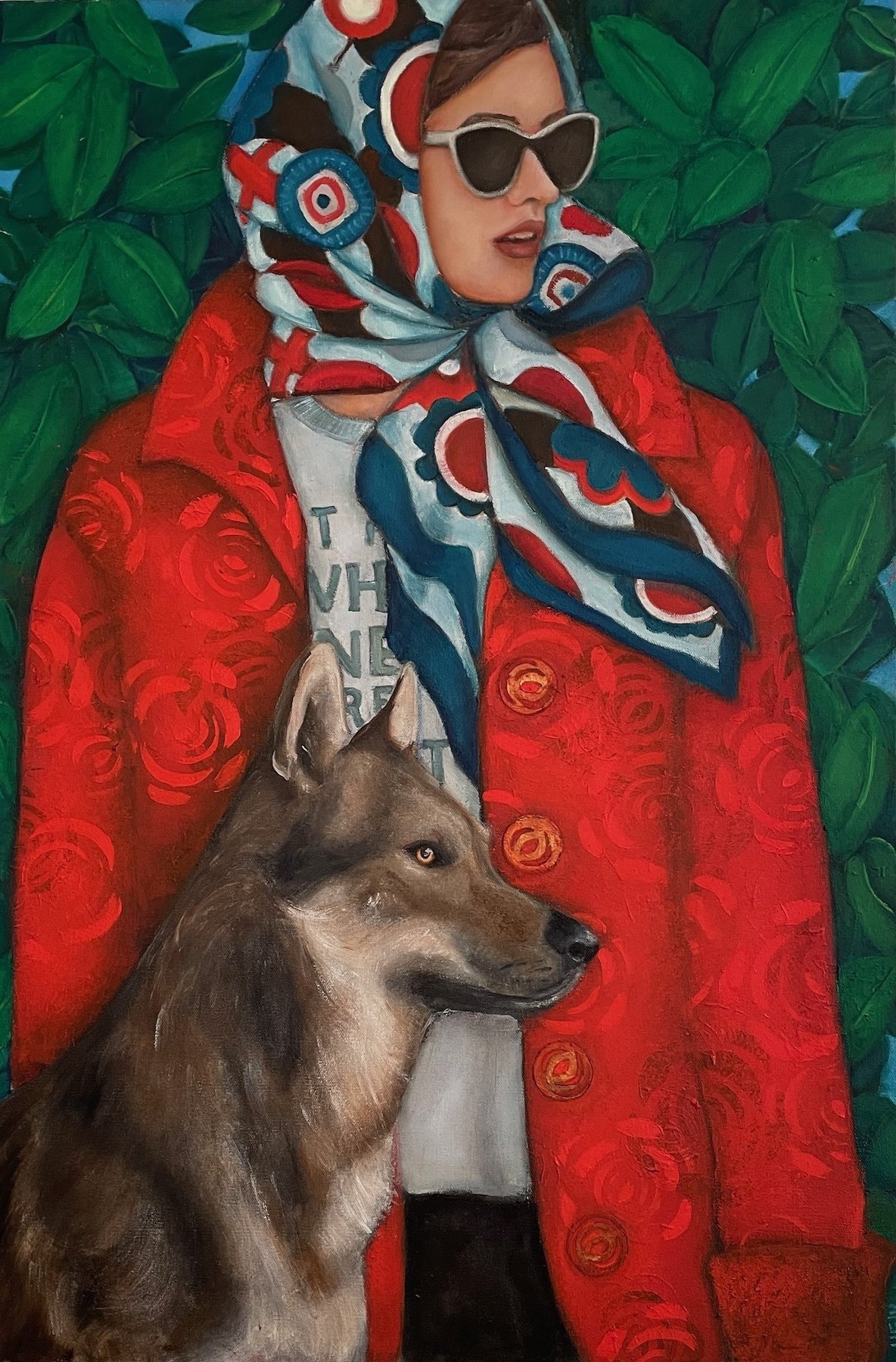
AAS: DeDe is one of my favorites of your pet portraits. She is so beautifully complimented by the setting. Was she a commission?
DeDe, 36” x 36”, oil on canvas
RH: DeDe was a commission for Sara Carrington from Magnolia, Arkansas. Sara had seen a painting I did for a friend of hers and she wanted something similar but with DeDe and to use the color blue. DeDe is an older Jack Russell terrier who hasn’t lost the playfulness that is common for that breed. I tried to capture that spark of energy with a touch of the world weariness that comes with age by emphasizing her eyes and alert ears.
One of the reasons I enjoy doing commissions is that they push me in directions I wouldn’t normally go. I also like meeting and, in some cases, getting to know the clients. When I sell a piece through a gallery or website, I rarely meet the buyer. When I do a commission there’s more of an opportunity to interact.
With DeDe I had a lot of freedom, but in other cases clients have many specifics that they want included. So, I find myself researching different flowers, patterns, color palettes and, of course, dog and cat breeds. Often these elements show up later in my own work. It surprised me last year when I was asked to paint a Siamese cat and realized I had never painted a Siamese in the many years I’ve painted cats.
AAS: OK then, tell me about that Siamese cat painting. I do love the title, Touch of Madness, and I suspect Siamese cat owners can relate to it even more.
Touch of Madness, 30” x 24”, oil on canvas
RH: Well, the first Siamese cat I painted was a donation for the 2023 Humane Society’s Reigning Cats and Dogs event. The theme was Keeping it Royal. They asked me to paint a King Cavalier Spaniel and a Siamese cat wearing crowns. I painted Touch of Madness after the Keeping it Royal painting.
The title comes from a Robin Williams quote “You're only given a little spark of madness. You mustn't lose it.” By just revealing part of the type, it works on two levels. On one level it’s a graphic element contrasting with my treatment of the cat. On another level it works as a clue similar to a crossword puzzle. The argyle sweater is a recurring image in my work. Again, it adds a flat graphic element for contrast. Argyle sweaters seem vintage to me and create ambiguity regarding placement in time. Is it an old sweater or is it a painting from a past time? But it’s the cat’s eyes that dominate the painting. Siamese cats are considered an intelligent breed, and this cat looks like she is definitely passing judgement on whatever she’s looking at.
Keeping it Royal, 24” x 30”, oil on canvas
AAS: You must have a great love for animals and how they interact and support our lives. Did you grow up with pets?
RH: I did grow up working on a farm, so I was around farm animals. We always also had cats and dogs. I had always thought of myself as a dog person, but very early on I started taking in stray cats. For the past few years, I’ve had foster cats and do what I can to support animal rescue organizations. I believe pets are one of those common denominators people have. I might not agree with someone’s politics or anything else about them, but I can relate to them when they talk about their love for their pets.
AAS: Tell me about your style of painting and was that something that you developed during your education?
RH: My technique is an updated version of the Flemish School’s layered approach to painting. I begin with a graphite sketch. Followed by layers using water-based paints creating mid-tones, shadow, and texture. The final layers are oil paint beginning with umbers and ochres, then color and finishing with details and highlights.
I was taught this technique in my first painting class without the use of acrylics. I use acrylics at this stage because they dry quickly and can be thinned with water or water based medium. I’ve tried in recent years to avoid the toxic mediums and varnishes traditionally used in oil painting. If I build the first layers with acrylics, I can limit the use of the oil mediums. I do use mediums that are alternatives to the traditional turpentines and varnishes that are sold as nontoxic, but I try to be aware of what I’m breathing.
I remember being upset because my first painting class was with an old professor who insisted we learn basic painting skills rather than in the classes with professors who let you experiment. Later I began to experiment and got away from this technique for many years. I returned to this technique because it enhances the spatial and form effects I wanted in my recent paintings. I’ve always been drawn to the work of the Flemish School artists especially Jan van Eyck.
AAS: I think Wee Small Hours has that wonderful old world feel.
Wee Small Hours, 28” x 22”, oil on canvas
RH: I’m glad you asked about this painting. It was inspired by a black and white photograph of a young woman lying on her back juggling oranges by the Bauhaus photographer Walter Peterhans. I learned a lot about the history of photography while working at the University of New Mexico Art Museum in Albuquerque. At the time the museum had the third most extensive photography collection in the US after the San Francisco Art Museum and the Chicago Art Institute. This photograph wasn’t in the collection, but I came across it in an old exhibition catalog. I’m interested in history in general and the period in Germany between the two world wars when the Bauhaus existed in particular is very interesting. I’ve never found anything written about this photo or even much about the photographer, but I had a copy of the photo for a long time. The background is inspired by William Morris, the artist and designer from the British Arts and Crafts movement. I think what made me finally incorporate the photograph into a painting were some vintage balls I saw in an antique store. The title comes from the song ‘In the Wee Small Hours of the Morning’ which is about lying awake while the rest of the world sleeps. And, of course, a pet accompanies one during those types of times.
AAS: I have to ask you about Being a Friend. I just love everything about it. It must have been fun to design?
Being a Friend, 24” x 20”, oil on canvas
RH: I’m glad you picked up on the sense of fun. I think art can be taken seriously even when there is a sense of levity. I had fun painting it. There are several different uses of space and depth. The background is flat created by using stencils, the dog and cardigan sweater have a more pronounced sense of depth and form and the foreground and cup spatially between the two. My use of color also feels playful to me with the magenta cardigan and the oversized vintage buttons, the pops of turquoise and shades of orange. Just writing about it here makes me happy remembering how it felt to keep adding elements and detail to this painting.
And I think friendship is important and should be celebrated. The reference to the Golden Girls sitcom and in particular the theme song ‘Thank You for Being a Friend’ has resonance for me. In retrospect I can see that I often took friendship for granted but I value it more as I get older as did the ladies in the show.
In the book Four Loves by C.S. Lewis he identifies affection and friendship as the first two types of love. Both are present in this painting. I’ve never owned a small fluffy dog, but to me they are small bundles of joy. Coffee cups are a favorite subject for me. They also signify connection. Like a lot of people, I have a cupboard full of cups that have been given to me by family, friends and colleagues over the years. They serve as reminders of that person or time in my life. I used the symbol of the Pisces astrological sign on the cup because one of the characteristics of Pisces is that they are loyal.
AAS: Your paintings often have strong graphic elements. Tell me more about your work as a graphic designer.
RH: While working as a graphic designer I was continually challenged to work with subjects that I knew little or nothing about and to present the client’s story in a visually impactful way. It was also necessary to be able to explain why I made the choices I made. I needed to balance my right and left brain. Although this was often challenging it made me look at the world around me in a different way. My degrees were in studio art and my first job after I graduated was with an art museum. Although I loved the environment it was in many ways an isolated one. Working for an ad agency or publication exposed me to so many different fields and people who were passionate about what they did. When I graduated and for quite a few years after graduation my main body of work was abstract paintings. While I still love abstract art, I also love observing the world around me. Once I paint or build an ad campaign for something I notice it in a different way, and it expands my appreciation beyond traditional painting subjects.
The aspect of graphic design that was most interesting to me was the use of fonts and typefaces. The choice of font in a design makes such an impact but it’s a subtle impact. It’s interesting to me to see the fonts used historically on album covers and t-shirts. Now using the typeface Comic Sans is tragic, but there was a time when it was popular.
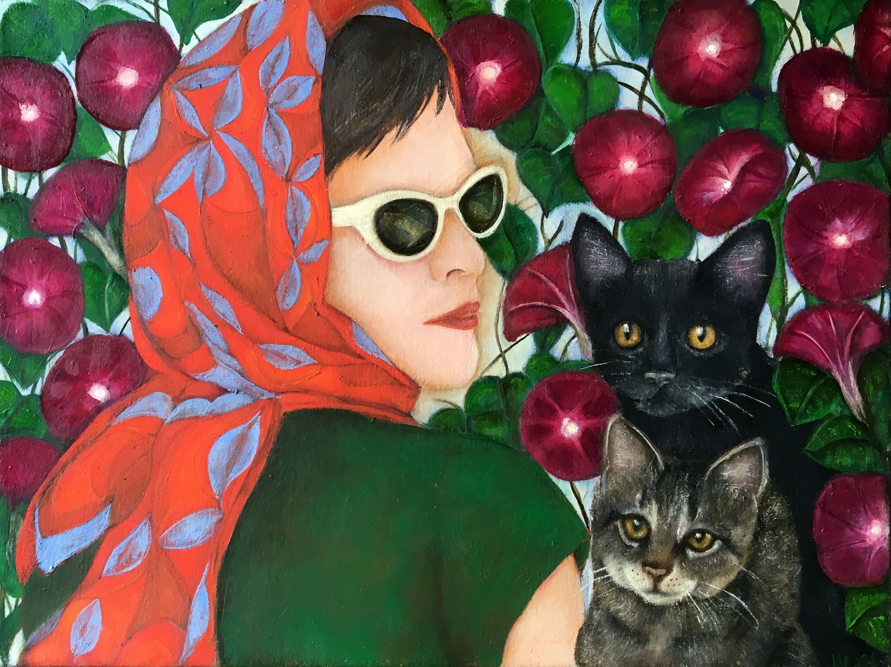
AAS: I want to hear about Notorious. We learn a lot about the woman from this painting – from her taste in music to her choice of a frisky alert companion ready for any adventure.
Notorious, 30” x 30”, oil on canvas
RH: Notorious was one of the first paintings where I started adding specific details beyond just the person and their animal. I began with the t-shirt. Although I certainly appreciate and admire RBG I was primarily drawn to the t-shirt design. This was the first time I used type in a painting. I was trying to think of ways to add more type elements and decided on the album covers. Looking at album cover art opened another Pandora’s Box. I was looking for a cover that related to the portrait of this woman that was emerging and that worked with the design of the painting. David Bowie’s Rebel Rebel was a good contrast to the color and design of the blouse but related to the blouse in that it felt like the 70s to me. I added the Kinks album just as a gesture to a close friend who knows all the lyrics to all the Kinks songs.
I choose the moonflower for the background because I was looking for a white flower that would relate to the white in the t-shirt and the white in the dog. I later looked up the symbolic meaning of moonflowers and found it interesting that among of the traditional meanings are ‘a wildness that can be tamed,’ ‘capricious beauty’ and ‘mystery.’
Your description of the dog is just what I saw. That combination of being alert but not in a threatening or fearful way. I reminds me of the way some dogs react when they hear their owner say ‘walk’ or when they see their owner reach for their leash.
AAS: Most of the work we talked about is from your Affinities series, in which you choose to reveal the individual through things they cherish. What inspired you to explore this approach to portraits?
RH: I met Helen, Cindy and Clarke at Cantrell Gallery in late 2022 and immediately felt a connection. I was thrilled when they offered to give me a show in May of 2023. Affinities was also the title of the exhibition. The paintings are not portraits in the traditional sense, but they tell the story of the person by the objects in the paintings. By not revealing the face of the individual the viewer relates to the painting in a personal way. The viewer recognizes the objects, relates to them through their own experience and in that way forms an idea of who the figure in the painting is. The specific items are part of a shared experience. For example, you could have that same coffee cup, record album or t-shirt. A common response to my paintings is something along the lines of “I would like to know her” or “that could be me.”