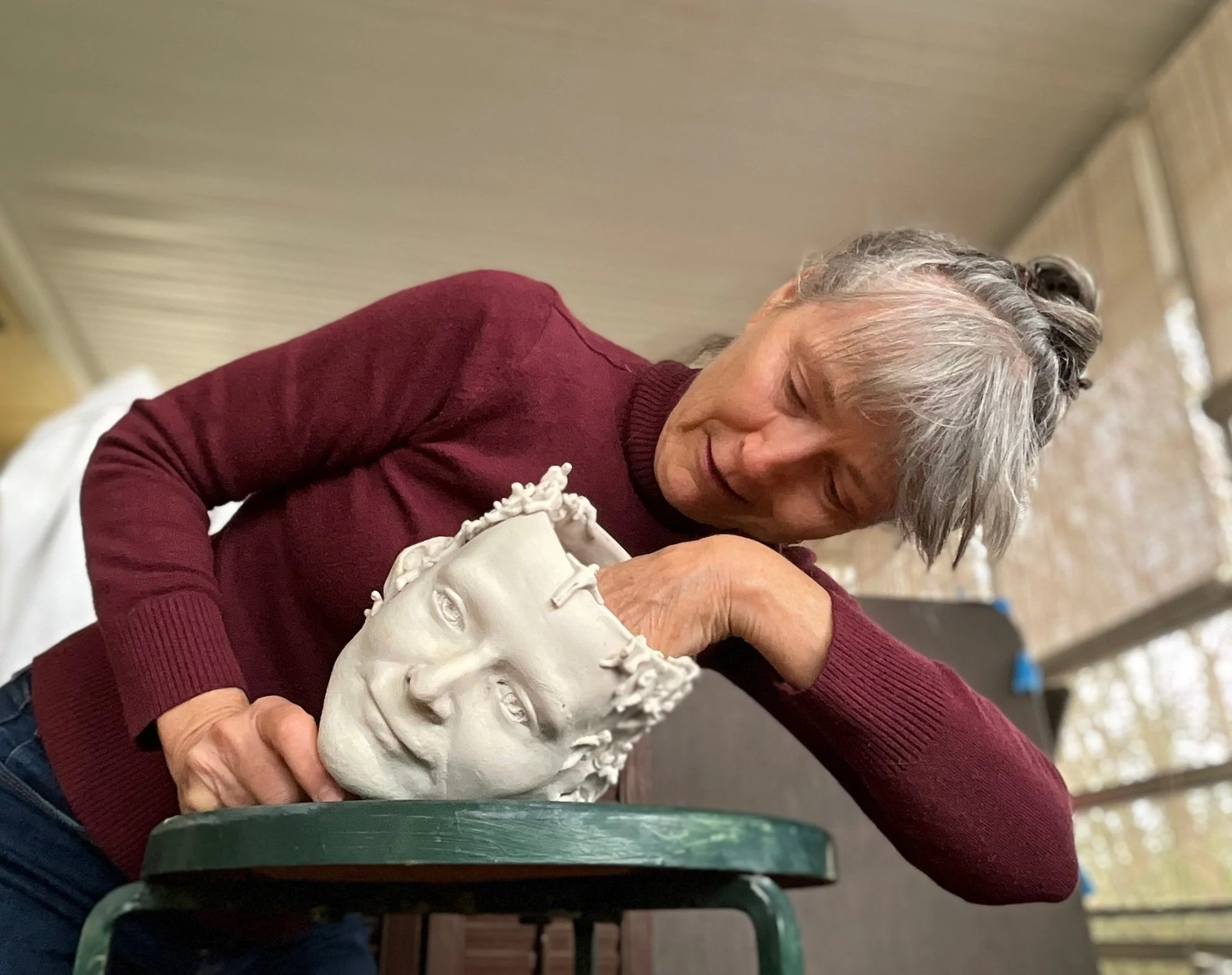
Interview with artist Milton Ruiz
Milton Ruiz is a Colombian-born artist and designer now based in Little Rock. He graduated with honors from the Columbus (Ohio) College of Art & Design in 2002 and from the automotive design program at the College for Creative Studies (Detroit, Michigan) in 2009. His technical skills and artistic voice were shaped by his work as an automotive production designer and later as a lead industrial designer, where he received multiple patents for his innovative designs. More of Milton’s work can be found at M2 Gallery in Little Rock and at his website miltonruizstudio.com. —2024
AAS: Milton, tell me a little about your background.
MR: I was born and raised in Bogota, Colombia. I later moved to the US without the intention of staying permanently. The idea was to study for a few semesters abroad. However, I really enjoyed my time here, so I decided to finish my education in Columbus, Ohio. I then lived and worked in Cincinnati and ended up taking a job with an automotive supplier near Detroit, where I went back to school and earned a degree in automotive design. I had the privilege of working as an automotive designer for a while, but it was during the industry's collapse. A great job opportunity for my wife took us to Memphis, where I lived for almost a decade. During that time, I worked mainly as a product designer, and it was then that I found my calling again as a painter and sculptor. Up to that point, I had participated in a few exhibits doing mainly installation art, but I hadn’t gotten very serious about creating a substantial body of work. Then, in 2016, I opened my design consultancy, and since then, I have worked in various areas of design while my fine arts practice was mainly concentrated on paintings of cars for car collectors. A job opportunity for my wife brought us to Little Rock, which we knew well and liked having visited numerous times since moving to Memphis. It was a relatively easy decision to make.
AAS: You have an interesting and unique educational background. Tell me about that and why you think you took that path.
MR: My mother is incredibly creative; she used to make cakes and decorate them for events like weddings, baptisms, graduations, you name it. She would also create the party favors, design, and hand-make the invitations with intricate calligraphy, decorate venues, etc. Eventually, she retired after years of making Lladró-style porcelain statues. Also, my older sister was a phenomenal artist who made most of the art that hung at my house growing up, although she pursued a different career path. Parallel to this, my father liked to take us to museums when we visited other cities and even some weekends in Bogota. I vividly remember seeing some Miro and Kandinsky pieces at a museum exhibit. I can recall how much I was attracted to that art and to the intricate art inside many catholic churches all over Colombia. Growing up with that made me want to explore my creativity, but it wasn’t until my senior year of high school that I was sure that I wanted to pursue art as a career path.
I enrolled in the architecture and design program in Bogota. I did three semesters there before coming to the US in a study-abroad program but, as I mentioned, ended up finishing my studies at the Columbus College of Art & Design (CCAD) in Columbus. Many jobs later, I ended up in Michigan working for an automotive supplier, and honestly, I have always been fascinated with cars and automotive culture. I explored the possibility of becoming an automotive designer and it was recommended that I pursue an actual degree in that specific area. One of the country's most well-known automotive design programs is at the College for Creative Studies (CCS) in Detroit, and I graduated in 2009 with a degree in automotive design. The program was very intense and there was a great emphasis on producing high-quality sketches and renderings of concepts quickly and in high volumes.
Automotive design, although very emotional in its approach, is a very technical field. Understanding surfacing is paramount, so in addition to very refined drawing and illustration skills, one is taught to sculpt symmetrical forms usually on one-quarter scale, using automotive clay. Verbal and written communication skills are also emphasized as the studio dynamics demand one to be able to present concepts to management in a few minutes while hitting the highlights of the idea. I never thought there were so many ways to describe a surface or a character line in a vehicle! A lot of this I experienced when I got my fine arts degree, but at CCS the expectation was at another level. It was a high-pressure environment, and it helped me refine my craft a lot. It exposed me to advanced technology such as 3D scanners, computer-assisted modeling software, and CNC and rapid prototyping machines. Having used these state-of-the-art tools, I realized I should employ these technologies to create my art once I began painting again after so many years.
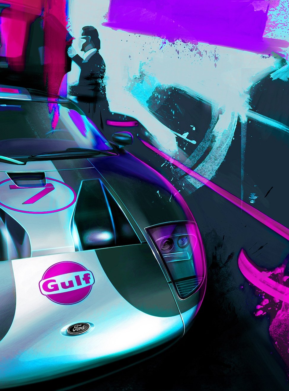
AAS: I am fascinated by your automotive renderings. The Fine Line Between Desire & Envy is one of my favorites. Are they all corporate concept cars or are some from your own imagination? And it is not just about the car, it is about the way you choose to depict it.
MR: Whenever we did presentations for the automotive studios, the actual renderings were incredibly realistic. I would now and then incorporate colors, but some studio directors were not very fond of showing the car not appearing as a near-photograph. That is because physical and digital sculptors interpret these renderings to make scale models and concept cars. Also, these illustrations may be part of focus groups or be presented to non-design executives and can be distracting if not portrayed like the production units.
The Fine Line Between Desire & Envy, 43” x 58”, sublimation print and acrylic on canvas
Although the renderings had to be realistic, cars are presented looking their absolute best. Just like in brochures, cars are shown at the best angles, with lighting conditions ideal for showcasing surfaces and character line features. In the case of the painting that you mentioned, the 1955 Mercedes 300SL Gullwing is an icon of automotive history. My automotive fine artwork takes existing iconic vehicles such as this and exaggerates certain elements that make the car so appealing, in a way that is reminiscent of the work I saw in the automotive studios. My aim is not to recreate a picture, but to enhance the car's look, making the perspective more dramatic; the stance is slightly exaggerated to make the vehicle appear a bit wider and, thus, more dynamic. The 300SL is a stunning piece of engineering and design, and it deserves to be portrayed almost like a spaceship or mechanical bird ready to take off. These cars are sold at auction between $1.4 and 6 million dollars, which inspired the title and the piece's color scheme. For some, it is absurd that a car could be valued at such a price, but for others, it is a collectible piece of history and worth it. I feel that cars, in general, are controversial in how they are perceived, making for a great subject matter.
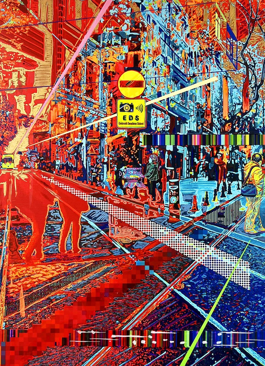
AAS: You did a series of work inspired by what I guess was a trip to Istanbul. Bosphorus is one of my favorites from that series. It’s an amazing image.
Bosphorus, 30” x 22”, sublimation print and acrylic on canvas
MR: Thanks; I’m glad the piece resonated with you. You are right; a trip to Turkey inspired that whole series. Frankly, since I was a sophomore in college, while we studied Byzantine art in one of my art history classes, I wanted to visit Hagia Sophia. I have heard great stories about the city of Istanbul, and it exceeded my expectations. There is a synergy between the ancient and modern. In many ways, I felt that it reverberated with where I wanted to go with my art, a mixture of traditional techniques, media, and today's technological tools. The Bosphorus [Strait] divides the Asian and European continents, passing through the middle of Istanbul. People depend on it for commerce, transportation, and food supply. It’s fascinating to see it all happening in front of you as one sees the shipping vessels going up and downstream while tourist boats are packed with visitors, and in the docks, one can buy freshly prepared street food from the fishermen and other vendors. The history behind it is also impressive: conquests, battles, ancient forts right next to modern suspension bridges, etc. Witnessing the present-day movement of people and events in a city with such rich history, I wanted to capture the actual process of time passing through a single position in space, and the emotions it evoked in me. In the piece, it could be day or night, or summer or winter, etc.
AAS: Tell me about your digital painting process.
MR: When I was at CCAD, many upperclassmen felt that painting had ended. This was in the late 90s and there was a sentiment even among certain art critics that painting had nothing else to say, and many of the avant-garde artists of the era echoed this way of thinking. This influenced me somewhat as a wide-eyed, young fine arts student. I couldn’t shake the disconnect between using traditional media to create art and what was happening in society technology-wise. Parallel to this, I saw many professionals phased out by digital tools and upcoming technologies. My first internship as a Junior was at a prominent architectural firm, which hired me only because I had taken an engineering drawing course where I learned how to do technical drawings by hand and using CAD software. My role initially was to translate an archive of hand-made blueprints into digital format. I witnessed many skilled draftsmen and architects slowly being replaced by others with software skills. During my automotive designer days, I noticed the pattern resurfacing as many skilled designers were forced out of their jobs as some didn’t adapt to industry changes.
After I left the auto industry, I started again, making paintings of classic cars for collectors. I had the epiphany of going digital and using those tools primarily to capture what I couldn’t with traditional media. I didn’t have a traditional studio then, and my home office was small, so stretching and preparing large canvases was not an option. Going digital seemed like an obvious transition as I could create large pieces and do it without the need for a specific location. Pop artists used commercial art processes such as screen printing to create art, and I had the chance to use a process and a tool of my time to accomplish the same objective. There are limitations with such technology, and that’s where I manually add details and effects that the digital printing process cannot at this stage. I use a gigantic Wacom Cintiq tablet, which is a higher-end iPad of sorts. I use different software packages where I can translate specific effects of traditional media such as gouache, acrylics, watercolors, etc. I enjoy the merging of both worlds when it comes to effects, detail, and color.
AAS: You really let the digital imagery take center stage in Istanbul Strays. Tell me about that piece.
Istanbul Strays, 60” x 48”, sublimation print and acrylic on canvas
MR: Yes and no about the dominance of the digital aspect. Istanbul Strays is centered on enhancing a digital feel with details such as image glitches, halftone patterns, and pixelated areas, but has a lot of manual work as well. Digital art tends to be perceived by many as quite impersonal, dismissed as a simple manipulation of images using automated software actions. Many often dismiss stray animals like dogs and cats as unimportant and unworthy of attention or acknowledgment. I wanted to draw a certain parallel between these two ideas and explore this theme, while creating a warm and inviting piece, and one where the viewer would wonder how it was made, as you did.
I am an animal lover and advocate, and I was unaware that Istanbul had so many stray cats and dogs, especially in the old city where we stayed. The dominant figure in the piece is one of the strays that we fed daily, but there is the suggestion of the presence of other dogs in the background. Perhaps for many, these beautiful and gentle creatures are almost like ghosts in the background, without names but with a number on a tag that differentiates them. We found their presence quite endearing, and on our last day in the city, we went to a supermarket, purchased a bunch of food, and did rounds through the old city, feeding the different dogs and cats. We even considered adopting one but decided not to due to the process it would have taken to bring him into the US.
The main dog’s profile was intended to reference early Renaissance portraiture in which humans were depicted in profile views; this early work was almost devoid of emotion or personality, in contrast to later Renaissance work. The background of the piece is full of color and texture, so this is a sort of merging of earlier and late Renaissance styles, with a modern feel. I reduced the rendering of its fur to simple strokes in vivid colors, adding a bright outline, resin work, and diamond dust to make it glow and juxtapose the portrayal of a profile instead of a three-quarter view. The intent was to highlight the happiness they brought us while they escorted us through our nightly walks.
AAS: I think the first piece I saw of yours was Market Street at M2 Gallery and I knew immediately that I needed to find out more about you. How do you begin to create a piece like that?
Market Street, 60” x 45”, sublimation print and acrylic on canvas
MR: All of my pieces definitely evolve as I create them, which, for me, is part of the fascinating journey of making art. I start with an idea, but many layers of meaning come to mind, which I often end up expressing through a series and not a single piece. Then, I use reference material and delve into the emotions that I attempt to capture and extract different components that will compose the piece. As I work, the idea tends to become clearer; sometimes, I struggle with capturing what I want, so I need to step away for a while and work on something else until I arrive at that ah-ha moment where I can visually articulate my intentions. Sometimes, it evolves quite rapidly, and the challenge is to be able to work fast enough so that I don’t lose my idea thread.
This piece was of a market street adjacent to the Grand Turkish Bazaar, one of the oldest markets in the world, but in contrast, it houses a lot of newer Western brands. It dawned on me that thousands or even millions of people have walked, sold, and bought goods on these streets through the centuries, and the piece explores the idea of the sheer transience of human beings not only on this earth but at a specific place at a specific time. I attempted to recreate the process of how memories come to mind as the viewer looks at the piece. There are fragments that may lack precision in certain details, but for me, I tend to recall a general idea often rooted in emotions.
I used as a reference hundreds of pictures I took of the area, but since I feel that they don’t do justice to experiencing a place in the flesh, I don’t attempt to recreate pictures in a realistic manner as they exist. The perspective of the pedestrian street, albeit accurate, resembles more of a dream than an actual pictorial representation of the site. There are recognizable details like in other memories and while some architectural elements are clear, the buildings melt with one another, and there are colors and lines that cross each other, representing the attempt from shop vendors to attract customers with window displays and merchandise. The figures in this series, especially in this piece, are suggested rather than fully rendered to convey the transient nature of humans. As visitors, we are spectators of a place at a moment in history, and most likely, in a few hundred years, commerce will continue with some architectural changes, but the essence and utility of the place most likely will remain. At the same time, the buildings are a long record of changing societal values, policies and the many people who have lived, maintained, and constructed these for the purpose of commerce and dwelling.
AAS: During your time in Memphis you, like many artists and musicians, could not help being inspired by all that is Memphis. Tell me about your extraordinary piece, Rockin Memphis.
Rockin Memphis installation
MR: Yes, I was definitely inspired by Elvis and the history of the city. In living there, I discovered that Memphis is not too far from the New Madrid fault line, an epicenter for earthquakes. The painted foam blocks are “rocks” of different heights intended to represent the shifting of tectonic plates in the wave pattern known as “love wave”, a known pattern of seismic activity. The clusters of red dots depict the locations of this activity as recorded by the U.S. Geological Survey. The “rockin” in the title is a play on words with a double meaning referring to both the “rocks” that shift to create earthquakes and to the rock music. In addition, the depiction of Elvis in black and white is intentional, symbolizing racial tensions still prevalent in American society as well as in Memphis in particular. The splashes of colored paint over his face are intended to capture an aggressive action, representing violence, rioting and abuse of power and authority that have been part of the fabric of the civil rights struggle and continuing racial tensions.
Rockin Memphis, 48” H x 200” L x 9” D, mixed media on canvas, styrofoam, blocks, plywood
AAS: I really like your take on Pop Art and questioning intellectual property, the digitally driven existence of art, and AI reality. Tell me about what I will call your commentary piece, The Physical Impossibility of Perpetual Youth.
The Physical Impossibility of Perpetual Youth, 76” x 49”, sublimation print and acrylic on canvas
MR: This piece appropriates a very famous piece of artwork, of course. It explores trying to halt the process of aging, and the ideas of immortality and transhumanism, hence the title, The Physical Impossibility of Perpetual Youth. The colors I used are not natural flesh tones and are meant to symbolize the enhancements people have to try to look as youthful as possible. Also, her cleavage is revealed to show surgical augmentation. I also use what is known as Ben-Day dots, reminiscent of Roy Lichtenstein’s pop art, to bring the image into a more modern context and make it more digital-looking, not blended like a portrait in the way that it was originally painted by da Vinci.
Following from the idea of trying to slow the aging process by improving our outward appearance, this piece also explores the idea of immortality and halting aging altogether. The intent of the piece is for viewers to question the idea of trying to stop aging from happening. If we become immortal, our zest for living may disappear, as may the drive to make the most of our finite time here on earth.
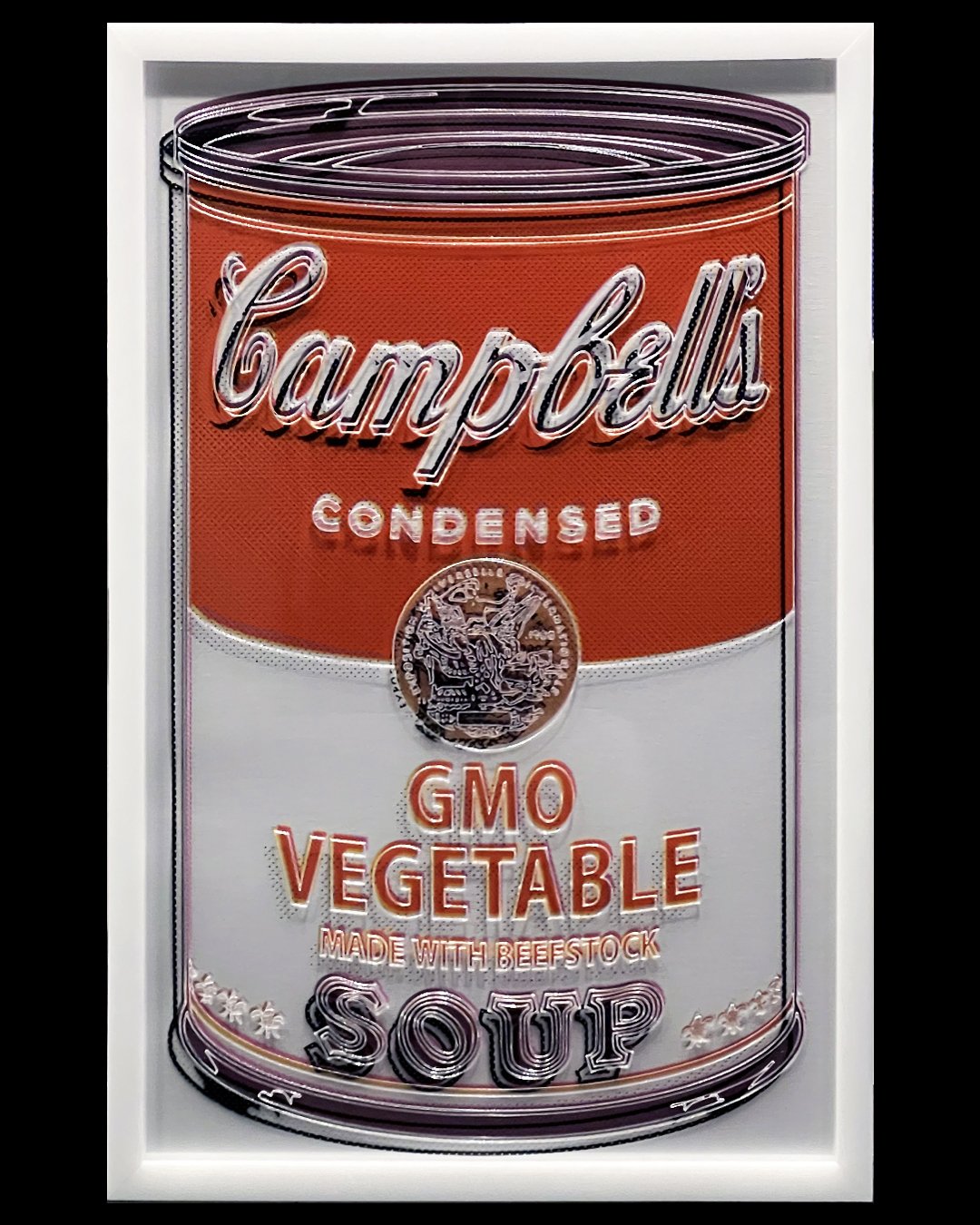
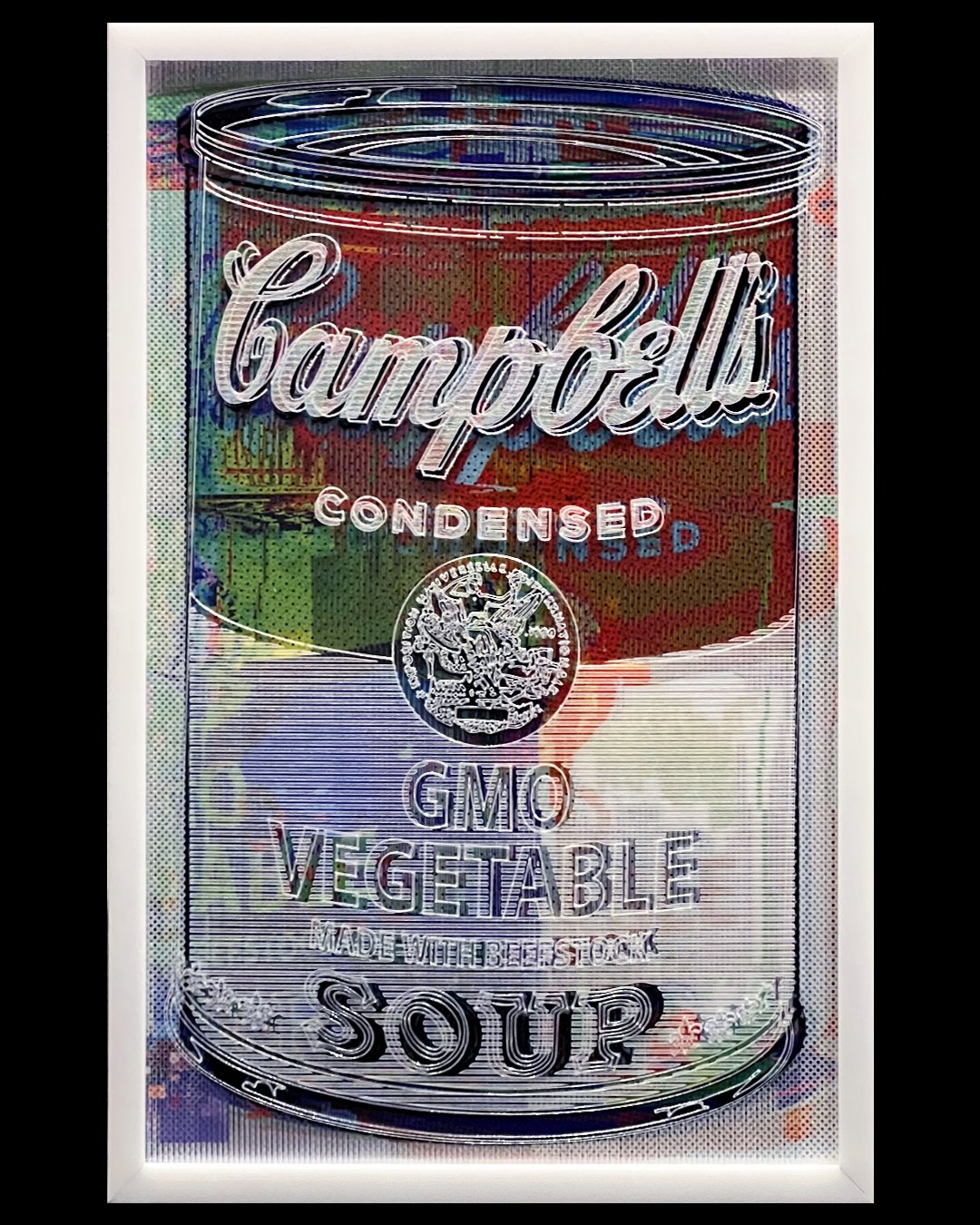
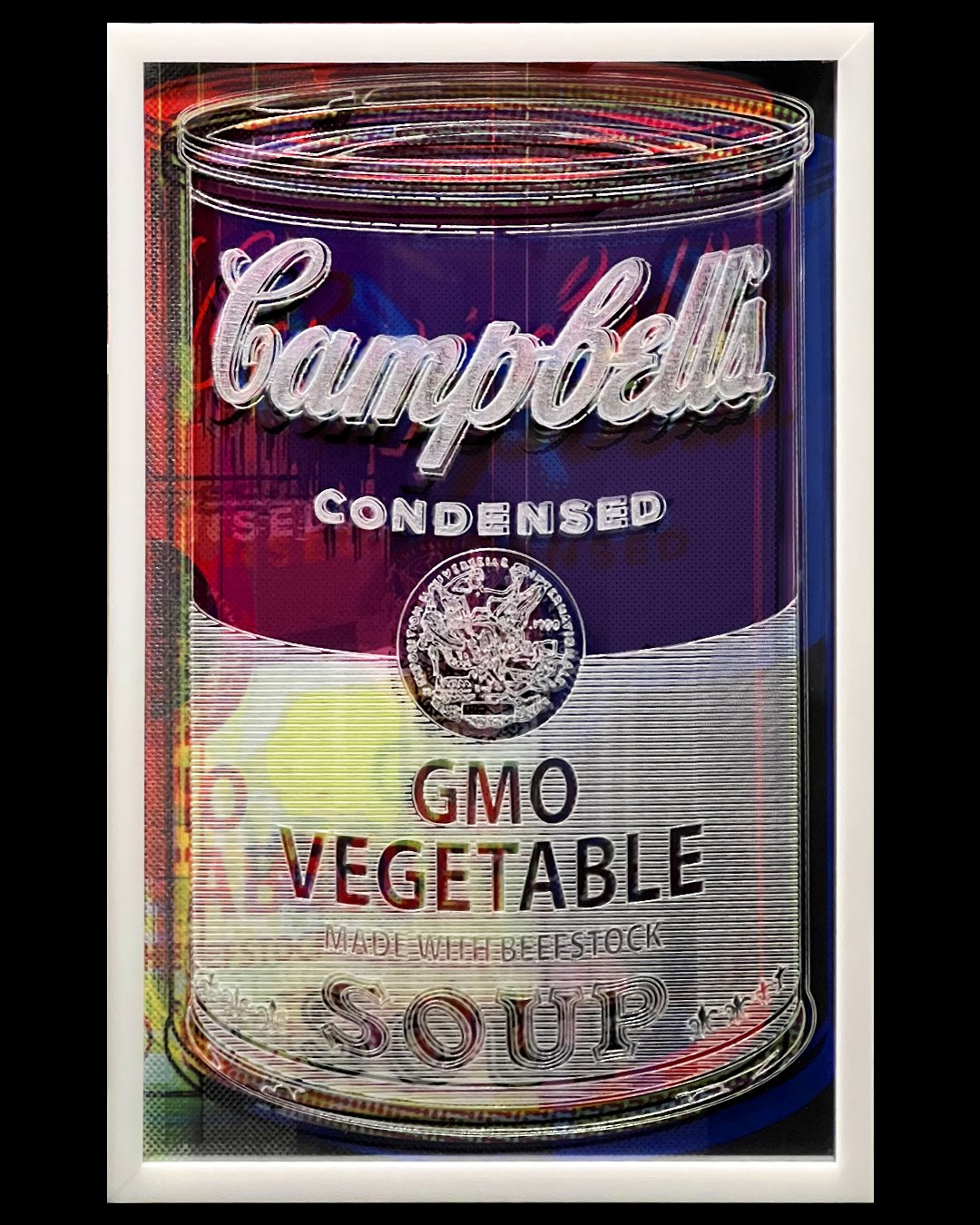
Similarly, my series entitled "OMG-GMO" also explores the implications of evolving technology and human modification (genetic in this case), which alters the fundamental building blocks of life. It was inspired by the January/February 2018 issue of MIT Technology Review, titled "GMO OMG," and explores the controversial topic of genetically modified organisms (GMOs) and their impact on agriculture, the environment and society.
This body of work is an appropriation of Andy Warhol's iconic 1962 Campbell Soup Cans, reimagined to explore the complexities and ethical dilemmas in the biotech industry. The alterations made to Warhol's original work are similar to the “glitches” we see on a TV or computer screen and are meant to evoke the process of genetic modification. This series also draws parallels between the appropriation of art under fair use copyright laws and the manipulation of genetic materials while encouraging a critical examination of the ethics and boundaries of these practices.
AAS: I think it is fair to say that you are not afraid of color, LOL. Your work is like looking through a prism – you break down images into their raw components. That is a more technological or scientific approach to visual art. Why do you think that interests you?
MR: Haha, you are right, I like the challenge of using lots of color in my pieces. I am highly inspired by Mark Rothko's work and his attempts to use color to represent emotions. Also, when I was a student at CCS, I attended a lecture by designer Karim Rashid in which he criticized our man-made world, stating that despite being able to perceive thousands of colors, we live in a neutral world made of concrete and steel. One of my favorite courses in college was color theory, in which we learned the Munsell system, a physics-oriented methodology, and I was introduced to a world far beyond the color wheel. As I created my artwork, I became very interested in exploring vibrant hues of color to evoke emotions.
AAS: Milton, where do you think your art is going to take you next?
MR: First, I would like to thank John Magee and Mack Murphy for encouraging me and giving me the opportunity to display my work alongside other incredible artists at M2 Gallery, and to my wife and parents for the years of support and for believing in me.
In terms of where my art will take me next, up to this point, the work that I have produced has been experimental for me. As I continue to create, I am looking forward to delving into the stage of refinement. I am not sure where this will lead, or how AI or other advanced tools will be incorporated into my work. I do, however, keep an open mind and I have been having ideas about expanding my work to include interactive sculptures and other 3-dimensional pieces.