Interview with artist Patrick Phillips
Patrick Phillips is an abstract expressionist artist living and working in Little Rock. His work is inspired by the colors and shapes of nature – and his imagination. His paintings are in private and corporate collections throughout the US. More of his work can be found at Allan Knight and Associates in Dallas, DP Designs in Little Rock, Facebook and Instagram. —2022
AAS: Patrick, are you originally from the Little Rock area?
PP: I am originally from the Dallas area. We moved to a small town in West Arkansas when I was about 11 years old, and I moved to Little Rock 32 years ago, right after high school. As well as being an artist, my partner and I have an interior design business.
AAS: Were you exposed to much art growing up?
PP: I was exposed to art growing up in a limited way, especially after moving from Dallas to a small Arkansas town. My mother is very creative and painted, did various crafts including quilting and stained glass. I started buying design magazines with my allowance when I was probably about 13 or 14. I was immediately attracted to large scale abstract works, color field paintings etc. one of the first art books I bought in high school was on Georgia O’keefe. My mother taught at a local community college and I would check out art books and study them. Some of my favorite artists are Mark Rothko, Helen Frankenthaler, Joan Mitchell, Robert Motherwell, Gerhard Richter, among others. I remember in high school having the Arts Center mobile gallery visit our school. While I don’t remember any specific works that I saw – it was some time ago – it was one of the first times for me to experience that caliber of art. Looking back, it’s pretty amazing that the Arts Center took the time and resources to expose young people across the state to art.
AAS: Do you have any formal art or design training or are you mostly self-taught?
PP: I am a self-taught artist. I’ve learned by experimenting with color, texture and various mediums. I had three years of art in high school and one semester of art history in college. I mainly work on canvas and wood panel, but I do some works on paper and have even experimented with collage and painting on cardboard. After moving to Little Rock and working in interior design I decided I wanted to paint again after a break from when I had to focus on other things. I began selling my works at a local design store where I was the buyer and manager for many years before starting my own business with my partner in 2012.
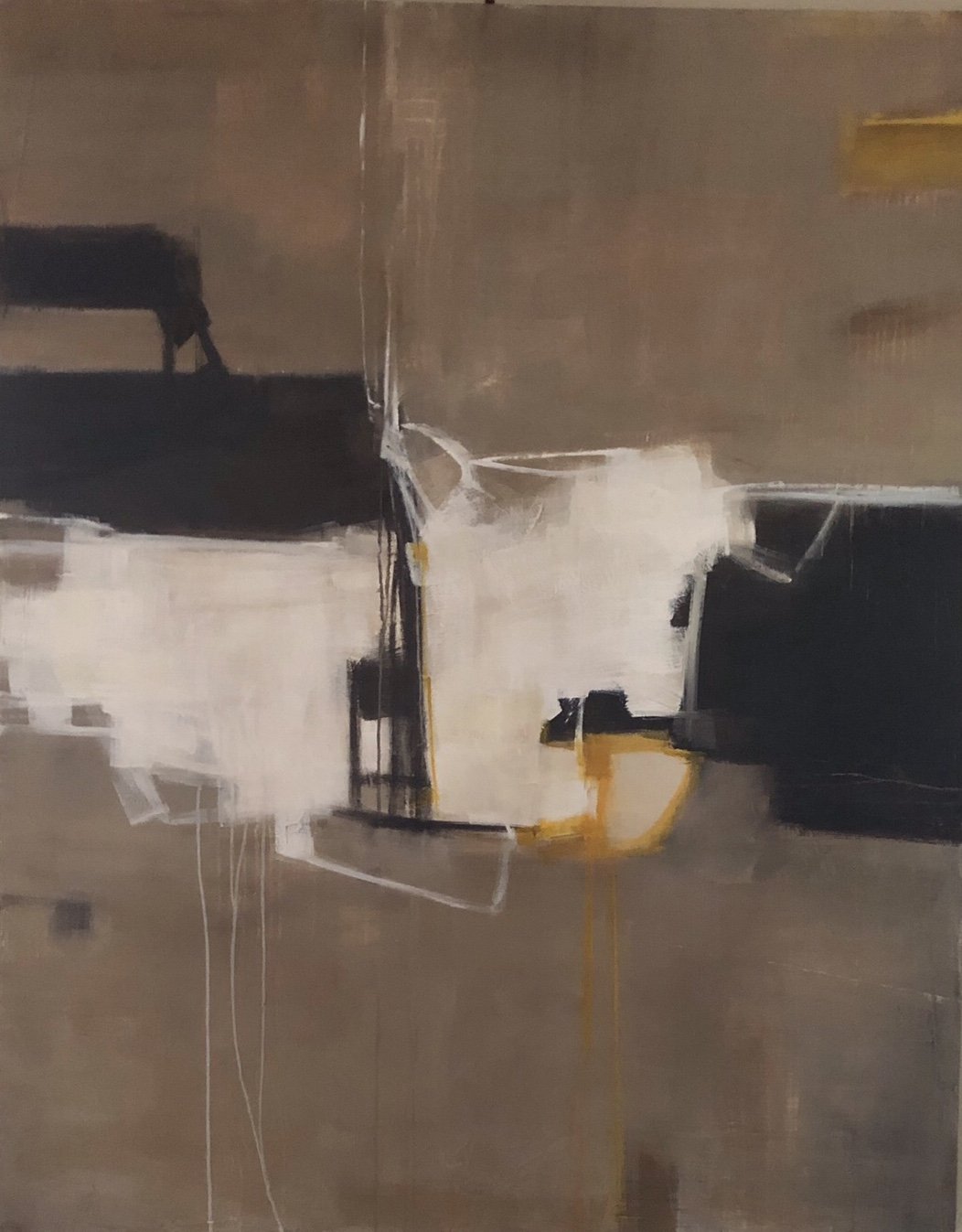
AAS: Your abstracts are a wonderful play of color. Orange Landscape is one of my favorites. Talk about that piece and your use of color.
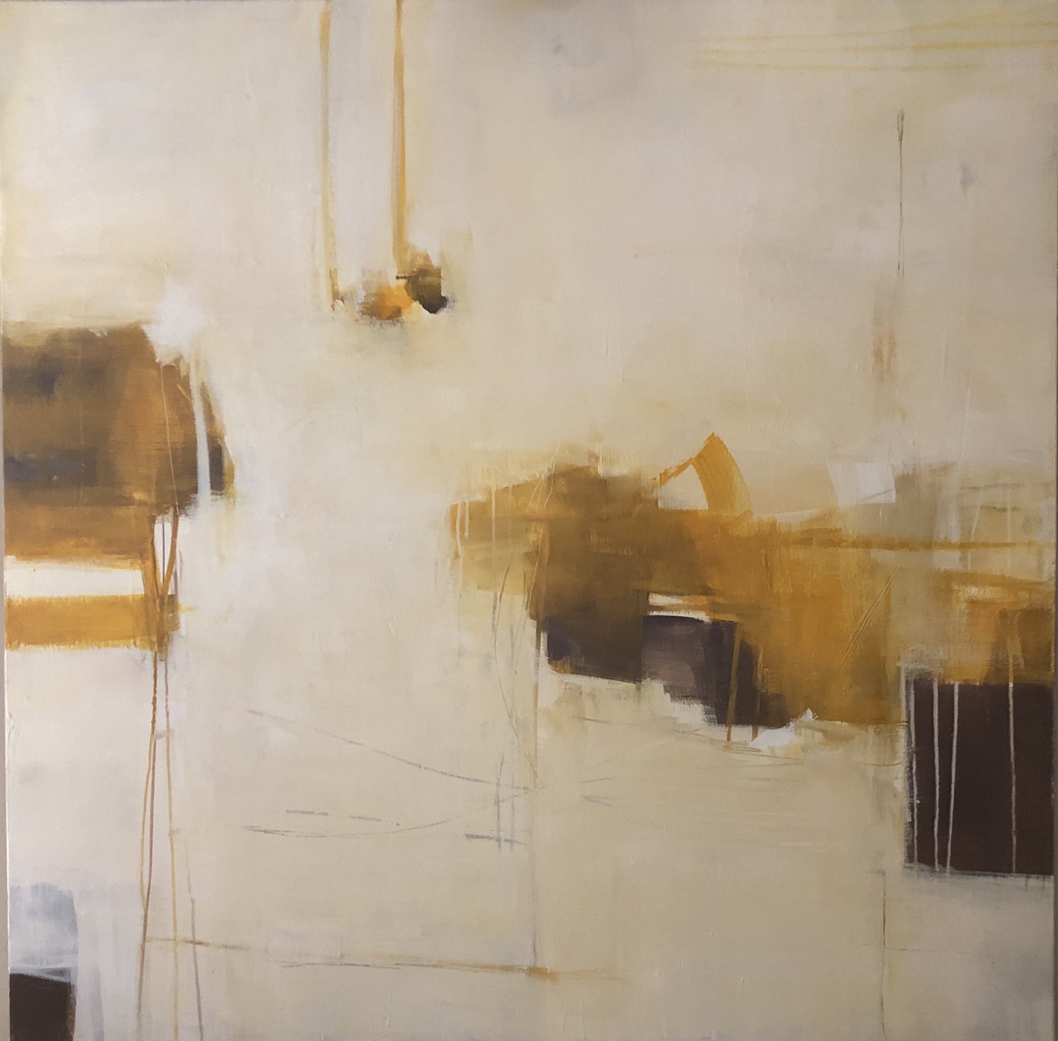
Orange Landscape, 48” x 48”, acrylic on canvas
PP: I sometimes hesitate to title my paintings, but orange landscape seems to fit this piece. I don’t like the viewer to be too influenced by the title. In my work I like to find a balance and harmony in the colors. Orange Landscape was influenced by the time I spent in Arizona. To me, it almost appears to be a mirage you might see in the distance, a settlement reflected. It also has an aerial view feel, like you are viewing the landscape from above. I usually start my paintings with a layer of texture and build up color from that point. There are several layers to this painting where I’ve added and subtracted colors to achieve more saturated areas of interest and deeper hues and more open areas of space to let the eye rest.
AAS: Your use of orange, pink and chartreuse is bold and, at least for me, not a combination I see a lot of, which makes it even more exciting. I think your work shows that abstract art can be an approachable way to introduce color into the home, which can be intimidating.
PP: That particular color palette appealed to me, because it wasn’t one I’d used before and I thought the colors played so well together. One of the things I love about abstract art is exploring different color combinations. Yes, I think art is a wonderful way to introduce color into interiors. I have always personally liked a very neutral background so that the paintings, sculpture, and other accessories or collections have a bigger impact. Colorful abstract art is a way to incorporate your favorite colors without having, say a red room or a lime green room. Color can have a strong effect on people, too. When I see a blue monochromatic painting I get a calm feeling, where if I see a bold red and black painting it evokes something completely different. I think color and the use of it in art and interiors is different for everyone. I want a very calm, uncluttered environment for myself, where the art is the focus, but some people are completely opposite and want lots of bold color and pattern. But, I also love black and white or monochromatic art and am currently working on a series of four commissioned pieces that are black and white geometric paintings. I also love to mix contemporary art and antique or traditional furniture. The contrast sets both off nicely and that is interesting to me.
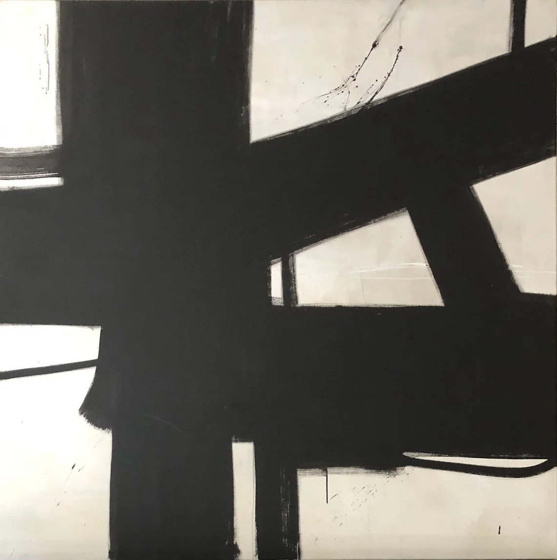
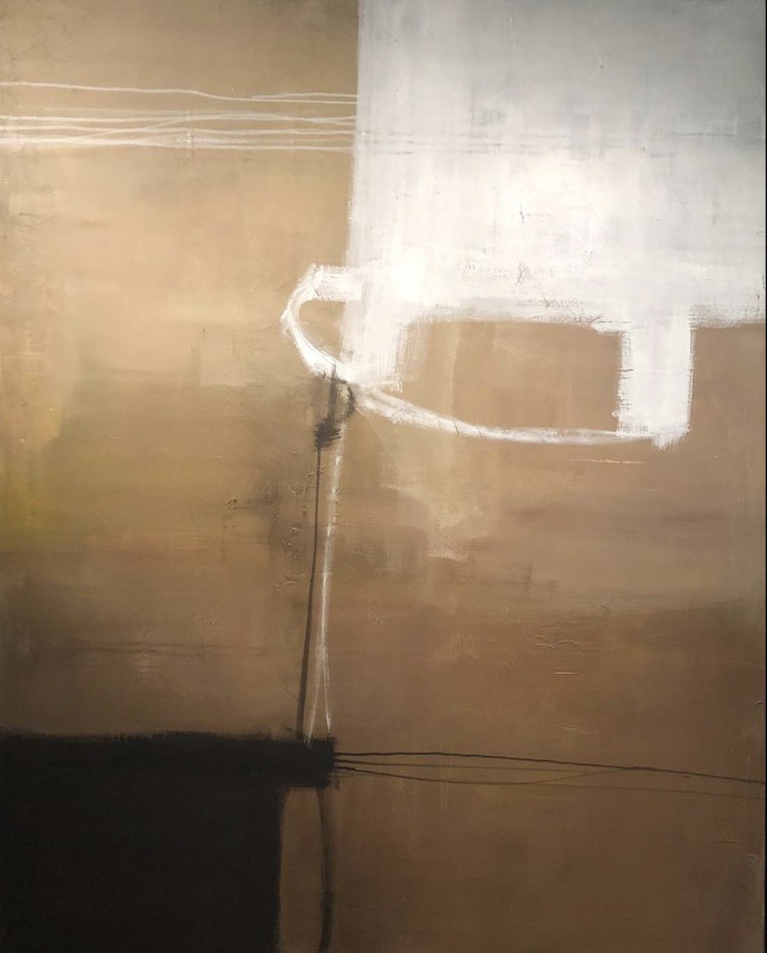
AAS: Your paintings often have strong vertical and horizontal elements accentuated by color. I think Other Worlds is an especially good example of that. Tell me about that piece specifically and what inspires your work in general.
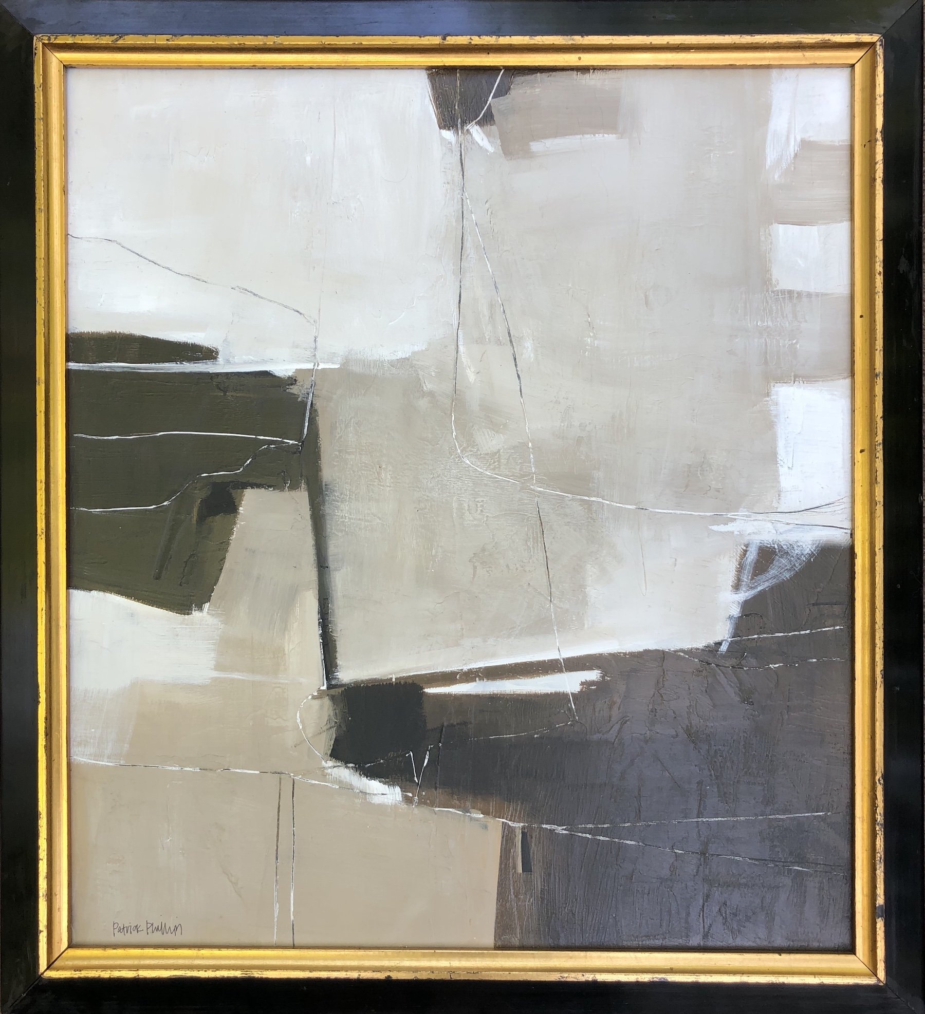
Other Worlds, 60” x 48”, acrylic on canvas
PP: With this painting I wanted to explore space, form, and the connections of lines. The negative or background space in this painting was important to me. I wanted a fairly medium to dark background with the white lines and shapes creating interesting forms and connections within. The black shapes add weight with the subtle hints of color for contrast. This painting has an almost ethereal appeal to me, in person especially. I also wanted to create a sense of light in this painting, which is sometimes lacking in abstract works. The title Other Worlds suggest a thought of space and other planets and how they might look. I am a big fan of science fiction.
AAS: That’s interesting. Science fiction is about accepting an altered reality and having an expanded imagination. And creating and enjoying abstract art is about that too. What is it about painting abstracts that you love? Who are some painters you admire and draw inspiration from?
PP: I’ve always been drawn to abstract paintings since I can remember being aware of art. To me there is a calmness and mystery to abstract art that I find appealing. There is so much to discover in an abstract work. I find that it sparks my curiosity personally more than a landscape, still life or portrait. It can transport you mentally to a different place, an imagined world or time. As I mentioned before I’m very much influenced by the color field paintings of Mark Rothko, Richard Diebenkorn and Helen Frankenthaler. My more monochromatic works are influenced by Robert Motherwell, Franz Kline, and Antoni Tapies. My main inspiration comes from nature, all color originates in the natural world. I can find color inspiration in a beautiful hibiscus bloom, the blue of the sky, the branches of a tree.
“I’ve always been drawn to abstract paintings since I can remember being aware of art. To me there is a calmness and mystery to abstract art that I find appealing.”
AAS: What do you think about when you paint? Is it the image and its development or is it more of a meditation time?
PP: When I paint, I always have music playing. I tend to get kind of lost in the work when I’m working on a painting. It’s very meditative to me. I usually start with a general idea of the colors I want to use and start there. I’ve learned not to get too attached to any certain areas of a painting in the beginning because it sometimes limits the outcome. My process is very organic and spontaneous, I rarely start with a picture in my head of how the painting will look when finished. Many times, I’ve totally changed direction with a piece in the middle or even near completion if it doesn’t have the balance and composition isn’t right to me. My work is all about building layers and adding and subtracting colors and lines. Sometimes the process leads you in a different direction than you originally intended, and you just go with it. The longer I’ve painted the more I trust in the process and try to enjoy how the painting evolves.
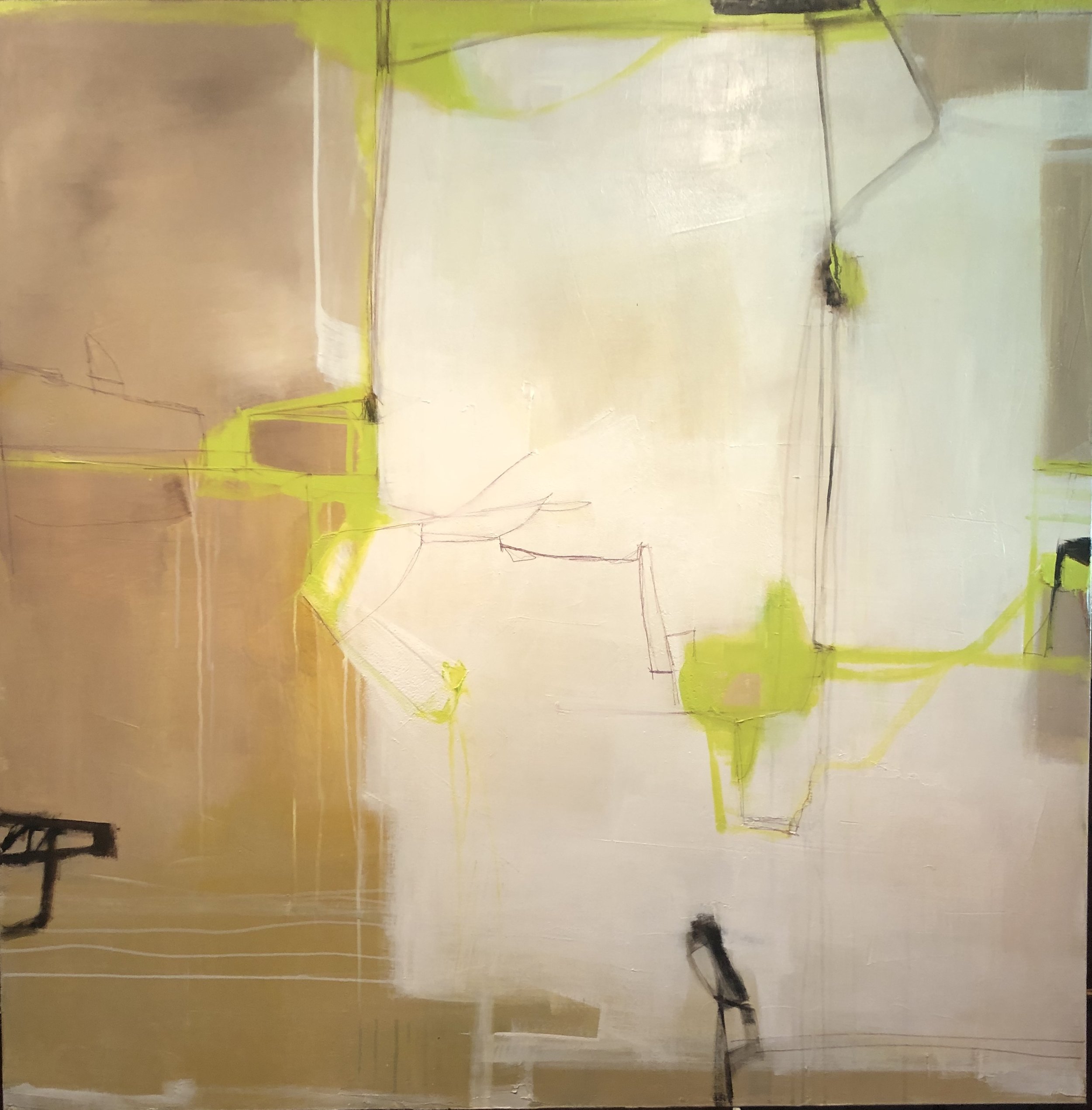
AAS: You mentioned that you like to mix contemporary art with antique or more traditional furniture. In Portal and some of your other smaller pieces you use an antique or vintage frame. I really like the juxtaposition of classic and abstract.
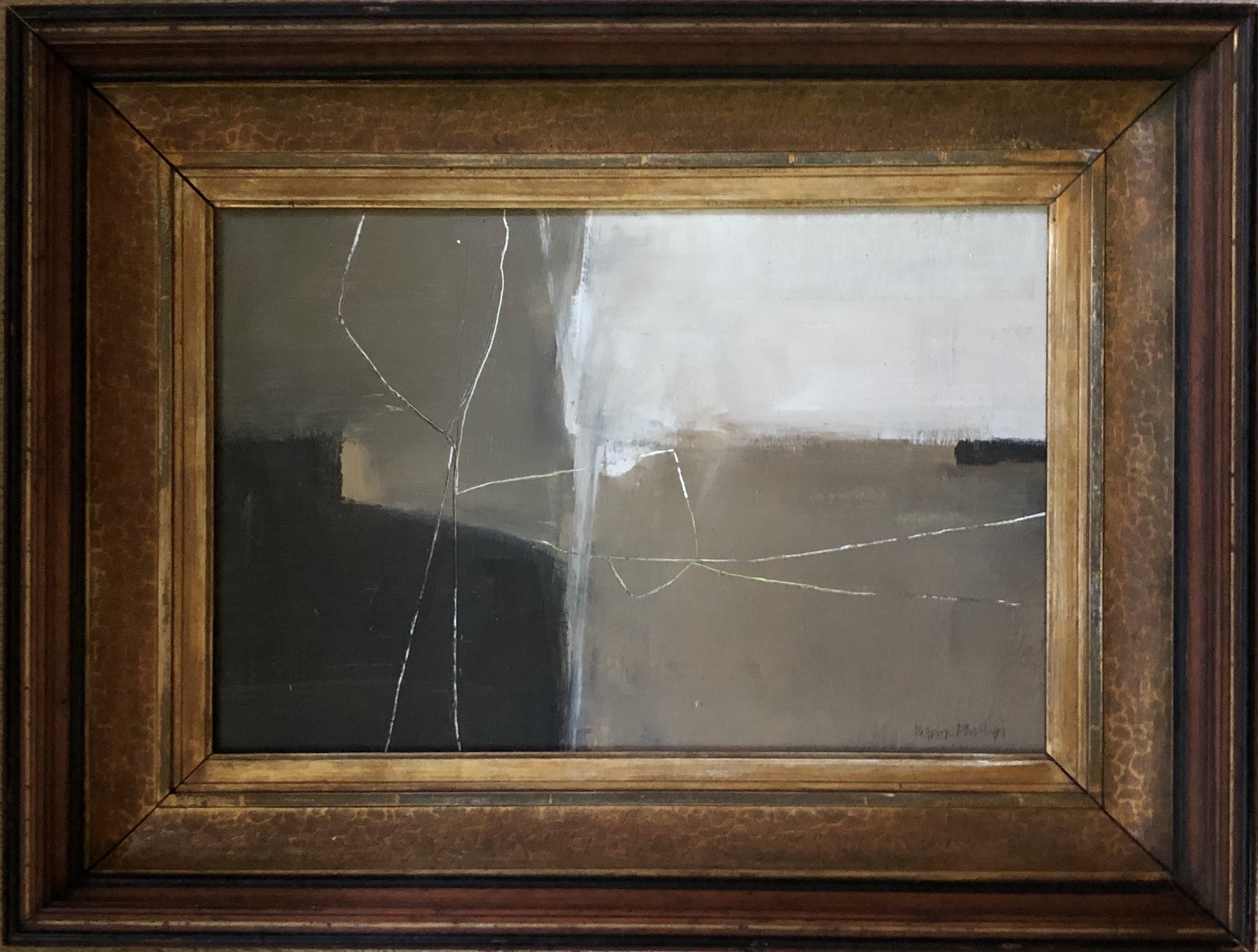
Portal, 11” x 13”, acrylic on wood panel in vintage frame
PP: I’ve had people inquire a lot about smaller works recently, so I decided to find some antique and vintage frames and create some smaller pieces on board. I really love the juxtaposition as well. I sell a lot through social media to collectors out of state, and these smaller works are easier to ship and a better price point for some people. I like my work to be accessible, so I try to offer a variety of sizes and prices. It’s also a nice change from working on larger paintings and these are sometimes studies for a bigger painting. One of the reasons I work in different sizes and mediums: paper, canvas, wood panel, etc., is so that I can offer a range of sizes and price points for my work. Someone may like my larger paintings but doesn’t have either the space or maybe the budget for a large painting, so hopefully there is something for everyone.
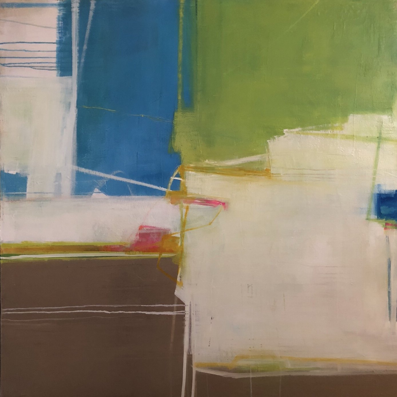
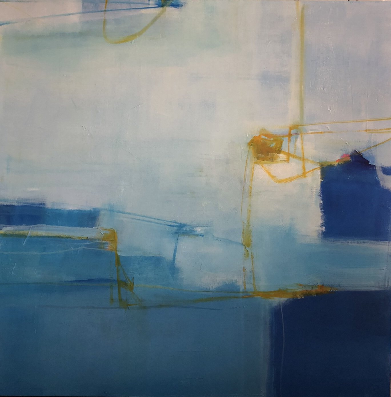
AAS: Another of my favorites is The Dance. The color palette and changes in value really do add to the movement of the piece.
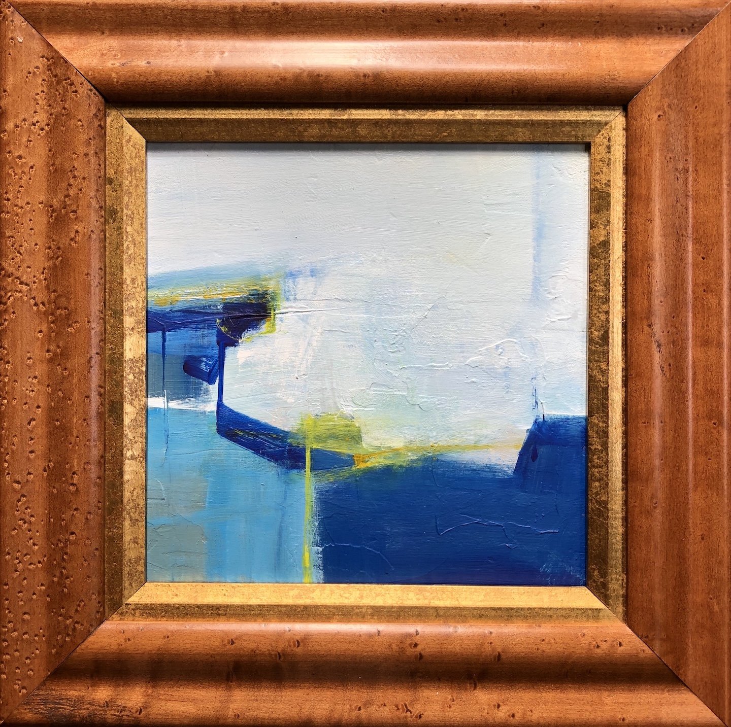
The Dance, 48” x 48”, acrylic on canvas
PP: I titled this painting The Dance specifically because of the movement it has. I wanted to do a high contrast painting with intense areas of color and darker areas. This piece also has a nice sense of light to me. I want people to feel like they can step into one of my paintings and discover something interesting or appealing. This painting was very much inspired by music. The openness of the middle seems to draw the viewer in to explore the movement and more complicated areas of the piece. It’s a fairly monochromatic painting with just the focal points being more colorful which seems to draw your eye.
AAS: Tell me about your design business.
PP: My partner and I started our design business, Phillips Johnston, about 11 years ago. After working in retail and design for other people for many years we wanted to start our own business where we could give more personalized service, and I could focus more on my painting. We do a variety of different types of jobs ranging from paint and fabric selections, ground up planning of spaces, interior editing and reworking existing furniture and accessories. We have also assisted clients in locating and securing art.
AAS: Patrick, what can we expect to see from you next?
PP: As an artist I’m interested in exploring new mediums, techniques and color combinations. I always have new ideas I want to try out. I don’t want my work to become static but to continually evolve and change. I’ve experimented with collage some in the past and that’s one thing I’d like to incorporate into some of my works. I’m going to continue working on large scale paintings and collections of smaller works on paper, and my vintage frame collections. I still get excited about the possibilities that a blank canvas holds.