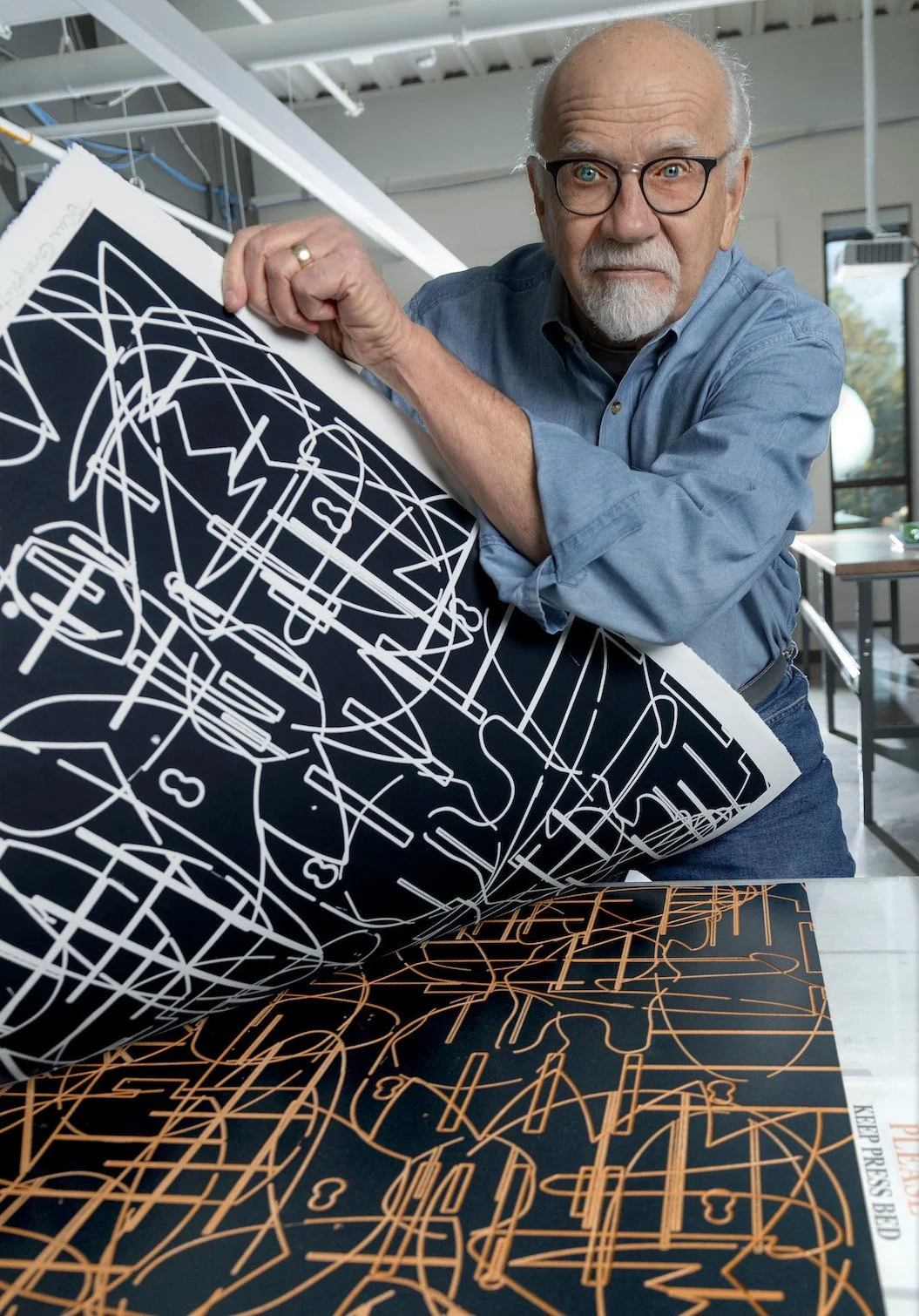
Interview with artist Win Bruhl
Win Bruhl is a master drawer and printmaker living and working in Little Rock. For fifteen years he chaired the Department of Art and Design at the University of Arkansas at Little Rock and shared with students his expertise and love of art and creating. Win has participated in more than two hundred regional, national, and international exhibitions and his work is in many major national and international collections. More of Win’s work can be found at his studio website southernflyerstudio.com and at Boswell Mourot Fine Art in Little Rock. —2022
AAS: Win, you moved to Arkansas almost 25 years ago to assume the chairmanship of the Department of Art at UALR. Was that an easy move to make?
WB: My family (Rita and one of three sons) moved from St. Paul Minnesota to Little Rock in 1998. This change was motivated by a number of issues. Professionally, it provided an opportunity to chair a department of art in a state university. My wife and I also wanted to assist with parental caretaking since my parents, having sold the family farm in Missouri, moved to Pine Bluff to be near my sister and her family who live in White Hall. But here’s the BIG issue. I was tired of shoveling snow and braving subzero temperatures six or seven months out of every year. During our first year in St. Paul, we experienced a total of ninety-eight inches of snow. Then too, I’ve always been coaxed by wanderlust. This led to a teaching career that included three universities in three states. My first teaching opportunity began in 1970 at Southeast Missouri State University, my baccalaureate and first master degree alma mater. We stayed there eighteen years before moving to Concordia University/St. Paul where we braved the cold for ten years. The decision to relocate to Little Rock was the right decision and after fifteen years with the University of Arkansas Little Rock, I retired. That was 2013.
Prior to my first teaching assignment, I was drafted into the U.S. Army where I was assigned as an illustrator/draftsman for the Headquarters of the 3rd Armored Division. Following discharge, my teaching career began.
Since retirement, I have taught part-time, conducted printmaking workshops in several locations including the Czech Republic, and continued producing fine art prints and drawings in my studio, Southern Flyer Studio. Rita and I recently returned from a month in Italy during which I had an opportunity to create a limited edition fine art print with Master Printer Giancarlo Busato at Stampleria d’ Arte Busato in Vicenza.
AAS: Where did you study art?
WB: During my professorship with Southeast Missouri State University, I took academic leave and completed a Master of Fine Arts degree in printmaking at Montana State University in Bozeman and then returned to Southeast Missouri State to assist with establishing the printmaking program for the Department of Art. I can’t imagine another career that could have provided such diversity of opportunities and welcomed challenges. However, there was a time when I wasn’t committed to art and teaching. My first years of college were dedicated to Biblical studies and classical and modern languages. It was during my study of Greek that I began to realize that it was the visual aesthetic of the written language and the printed page that fascinated me. That fascination eventually led to a college transfer and a change of major to studio art and art education.
AAS: Were you encouraged to become an artist growing up?
WB: Throughout my formative years and public school education, artistic endeavors were encouraged by my parents and teachers. My father was a furniture and custom cabinet builder, and my mother was creative in nearly everything she did including cooking, gardening, sewing, and writing. Although neither parent had an opportunity to pursue education beyond the eighth grade, my siblings and I were expected to pursue studies beyond high school. I had many teachers and professors who were instrumental in my development as an artist and eventually as a teacher. Jacob Wells was a drawing and painting professor who hired me as a muralist assistant for more than three years painting an 800 square foot mural in Kent Library on the campus of Southeast Missouri State in Cape Girardeau. From this I learned dedication to a specific task, and I also learned that I didn’t want to be a mural painter.
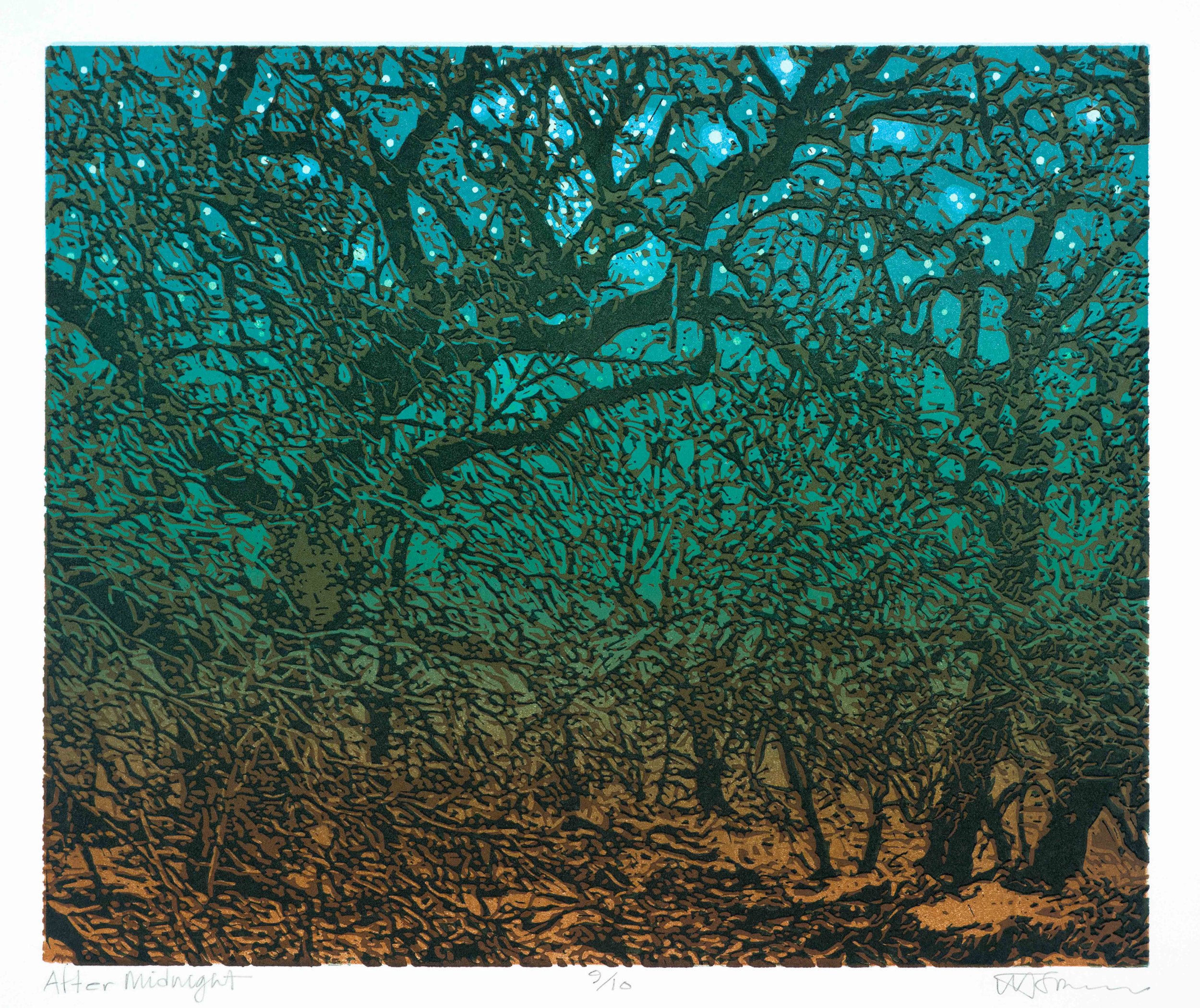
AAS: Let’s talk first about some of your prints. Redbud is spectacular and I love your use of color. I can hear the wind – and it also makes me want to sneeze. It is a linocut. Would you talk about how you achieved the coloration using a linocut?
Redbud, linocut, 15 ½” x 20 ¾”
WB: Redbud required an enormous number of hours and lots of patience. The image began as a color photograph taken on my brother’s ranch near Blue Grove, Texas. I used Adobe Photoshop to separate the photograph into sixteen specific color components. This provided an opportunity to view each color independent of being among the complexity of fifteen additional hues. When I had sixteen different colors identified, each component color was converted to a high contrast black and white composition and enlarged to 15 ½” x 20 ¾”, the dimensions of what would become the finished fine art print. Sixteen linoleum blocks were prepared and each of the enlarged high contrast b/w compositions was transferred to one of the sixteen blocks while maintaining appropriate registration. That’s the tedious part. The negative space surrounding the high contrast b/w images was carved away using gouges and chisels. This was the most time-consuming part of the process…more than 300 hours. The sixteen finished blocks were then printed in a specific color one on top of the other. This permitted the original photographic image to be recomposed as a full color composition although with a significantly modified color scheme. To complete an edition of 12 impressions required 192 applications of ink and an equal number of passes through the press. Whew! Until I was asked to write this, I had not thought much about the complexity of the process. Now I’m exhausted…Ha!
AAS: Another terrific print is 2 Eggs w/neutrals. It is a screen print. Is there a story behind that piece?
2 Eggs w/neutrals, screen print, 16” x 23”
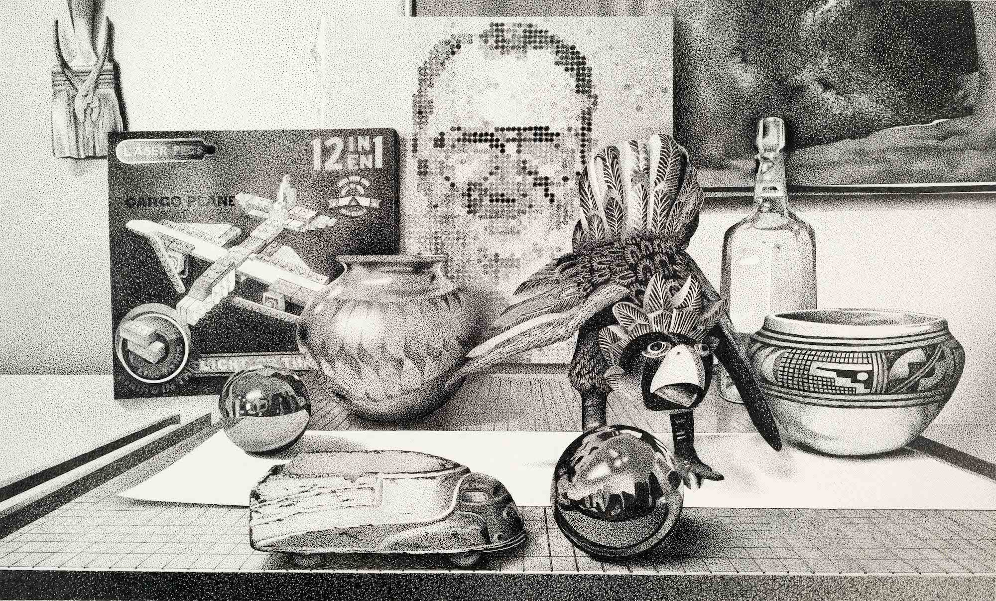
WB: 2 Eggs w/neutrals is one of 15 different compositions related to a series that took shape as a result of a welcomed influence from art history. The geometric order of the grid in the negative space may be related to the use of geometry by Piet Mondrian or Theo van Doesburg as well as other de Stijl artists or maybe even the Cubists. The 20th century west coast artist Richard Diebenkorn also employed a masterful way of dividing compositional space using geometry. Look at his Ocean Park series. The spontaneous or gestural marks within 2 Eggs w/neutrals are associated with Abstract Expressionism and artists of the New York School while the egg images relate to a naturalistic representation of subjects. Understanding art history is essential to giving context to one’s study of art. I have worked with students who neglect the importance of art history and their studio practice shows it.
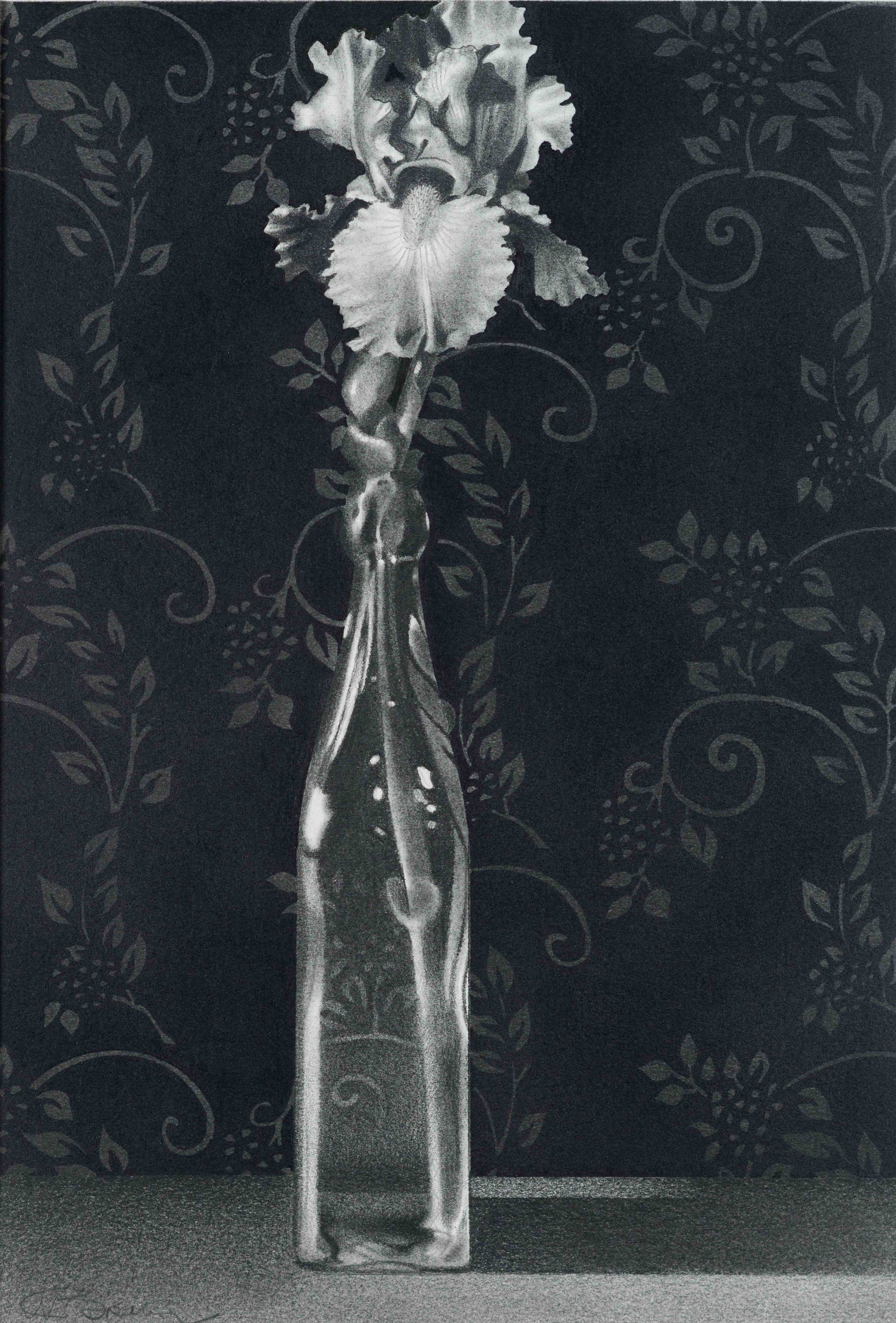
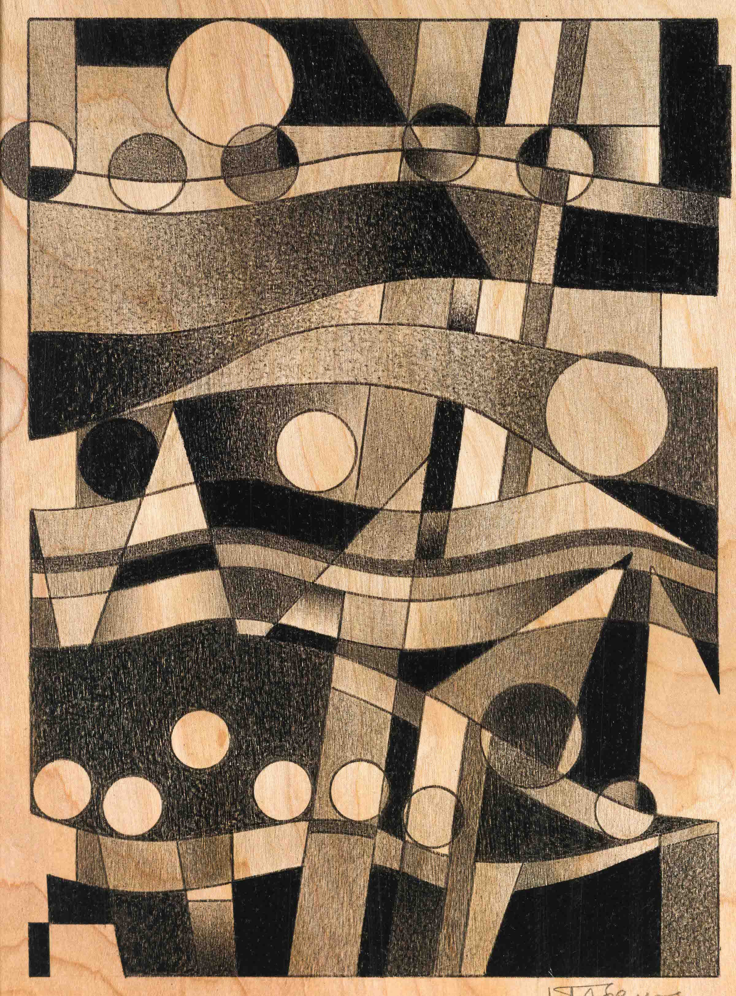
AAS: Frankly, I’ve known of your work through your drawings, so I definitely want to talk about some of my favorites. You have done several dramatic drawings of flowers in a glass bottle. My favorite I think is Fleur de Lis. Would you talk about that piece?
Fleur de Lis, graphite drawing, 14 “x 9 1/2”
WB: My interest in irises began years ago on the family farm near Cape Girardeau, Missouri. My parents were members of the American Iris Society and they propagated about 250 varieties of tall, bearded irises. I couldn’t help but develop a passion for the iris. Eventually my wife and I, along with our sons, became members of the Society and developed a small garden of the flowers. But now it’s time again to refer to art history.
The iris was employed symbolically in Western Art from ancient Greek mythology as well as throughout the Christian world to the present. Notable artists including Albrecht Dürer, Vincent van Gogh, and Georgia O’Keefe featured irises in their paintings. The current fleur-de-lis is a stylization of the iris blossom.
AAS: Your graphite drawings or drawings for a print must take a great deal of time. Do you work on several at a time? What is your studio like?
WB: My studio is a mess. I should just leave it at that and go on to the first part of the question. However, I firmly believe that if there isn’t a bit of disorder in the studio, nothing of significance is happening. So, although messy, I try occasionally to return the studio to some reasonable order so I can at least walk into it without taking a risk.
I most often work on one print or drawing at a time pursuing it until finished before beginning another composition. I’m such a linear thinker.
AAS: I am curious about your creative process. When you go into your studio to begin a new work, do you always have the look of the finished piece in your mind and whether it will be a specific type of print or a drawing?
WB: I most often make prints and drawings that relate to a specific theme. With that theme guiding me, I know what I want to see but because of how the creative process works, a composition may take a number of turns or redirections during the process. In that sense, when I begin a print or drawing, I don’t know exactly how the finished product will look. And I don’t know exactly when it is finished. I simply continue to draw or print until I sense that the composition communicates what I want to share.
AAS: Another of your drawings I love is Syncopation. Which came first, the design of the drawing or the title – they fit so perfectly? You must be a fan of jazz?
WB: I became a fan of jazz years ago but for all the wrong reasons. When I was fifteen years old, I worked as a waiter in a restaurant that was frequented on Friday and Saturday evenings by young married couples. The restaurant had a jukebox. This was 1959. As couples waited for their dinner order to be served, they would “plug” the juke box for their favorite tunes. Most of the numbers were jazz. I memorized the customers’ preferences and the next time they came for a date night dinner, I would be the one to “plug” the jukebox and play their song. That practice resulted in bigger tips. So, my interest in jazz started surreptitiously but later grew into legitimacy.
I think about jazz every day even when I don’t take the time to listen to some of my favorites. That’s how the drawing Syncopation evolved. It was from an intrinsic musical experience. When the drawing was nearing completion, I knew that the experience had been about syncopation.
Syncopation, graphite drawing, 14” x 22”
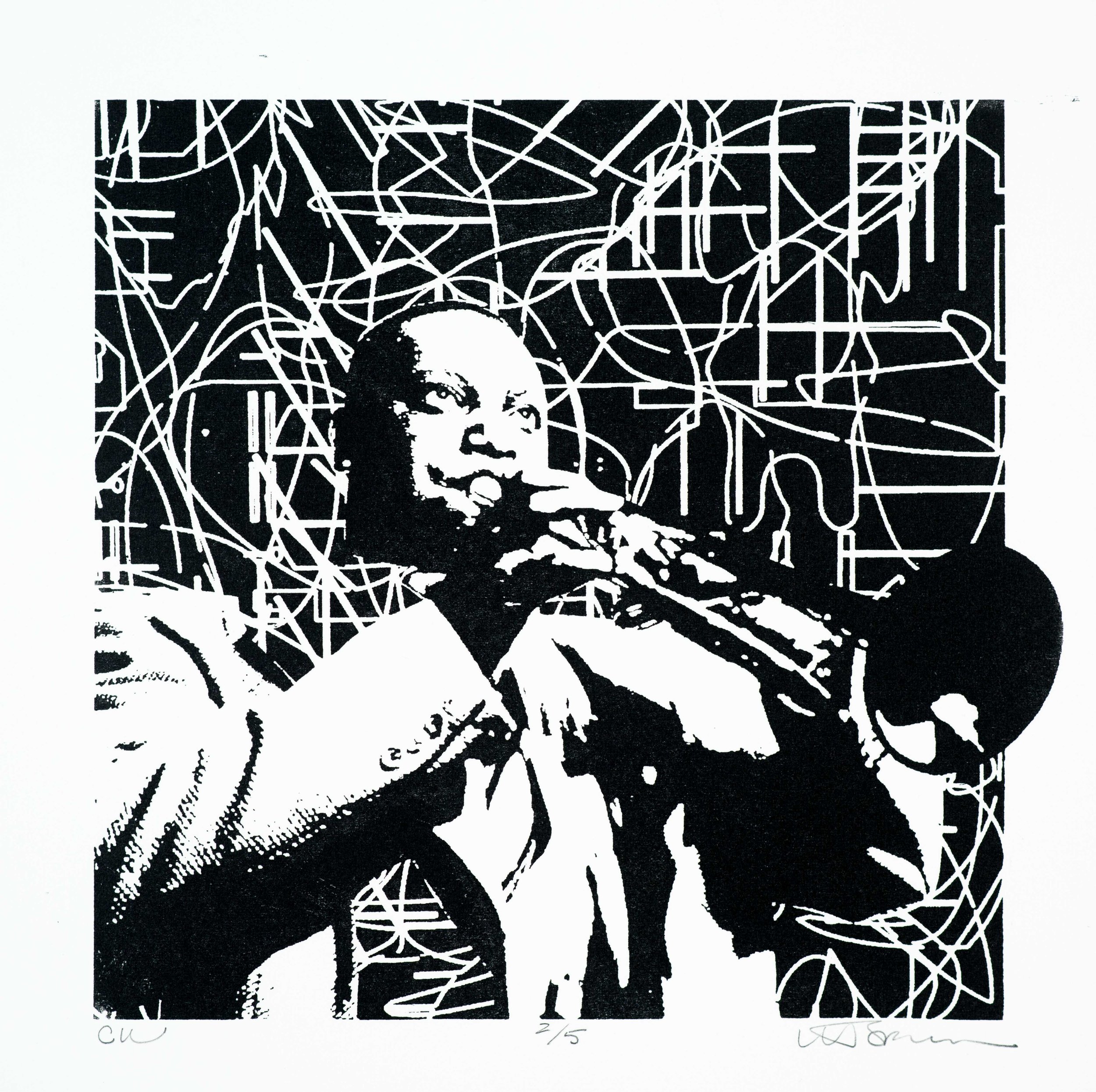
AAS: Blue Graphite Jive is a woodcut and another reference to music and dance. It really does capture the movement of jive and references to jazz.
Blue Graphite Jive, woodcut, 31” x 31”
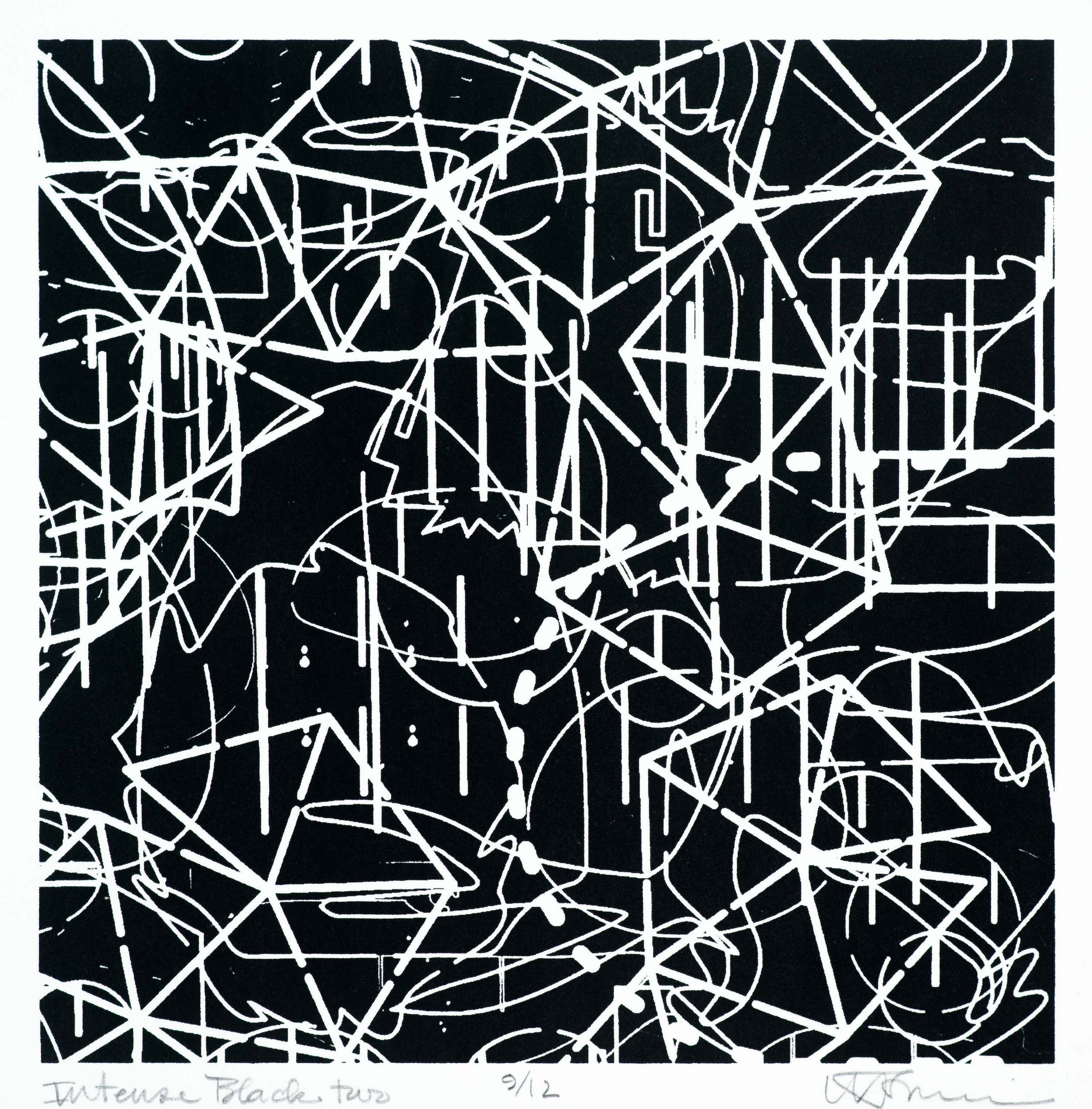
WB: Blue Graphite Jive has an interesting beginning. Walking through the furniture design studio at the University of Arkansas Little Rock, I noticed a discarded piece of wood that had been used as a base plate for a CNC (Computer Numeric Controlled) router. Numerous routing patterns had been cut into the plate and the density of lines and complexity of the surface had rendered it beyond use. I saw great jazz possibilities in the various patterns, so I rescued it, modified it and proof printed it to see what needed to be done to bring the composition into my own. What one sees in Blue Graphite Jive is a lively dance of lines some suggesting musical key changes and rhythmic movements, a genuine jive.
AAS: Has your style or your interest in a particular subject to capture evolved over the years?
Part of my teaching philosophy is that to give something to my students, I must first have what they’re looking for within me. One cannot give away what one doesn’t have.
WB: I have more than once been questioned about my pursuit of numerous subjects and ideas in my art making. Many artists may be recognized because of consistency evident within their works of art i.e., a whole career as a landscape artist or a figurative painter. But within my work, consistency of subject and idea may be difficult to see. And that’s intentional because of my teaching for the benefit of students. Students come to the classroom with all kinds of interests and experiences many of which may or may not relate to what their professor does as a professional artist. So that a professional rapport can develop between me and my students, each student may recognize among my diverse interests, something to which they can relate. And from that meager beginning, a more beneficial educational experience can be developed. Part of my teaching philosophy is that to give something to my students, I must first have what they’re looking for within me. One cannot give away what one doesn’t have.
AAS: What can we expect next from you?
WB: I’m excited to see my show on the walls of the Boswell Mourot Fine Art gallery. I don’t often have an opportunity to evaluate a collection of my work if I don’t see it in a collective setting. The exhibit opens June 11th. Hanging an exhibition could mark the end of a particular studio experience and the beginning of another…but not for me. I will continue the visual representation of jazz music with only a very slight deviation.
I am deeply disturbed by what is happening in Ukraine and enormously impressed by the citizens of Ukraine and their president. I have begun work on an intaglio etching that will combine my interest in a specific jazz title, “Crescendo in Blue” by Duke Ellington with an upward movement (crescendo) within a vertical rectangle from darkness transitioning into a brilliant blue of the flag of Ukraine. Behind a pattern of black line and aquatint etching, a field of color within the negative space will rise from yellow to blue. This will be my tribute to the strength of the people of Ukraine.
Beyond “Crescendo in Blue” will come many more prints and drawings dedicated to “seeing jazz.” Visit Boswell Mourot Fine Arts often to see where this adventure is taking me. I am thankful for Kyle Boswell and his interest in my art making and most appreciative of anyone who visits the gallery to see jazz with me.
And I do want to thank you, Philip, for this Arkansas Art Scene Blog.