Interview with artist Beverly Buys
Beverly Buys is a Hot Springs artist – a photographer who enjoys the physical work of manipulating light sensitive materials from negative to final print. The result is a body of work that is impassioned and personal. Her photographs have been exhibited throughout the South and in many notable exhibitions including the 57th Annual Delta Exhibition and the Delta National Small Prints Exhibition. More of Beverly’s work can be found at Justus Fine Art Gallery in Hot Springs and at her website beverlybuys.com. —2024


AAS: Beverly, did you grow up in Arkansas?
BB: I am a native of Hot Springs and live a couple miles from the house I grew up in. I graduated from Hot Springs High School in 1971. I received my B.S.E. in Art Education in 1978 from Henderson State University. In my mid-30’s I studied photography at the University of Arkansas in Little Rock, receiving an M.A., and then completed an M.F.A. in Photography and Printmaking at the University of Memphis in the early 1990’s.
AAS: Were you exposed to a lot of art and artists growing up?
BB: I was not. I don’t remember any art classes other that craft projects at summer camps. My mother taught me how to sew when I was 13 and soon, I was making all my own clothes. I credit that skill with learning how to read and follow directions, develop my fine motor skills, and carry a multi-step task to completion. Sewing was my creative outlet and I enjoyed adding my own twist to the sewing patterns I used. Later, for a period of time, I incorporated stitching in my photographic work falling back on my love of sewing. It wasn’t until an unsuccessful freshman year as a home economics major in college that I redirected and took my first art class as a sophomore.
AAS: You taught art and photography for so many years. What did you enjoy most about teaching?
BB: My teaching career began teaching Pre-K – 12th grade art at Jessieville School District and I was there for three years. After taking a few years off when my daughter was born, I began working at the Hot Springs Art Center where I taught afternoon art classes and also where I became the gallery director. HSAC was a pivotal job for me. It was there that I learned the skills that would define my career in art. Under the direction of Fred Strebeck, the HSAC director, we received a grant to conduct summer workshops in photography. It was such an interesting project. We built and set up a portable darkroom in one of the Hot Springs Bath Houses during the summers. This was in the mid-1980’s before smart phones and digital cameras were in use and at that time everyone was carrying around a film camera. Interested people would sign up for a two-hour darkroom session, we would give them a roll of film and they came back at their assigned time to develop their film, make a proof sheet, select one negative to work with and make a final print. I entered this job having taken only one photography class, so I learned on the job how to manage a darkroom. People swarmed this opportunity, and it was a lot of fun. It was during this time I met a pivotal person in my development as a photographer. Thomas Harding, from Little Rock, was renowned for using Pin Hole cameras and making Palladium/Platinum Prints. He was interested in photographing the Bath Houses which were at that time, with a couple of exceptions, mothballed and full of interesting objects. We spent a fair amount of time together and I visited his darkroom in Little Rock for workshops and one on one darkroom time. I also have to mention that as an employee of Hot Springs Arts Center I learned how to hang and publicize gallery shows and that knowledge was invaluable as I continued my career.
When my job at the HSAC ended I went back to school at UALR to study photography seriously. After that I spent a year teaching elementary school art at Martin Luther King Jr. elementary school in Little Rock before returning to school to earn my M.F.A. in Memphis. While attending this final leg of my education I also taught photography half time at Henderson State University. It was rough! I commuted to Memphis from Hot Springs twice a week for classes, commuted twice a week to Arkadelphia to teach and did homework on the weekends.
The thing I enjoyed most about teaching? I most enjoyed teaching Photo I, I NEVER taught digital photography. The first experience in a darkroom is so magical and it is easy to fall in love with so introducing the darkroom to students is just the best. I was also the gallery director at Russell Fine Arts Gallery at HSU and that was a very enjoyable aspect of my teaching career. The thing I miss most about teaching is interacting with students and how they kept me current on the language, fashion, and culture of the day. In a way they kept me young, or at least kept my ideas young.
“I am not in control of my method. I work toward perfection but welcome the imperfections that invariably occur. More often than not the imperfections are the making of an image.”
AAS: I love that you describe yourself as an analogue photographer. What is it about the process from start to finish that you find so compelling?
BB: Oh, my goodness. I think because of my age, having come into my own as a student and a photographer just prior to the explosion of digital photography, I felt betrayed by digital photography. I had just spent several years studying how to make well-crafted prints and falling in love with historic photographs. Basically, I wasn’t having it and I got very stubborn about it. One of my former (and excellent) students reminds me of the day he brought in a matted and framed digital print to show me and I asked him why he wasn’t making REAL photographs. That was early on and of course I moderated my comments and ideas eventually. I retired a bit early, 10 years ago, and in large part because I realized that while teaching only analogue photography strengthened my students with whatever their photographic endeavor in the future might be, I also thought they really weren’t getting what they would need for the current job market. I like to think (and hope) that I didn’t outstay my usefulness in that job.
What do I find compelling? I like handmade things. My half-hearted attempts at learning how to process images with a computer left me with the feeling that I was trying to make a drawing with a long pencil on a surface that was 20 feet away from me if that makes sense. The final image was just too distant from me, there was just too much static between what I understand and how I like to work.
Ironically, there was a short time when digital photography was beginning to show up on social media and a lot of people began using filters on their photos. The filters emulated the kinds of errors and mistakes that the modernist (think Edward Weston) photographers had considered bad. They added the appearance of grain, vignetteing, high contrast, plastic lenses, etc. to digital photographs. Those digital images did influence me and helped me loosen up about how a photograph should look. In my mature work I wanted my photographs to show the photographic process, the hand of the artist. This quote by the musician Brian Eno help me convey my feelings on the subject: "Whatever you now find weird, ugly, uncomfortable and nasty about a new medium will surely become its signature. CD distortion, the jitteriness of digital video, the crap sound of 8-bit...all of these will be cherished and emulated as soon as they can be avoided. It’s the sound of failure...the sound of things going out of control, of a medium pushing to its limits and breaking apart. The distorted guitar sound is the sound of something too loud for the medium supposed to carry it. The blues singer with the cracked voice is the sound of an emotional cry too powerful for the throat that releases it. The excitement of grainy film, of bleached-out black and white, is the excitement of witnessing events too momentous for the medium assigned to record them."
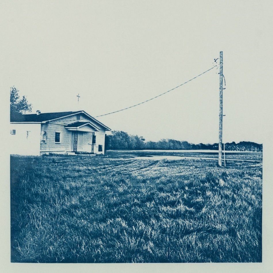
AAS: I would like to begin by asking you about your Delta in Blue series. One of my favorites from that series is Delta Wedding Cake. Tell me about that photograph and that series.
Delta Wedding Cake, cyanotype print
BB: The series Delta in Blue is the apex of my work as a photographer. I spent about 12 years making trips to the Arkansas Delta region to photograph. My interest in the area is centered in Helena, Arkansas and radiates out about 50 miles north, west and south, and slipping east into Mississippi just a bit. Early on I would visit 3 or 4 times a year to photograph for 3 or 4 days at a time. The 2010’s seemed a time when the last vestiges of a more booming era for that region were in their last gasp. Buildings were tumbling down or being overgrown in thickets and kudzu, and yet enough remained to get a sense of an era. I was interested in recording what remained from the mid 20th century, and I was interested in the unique characteristics of a place in Arkansas that was reminiscent of my childhood in a lot of ways and yet was populated with people and businesses that were very different from my home in central Arkansas and very specific to the Delta region. I wanted to understand the Arkansas Delta’s story. I am an avid reader and exploring the area opened up a whole new direction of thought and study for me that paralleled my photography.
Delta Wedding Cake was photographed in Marvell, Arkansas. It is a photograph of a shop that was still in business the last time I checked. The small concrete brick shop also advertised prom dresses and tuxedos. The wedding cake is evocative of southern tradition and southern belles and the feminine side of Delta farmlands. It made me think of Eudora Welty’s novel Delta Wedding and other literary novels set in the south. Beyond that, the scene was compelling and unexpected sitting at the edge of a highway alongside farming equipment and vast fields of rotating crops. I photographed this window every time I went to the Delta for a couple of years until the display was finally changed. It was difficult to find the right lighting condition that enabled me to make a successful photograph without my reflection showing up in the plate glass. As with many of my photographs it revealed itself to me over time. In the beginning I was drawn to the subject of the cake and only after printing it did I begin to appreciate the elements of design that make the image work. The white painted bricks with the smaller house bricks placed diagonally under the window make me think of piped icing on a decorated cake. The circles of the planter to the left and the wreath to the right echo the circles of the cake and the holes of the diagonal bricks. The delicate tracery of brass altar accoutrements in the window is added information that also serves as a linear element of design.
There are approximately 45 photographs in the Delta in Blue Series. Its debut was at the Delta Cultural Center in Helena and Delta Wedding Cake was in that first show. Other places it has shown are Russell Fine Arts at Henderson State University, Arkadelphia, Southeast Arkansas Performing Arts Center, Van Buren Community Arts Center, Beebe Community College, ASU Library, Argenta Public Library, and Batesville Area Arts Council.
AAS: I grew up in a very small town in South Louisiana and I know exactly what the bricks and sign in Big Boy’s Place looked like in ‘real life’. That is an amazing photograph – melancholy and almost surreal. Tell me about Big Boy’s Place and what is a cyanotype?
Big Boy's Place, cyanotype Delta
BB: Big Boy’s Place is on Highway 49 between Marvell and Helena. I passed Big Boy’s so many times and never noticed it. I was well into my series by then and had probably driven by it no less than 30 times before I finally noticed it one late afternoon when the light hit it in a commanding way. I photographed this series with a square format Mamiya 6 camera and the almost square store front of Big Boy’s Place dominates the frame. Ever aware of the history of the south, I often find symbols within my photographs only after they are printed. An example of this is the torn white curtain in the left window. To me it seems to be a flag of surrender.
A cyanotype is one of the earliest processes in photography. It is often used as a way to introduce light sensitive materials to children. The cyanotype emulsion (light sensitive property) is a combination of two chemicals, ferric ammonium citrate and potassium ferricyanide which can be purchased in kits. The emulsion is painted onto a surface, in my case drawing paper, and then exposed to light. To create an image, you can use a negative, a piece of lace, a leaf, a feather, or anything that blocks ultraviolet light from hitting the coated paper. In my case I use enlarged negatives that I make using the original 2 ¼ “x 2 ¼“ negative from my camera. I spoke earlier of my mentor Thomas Harding, he taught me how to make enlarged negatives in my early days of photography. Enlarged negatives are a bit more complicated requiring a darkroom, large pieces of film, and standard black and white darkroom chemicals. I expose my negatives onto paper coated with cyanotype in the sunlight anywhere from 10 to 20 minutes. The development is a simple process that only requires washing in water for several minutes.
AAS: In Facing Walnut Street the way you printed it really creates a mood that accentuates the image. Why did you choose to print it in that way?
Facing Walnut Street, cyanotype print
BB: This print is a good one to talk about in regard to the entire Delta in Blue series and how they were printed. First let me say, I am not in control of my method. I work toward perfection but welcome the imperfections that invariably occur. More often than not the imperfections are the making of an image. When I began this series, I wanted my photographs to be larger than the usual 8” x 10” format. Contemporary photography was getting larger and larger, taking up more room on gallery walls and I was feeling that my already “quiet” photographs were getting lost in group showings. I knew I was not going to make digital prints which more easily allow for a larger format so I decided I would enlarge my negatives from 2 ¼” x 2 ¼” to a larger size, but the film I used to make enlarged negatives was pretty expensive in sizes larger than the standard 8” x 10” size. I decided to lay down 6 separate pieces of 8” x 10” of film on my enlarger base and project the negative onto all 6 pieces at once. This came with its own set of problems, mainly lining up the six pieces of film without the edges overlapping or having gaps between them in the dim light cast by a red safelight. I did my best, but even in developing the enlarged film it was difficult to end up with consistent exposure across the entire six negatives composing the image. Then there was the problem of laying out those same six pieces of negative without overlapping or having gaps on top of my cyanotype coated paper. The resulting image has a feel of looking through a transparent and unexplained entity. In the end, I felt my solution for making larger prints added to the feeling of looking “into” rather than “at”. It creates a symbolic metaphor for how we perceive memory or think about the past.
Walnut Street is a great example of the pieces of film overlapping where they join up and in other places not quite being lined up as the original negative would be so there is a bit of a break in the lines. The resulting images in this series are approximately 15 inches square.
AAS: I must ask about Beaver Dam. It is an extraordinary print and I think one that really showcases your skill in the darkroom.
Beaver Dam, albumen print
BB: Thank you. Beaver Dam is from an earlier series I call Paddling to Beautiful. I took up kayaking on Lake Ouachita near Hot Springs in 2001 and photographed the shoreline from my kayak. I was able to get up into the creeks surrounding the lake and discovered all kinds of amazing things. This is an albumen print and also employed the use of an enlarged negative. This is a much smaller print though, maybe 7” x 9”. It is much easier to retain detail in smaller prints when using enlarged negatives. I have always been interested in alternative printing techniques like Platinum/Palladium, Cyanotype and Albumen. Studying the invention of photography and looking at old prints have always informed my work.
AAS: Garden of Repose is one of your earlier photographs. It makes me think of the Berendt novel Midnight in the Garden of Good and Evil. What is the story behind that photograph?
Garden of Repose, silver print stitching with metallic threads
BB: Garden of Repose is a piece from my M.F.A. thesis at the University of Memphis. As I look back at this image, I am reminded that I have been dealing with wanting to make larger photographs for a long time and running into technical problems. Affordable materials to make large prints is a challenge. In the 90’s you could still purchase single weight photographic paper that was much thinner than standard black and white printing paper. It lent itself to collaging, and in this case, stitching together several images to make a larger image. It is also hard for me to pass by an old cemetery without wanting to photograph it back then as it is now. The crypt, statuary, and architectural images were taken in Williamsburg, Virginia while I was vacationing. The floral elements in the background are from my mother’s flower garden, the center figure was a model from one of my photography classes and you will notice in the lower right a luna moth which echoes, if you look closely, a bit of drawing of a Luna moth on the figure. There is a lot of symbolism here regarding the death of a loved one.
AAS: Your photographs are very atmospheric and almost desolate, and while they may contain a figure, the figure is often ghost-like. Why is that? And does that reveal anything about yourself?
BB: I am a little reclusive by nature. I grew up an only child and was left on my own a lot and I spent my time reading and sewing which are both solitary pursuits. I am interested in the people and culture of the places I photograph, but I don’t interact very much with the inhabitants. I would rather study them by looking at and photographing the things they build and the flora and fauna that shape their world. I hope to convey something about the collective history rather than the individual. I have never felt comfortable having my own photograph taken or taking photographs of others. I am awkward at it. As a professor of photography, I found it fascinating to see how some people are very good at portraiture in an instinctive way. They are at ease with themselves and make others feel at ease in front of their camera. That was never me.
Beyond that, I think leaving people out of my images allows the viewer to apply their own narrative to the scene, to populate it with their own thoughts and memories. It makes things a little less specific and creates an open field for contemplation.