Interview with artist Aaron Bleidt
Aaron Bleidt is an Arkansas native living, working and creating in Fayetteville. A design and marketing entrepreneur, Aaron takes inspiration from life experiences, his surroundings and a creative imagination to produce art that is elegantly simply in form, approachable, and fun. More of Aaron’s work can be found at his Instagram and website artfuloutsider.com. (source profile photo by Meredith Mashburn Photography, embellished by the artist) —2022
AAS: Aaron, I understand you’re a native and lifelong Arkansan. Would you talk about that and what’s kept you here, and what you do today beyond your art?
AB: Yes indeed, I was born and raised in Fayetteville, attended the University of Arkansas, and I still happily call Fayetteville home today. My parents divorced when I quite young and I was the only child of a single mother household, so growing up l also spent a lot of time in Fort Smith as that’s where my mother was from and where my grandparents were. Little Rock’s Hillcrest neighborhood was another home away from home, where my uncle was. In my early twenties, I was fortunate to have the opportunity to travel around the country quite a bit during time spent as a regional president of the Young Democrats of America, and I flirted with the idea of moving to the Northeast after a volunteer internship at the White House during the Clinton administration. But Fayetteville has always been my rock; there’s a powerful magnetism to it. As a university town full of progressive-minded people, I’ve also always just sort of felt an “anything is possible” vibe here.
My love of the place coupled with a burgeoning interest in politics and community work was the first thing that compelled me to stay – barely of drinking age, I found myself running for public office as one of the youngest candidates at the time ever to do so here. I was elected to the county’s legislative body, where I served three terms representing a Fayetteville district. Around that same time is when I also met my future husband John, which even further grounded me here.
During this time, I also started CitiScapes Magazine, today the region’s longest running monthly regional lifestyle magazine, where I served as publisher and editor for 10 years, covering all the people, places and things that make this region such an amazing place (including the area’s deep artistic roots). Upon selling the magazine, I established the marketing and design firm Vantage Point Communications in 2010. Then in 2020, VPC merged with brand/design firm DOXA to form a new full-service agency DOXA / VANTAGE, where today my role is co-principal and Chief Marketing & Communications Officer. With a keen interest in working in the arts (among other industries), D/V counts among its clients some of the region’s largest cultural and academic institutions, art museums, and performing arts centers.
AAS: Was design and media/marketing something you always wanted to do?
AB: I’ve always been interested in storytelling, the design and consumption of visual cues, and their impact. I served on my junior high, high school and college newspaper staffs, and studied journalism, marketing, and PR at the U of A. In college, the art/design side was more extracurricular or in the background, but still always present. I’d say my career path has been a mix of storytelling, entrepreneurial spirit and taking intuitive leaps along the way, but I’ve always been in that “communications” space.
AAS: I know that you started creating your own personal art relatively recently. Did you just wake up one day and think I’ve got some things to say, or had you deep down always known you wanted to be an artist?
“Art is everywhere if you’re tuned-in to the frequency.”
AB: It’s true, I’ve only been creating and actively showing my own work for a few years now, with my first solo show at Fayetteville’s Arsaga’s Depot in February 2020. But I’ve always been surrounded by art in some form or fashion. Both my mother and uncle were artists, she a painter and interior designer, he a fine art photographer. For as long as I can remember, when I’ve looked out into nature, or down the street, or across the room, all I see is art, beauty, and varying degrees of design. When I read or write, or buy a product, the artfulness of the words or of the object always registers with me, sometimes subtly or even subliminally, other times with great gravity. I see abstract paintings in stretches of cracked street pavement, or figural profiles in the random drips or chips of dried paint on a utility box. Utility polls and electric lines at just the right angle are art to me. Art is everywhere if you’re tuned-in to the frequency.
I guess I’ve tended to always have some sort of a creative outlet to play with on my “off” hours, but earlier it was mainly in the form of creative writing and “guerrilla style” photography, and collecting others’ art. We’ve also been fortunate to count a number of working artists as close personal friends. And I’ve had the pleasure of serving on the boards of a few different arts organizations. So, I guess you could say that for the past couple of decades in many ways I’ve been eating, drinking, and basically breathing art.
Slashdown, 29” x 39” digital drawing, pigment ink on cold press paper
And yes, I do think a deep-down “knowing” and desire to create my own visual art has been burning within for a while; for whatever reason it just took me a while to summon the courage to actually step “behind the brush” myself and give it a go. My imagination has always run very deep, and this is a labor of fun and of love, and of learning, an organic unfolding of new discovery each day. In my professional life, I’m all about goals and strategy and linear paths. But with this, I tend to approach my art with an open-door policy, no expectations and no limits, anything’s possible. It’s an experiment I guess in letting go and letting the universe guide me. I find this approach yields genuineness and truth, which opens up so much possibility. And so, in that way, yes, I also feel I’ve got some things to say!
“In my professional life, I’m all about goals and strategy and linear paths. But with this, I tend to approach my art with an open-door policy, no expectations and no limits, anything’s possible.”
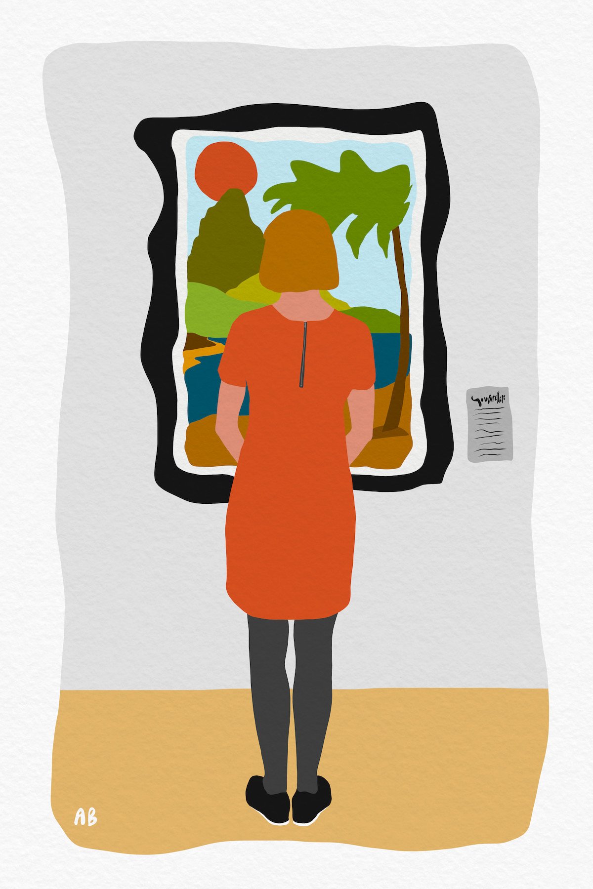
AAS: Your work has been getting a lot of attention lately – a Black Apple nomination, a bunch of upcoming shows and a piece in the last Delta Exhibition. How has all this attention and recognition made you feel? And tell us about your Delta Exhibition selection, Drawn to the Moon.
Drawn to the Moon II, 24” x 36” digital drawing, pigment ink on cold press paper
AB: Deeply grateful. Frankly, it makes me want to pinch myself to make sure it’s real. Much of my personal art practice has “come of age” so to speak during the time of Covid, too, which we all know has been like a time vortex. In many ways it seems like a blur or a whirlwind, and suffice it say, a couple of years ago, I would never have imagined that I’d be creating so prolifically, much less showing and selling my own art. It’s thrilling really, and I’m so excited to see what the continued journey has in store. It also validates my longstanding theory that anything is possible, for all of us, if you listen to your inner voice and find the courage to lean-in to your callings, and just try. Live it or lose it, and chase those dreams!
As for the Delta selection, that was such an honor to have my work chosen for such a longstanding and important contemporary arts exhibition. It was also especially meaningful to have that particular piece on display. With my Drawn to the Moon series, I delve into a subject area that I’ve always been interested in – the idea of one’s “situational awareness” and the pathways to personal growth and contentment, or to reaching what one might consider a sense of enlightenment. In this work, the singular yet manifold figurative female form is an image of strength and resolve, at peace with herself and her many selves. Like all of us, she is one but many under our shared moon and sky; she is balanced and knowing in her connectedness to the earth and to the wholeness of humanity; she is present, contented and grounded in the still and quiet moment, yet pulled ever forward and upward by the forces of momentous possibility. Contentment found. Enlightenment just ahead? ;)
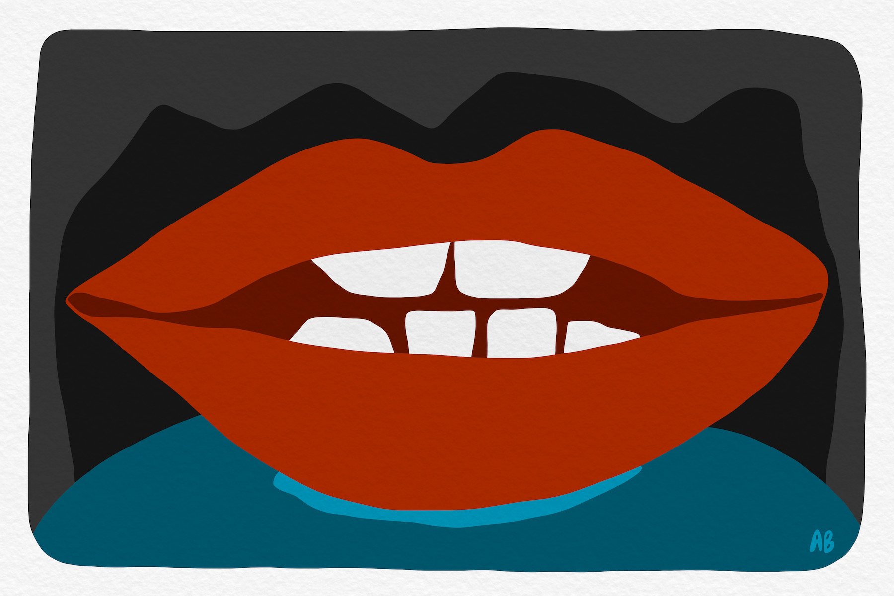
AAS: OK, let’s talk about some of my favorite pieces. We have to start with Washed Up Butter. I am almost afraid to ask what might have inspired that image.
Washed Up Butter, 20” x 20” digital drawing, pigment ink on cold press paper
AB: Ha! Don’t be scared, friend, it’s just a harmless little stick of butter. It’s funny you ask about this one first, albeit apropos really, because it’s a great example of the random nature of some of my themes and subject matter. While sometimes I might start a drawing with very specific mindful intention to what I’m going to draw, I’ll also often start with only a small nugget of an idea. In this instance, it was decidedly the latter – all I knew is that I wanted to draw a stick of butter. I was walking through the kitchen one day (not my natural habitat, but I digress) and somehow it stopped me in my tracks, as random basic objects somehow often do. There’s something almost architectural about it, a stick of butter, so efficiently packed with only a sheer piece of printed parchment holding in all that dense powerhouse of fatty, flavorful goodness. I also like the graphical look of the lettering, so simple and basic but somehow beautiful to my typographically inclined eye – I know it also probably sounds a little absurd!
So, I drew a stick of butter. But it took me a while to figure out a narrative setting to put it in. I wasn’t feeling a literal representation, there were no kitchens or plates or tabletops down the rabbit hole that day. As I considered what else drew me to draw this seemingly mundane and ordinary object, I realized it’s also the “guilty pleasure” trigger that only a stick of butter can trip. I mean, there’s nothing more in-your-face gluttonously hedonistic than an encounter with a mass quantity of something like butter or lard (i.e. eating it, all the while knowing how bad but good it is). Well, when I came to this realization, I happened to be sitting on a beach at the time, where I’d also just been pondering the age-old question, “What items would you want to have with you if stranded on a deserted island?” Which naturally led to wondering what said stranded individual might daydream would wash up along the shore – and the dominoes just fell from there. That’s my story, and I’m stick-ing to it.
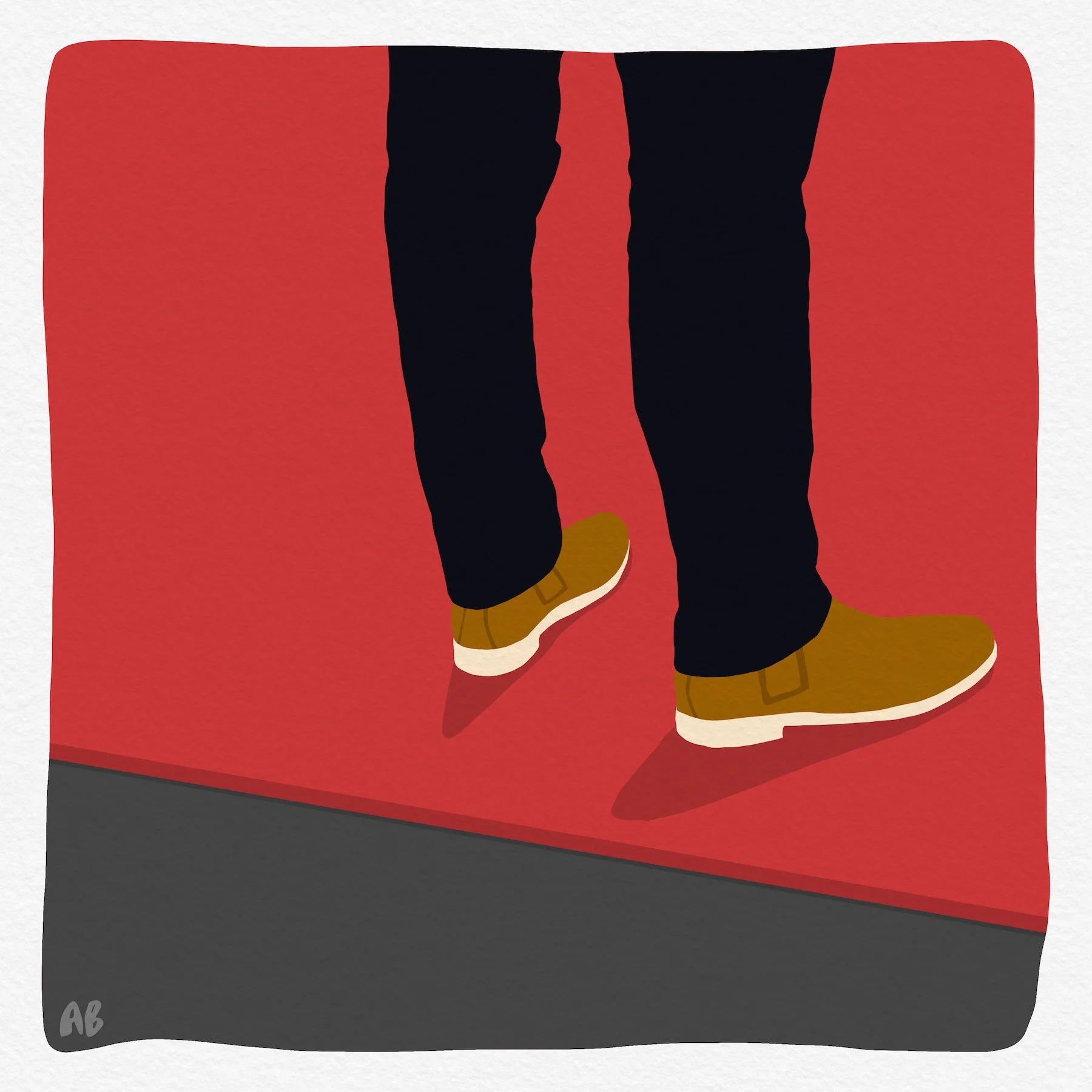
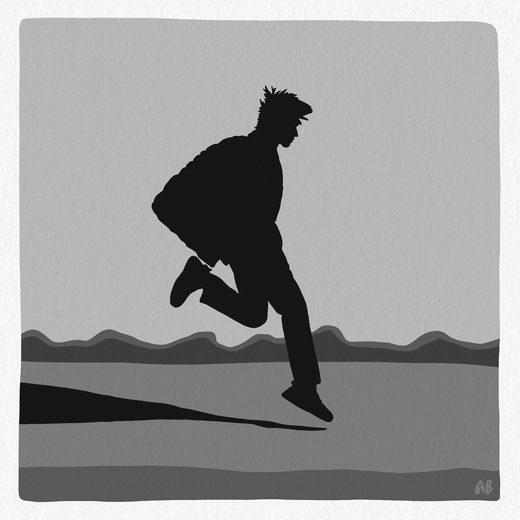
AAS: Somewhat at the opposite end of the ‘Butter spectrum’ is Stuck a.k.a. Lean In. It is a powerful and relatable image. And I think both come from their simple and pure design, which I guess comes from your marketing or design experience. Can you talk about that, and also your intent with this piece?
Stuck a.k.a. Lean In, 30” x 30” digital drawing, pigment ink on cold press paper
AB: That’s exactly right, this one started with a much clearer intention. We’ve all felt the sting of feeling a little stuck at times, right? Whether personally or professionally, whatever the situation. For this piece, I wanted to explore two dimensions of that normal and relatable (and ultimately healthy) human state. This duality is why I gave the work two different names. Is it a vignette of someone stuck, in a frustrated sort of way, or is it of someone simply taking a momentary pause to lean in and be present to collect their thoughts? Or, both? My intent was/is the latter; a reminder to the viewer how if you give yourself some latitude in the moment, oftentimes what feels like being stuck is actually the very opportunity you needed to pause to gain clarity and to take that next onward-and-upward leap.
While some of my works are simple straightforward objects or super easy-to-understand scenes (or vignettes as I call them), some like this one seek to tell a deeper story, or at least to suggest the start of one, which the viewer can also write themselves. This one also gave me the chance to have some fun with narrative blending, situational abstraction, angles and minimalist depth-suggestion, and shadow-play, all in a very simplistic but hopefully balanced arrangement.
As to the marketing / design experience influence on my style, I can definitely attribute to the “day job” my awareness of spatial arrangement and appreciation of negative space, and how “brevity is the soul of wit.” My professional life has also consistently fueled my lifelong interest in storytelling, and it’s also kept me quite current when it comes to matters of technology and media, which all play a part in my art.
AAS: I have to say maybe my favorite piece is Where Is The Escape Hatch. I am a child of the 60’s and it has a 60’s feel to it as well as speaking to the recent (and current) state of affairs. What can you tell us about this work?
Where’s the Escape Hatch, 24” x 16” digital drawing, pigment ink on cold press paper
AB: Thank you, and you’re right, there is a sort of curvy 60’s feel to it; I do love the aesthetics of that era. I certainly had a clear narrative in mind for this one, but it was simultaneously drawn almost “stream of conscious” as I worked through trying to visually represent the collective feeling of the moment – it was in Spring 2020 just as the pandemic was really taking hold. While it could likely apply to myriad other situations, at the time it was meant as a visual representation of our inner thoughts and dialogue as we all attempted to navigate the confusing, circuitous, seemingly perilous and fractured roadmap in front of us as we traversed each new day...as we tried to reconcile and dodge all the various uncertainties along the way. Which way do we go, left or right, up or down? Straightforward paths sometimes seem in short supply. Do we climb that ladder over there, or do we rappel down that rope? Do we laugh or do we cry? Where’s the escape hatch? I think the answer to all these questions, then and now, starts with taking a deep breath, wiping the sweat from your brow, summoning a can-do smile and taking one step forward, followed by another.
AAS: There must be a story behind My Grandfather’s Ring.
My Grandfather’s Ring, 20” x 20” digital drawing, pigment ink on cold press paper
AB: Aside from hopefully being a striking image that just looks cool and mysterious, begging for questions more than answers, there is indeed a specific inspiration source for this one. This piece intends to symbolize the moment of transfer (passing) of generational inheritance, an ode to the objects that tether us to memory and familial connection – inspired by personal experience vis-à-vis my great-grandfather’s garnet ring, which I in-turn inherited and proudly wear today.
The X-ray-esque imagery is to broadly suggest our human mortality, but moreover to visually communicate a snapshot in time of transcendent conveyance, the hand tilted so as to let gravity inform the material ring position, as if about to fall into immortality as it passes to the next bearer. So, this is about transcendence and immortality. Or maybe it’s just a rad hand with a shimmering ring on it.
AAS: Another relatable image is Pinned Lab Rat a.k.a. We Are The Mouse. With all the vaccines and boosters and being trapped inside for the better part of two years I have certainly felt like a lab rat.
Pinned Lab Rat a.k.a. We Are The Mouse, 36” x 24” digital drawing, pigment ink on cold press paper
AB: That’s precisely the genesis of it. I drew it during a heightened pandemic time as a roundabout metaphor for all that was 2020/2021 – the overall state of being and feeling during the pandemic, when it felt like we were all lab rats (“we are the mouse”) with the feeling of being “pinned” or stuck or under the metaphorical microscope.
Before even thinking about where this piece might go thematically, I had clear in my mind that I wanted to draw a clothespin, it was literally a random desire to draw one. But then I had to give it life through context. I wasn’t sure what I was going to pair with it – I started down numerous paths spanning various representations of flora and fauna along with some other manmade objects, but then the mouse turned lab rat crawled into the mix. And it was like a light bulb went off – this was the match! I wanted to handle it delicately, though. I wanted there to be an innate (but not overly intimidating) sense of tension and perhaps even a touch of precipice, but in literal terms I certainly didn’t want to convey a sense of physical pain on an animal. I wanted it to feel more like an examination, not like an extermination. Which is actually why I added a padded element to the business end of the pin, cushioning the pinch around the tail but still in control – and just adding a touch of softness to help balance the gravity of what may initially appear to be solely a tense interaction.
We are the rat and the clothespin represents both the larger social order and authority (society at large), but also our own personal social responsibilities. And the cushion is the knowing that it will all be okay and that this test will surely be over soon.
Or, as with many of my works, maybe it’s just a cool rat in a mildly domineering dance with a random clothespin – I’ll let the viewer be the judge.
AAS: What inspires your imagery and style, and the way you create it? To me it’s very new school digital meets old school pop art.
Ice Cream Cone on a Boat, 24” x 16” digital drawing, pigment ink on cold press paper
AB: I think that’s an apt description! My work is primarily in the realm of digital media and printmaking. My freehand digital drawings and pigment ink prints explore a lot of different and oft random topics. I’m generally drawn to a minimalist aesthetic, with much of my work intending to convey a thought, object, situational experience or emotion in the simplest and least cluttered way possible. A visual haiku maybe. But I also want to give the viewer boldness and color and depth, but again only enough information to express a meaning or feeling and to spark a sense of instantaneous relatable introspection, or just enough information for the viewer to fall down their own little contemplative rabbit hole.
As for what inspires my art, I must admit, I’m a little all over the place! To quote Maya Angelou, "I want all my senses engaged; Let me absorb the world's variety and uniqueness.” That said, I’m inspired by nature and the critters in it … space and the great unknown … concepts of escapism and wanderlust … modern design … imaginative ‘what-if’ scenarios, the more outlandish the better … and slices of everyday life and experiences that people may initially take for granted but that actually have great meaning and are infinitely relatable. And humor and sarcasm.
I am at my core an eternal optimist and a believer in the goodness of humanity and our place in the universe. If I can achieve one thing with my work, it is that it brings a smile or a pause of reflection to those who view it, and that it serves as a reminder to folks to find meaning in every beautiful moment – and maybe to not take things (and themselves) quite so seriously. That’s what creating this work has done for me.
Granted, while themes of optimism do tend to ground most instances of my art, optimistic sensibilities also come with an acute awareness that for there to be light, there too must be dark – so sometimes the work will also explore the darker, grayer, or seemingly sadder shades of the human experience; but even so, there’s still usually a ‘silver lining’ lingering somewhere nearby to bring us back to the positive path.