Interview with artist Tim Walker
Tim Walker is an artist and graphic designer living and working in Fayetteville, Arkansas. He served as the inaugural president of the Northwest Arkansas chapter of the American Institute of Graphic Arts, has served as an adjunct instructor of graphic design for two regional universities, and served on the professional advisory boards for The University of Arkansas School of Art and the Fay Jones School of Architecture and Design. When not working with clients as Chief Creative Officer at DOXA / VANTAGE, Tim uses painting and photography to decompress and express his keen eye for line, form – and the unexpected. More of Tim’s work can be found on his Instagram. —2023
AAS: Tim, tell me about your background.
TW: I grew up in the mid-south, in Northeast Arkansas, and I identify very strongly and proudly as a Southerner. I often describe my hometown of Jonesboro as being a kind of confluence of southern culture, farming, business, and education. I feel lucky to be a product of the public schools there, and particularly Jonesboro High School, where there were opportunities to pursue the arts. The presence of Arkansas State University, where I would eventually study art and design, ensured my exposure to the wider world and to people very different from me, as all good universities do. Jonesboro’s proximity to Memphis provided regular opportunities to visit places like The Brooks Museum and Memphis College of Art. I was exposed to the work of great artists like Carroll Cloar and William Eggleston, among others. At Arkansas State I had excellent teachers and mentors in both design and art, like Curtis Steele, Ron Clayton, Roger Carlisle, Evan Lindquist, John Keech, Tom Chaffee, and Greely Myatt. Many of them I’ve fortunately maintained friendships with over the years.
At the beginning my career as a graphic designer, I moved to Fayetteville in 1989 to work in the University of Arkansas Office of University Relations as an in-house creative services coordinator, then left there to start my design practice in 1992. That company has evolved over the last 30 years into what is now DOXA / VANTAGE, with my business partners and good friends Neil Shipley and Aaron Bleidt. I’ve been pretty fortunate that my business came along at a time when Northwest Arkansas was growing, and I’ve had amazing opportunities to play a supporting role in the business, non-profit, arts, and higher education communities along the way.
AAS: Have you always painted?
TW: Painting and drawing were interests of mine from a very young age, as was design. Again, a comment on the public school system, but I was fortunate to have middle school and high school art teachers who recognized that and helped guide me even beyond their normal curriculum. Especially in those early years, I didn’t really try to compartmentalize those interests but pursued them with equal focus. I studied both studio art and graphic design at university, briefly considered pursuing an MFA in painting, and ultimately settled on design as a profession.
I never completely left behind my interest in painting, but for most of the last three decades building my business, it was dormant. In the past few years, I’ve picked it up again with renewed focus, and with a history of design practice influencing it in ways I never anticipated.
“Painting has saved me in many ways. It’s very much like a form of prayer or meditation for me.”
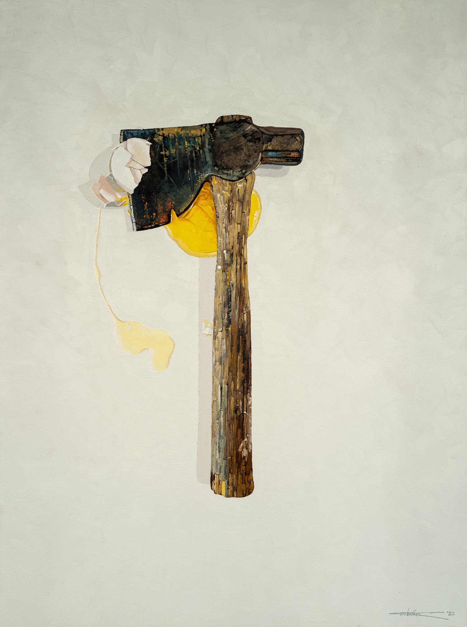
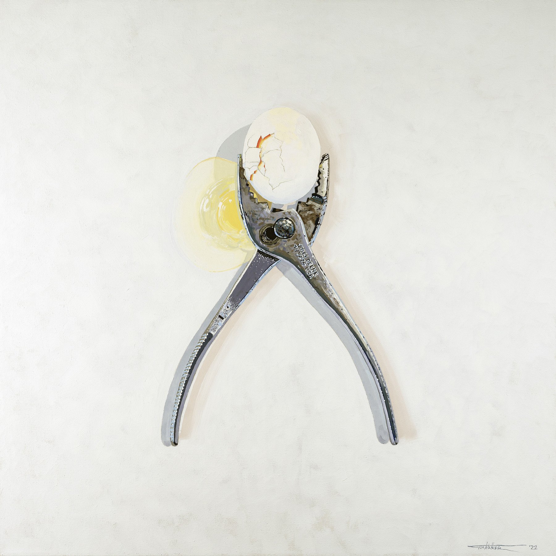
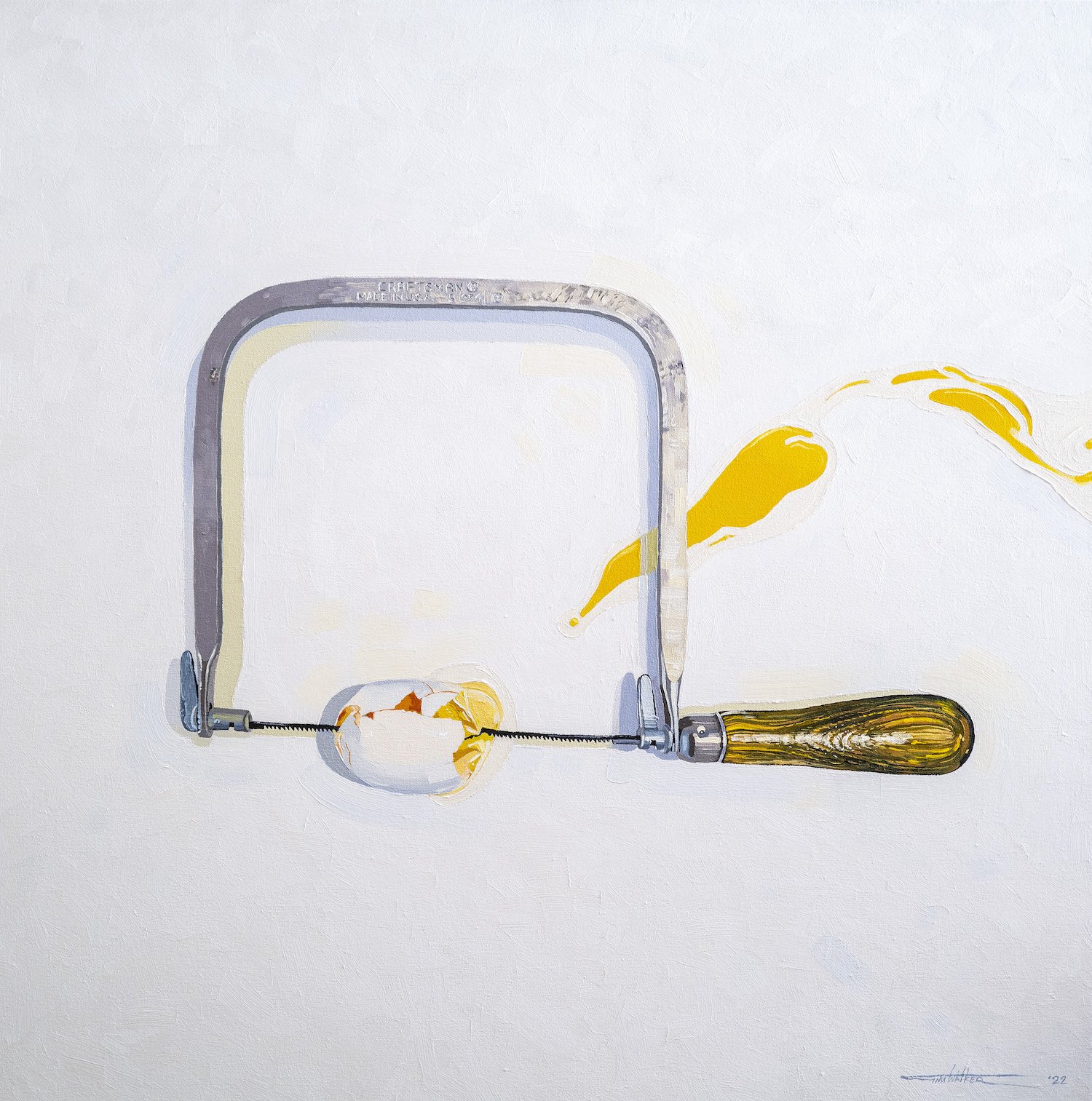
AAS: I would like to talk first about your Fragile/Strong series. One of my favorites is No. 6, Hedge. They are terrific images. What is behind that series?
Fragile/Strong No. 6, Hedge, 48” x 36”, on oil on canvas
TW: I wish I could truly explain it, but I think I’m actually using that series to figure that out for myself. The past few years I’ve had a lot going on in life, including the chronic illness of a child, the death of my father, a divorce, and very recently the death of one of my children. The tools are mostly all inherited from my father, so I feel they function as talismans in a way as I’m still processing my grief for losing him. I guess I’m thinking about the fragile nature of life in contrast to the archetypal symbols of strength. The tools and the eggs serve to distill that idea down to its essence, I hope. The truth is I’ve had a number of different ideas about why I’m compelled to make those paintings, but my work typically begins with a compulsion to do something, and the process is my way of working out the why of it. I’m still in that process with these.
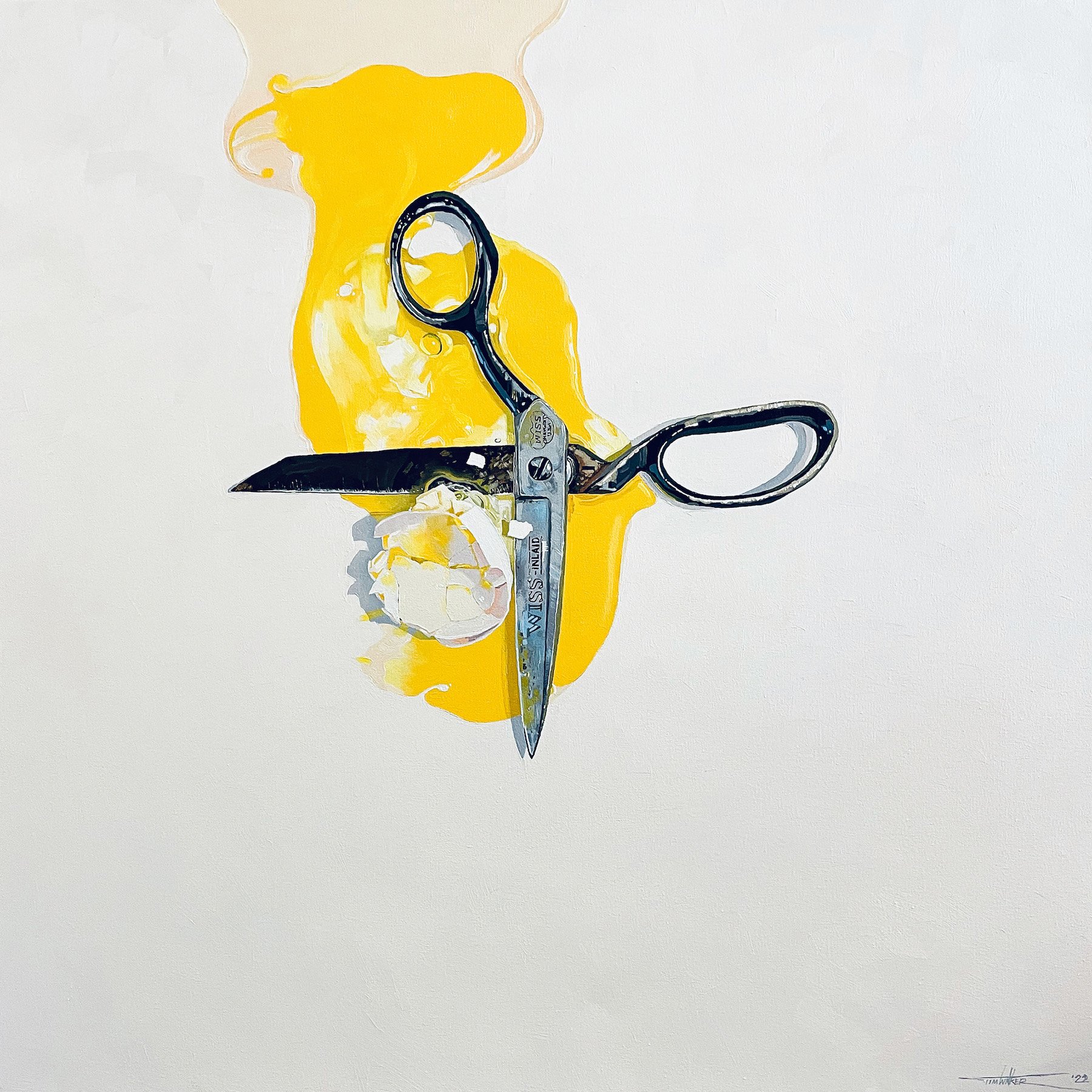
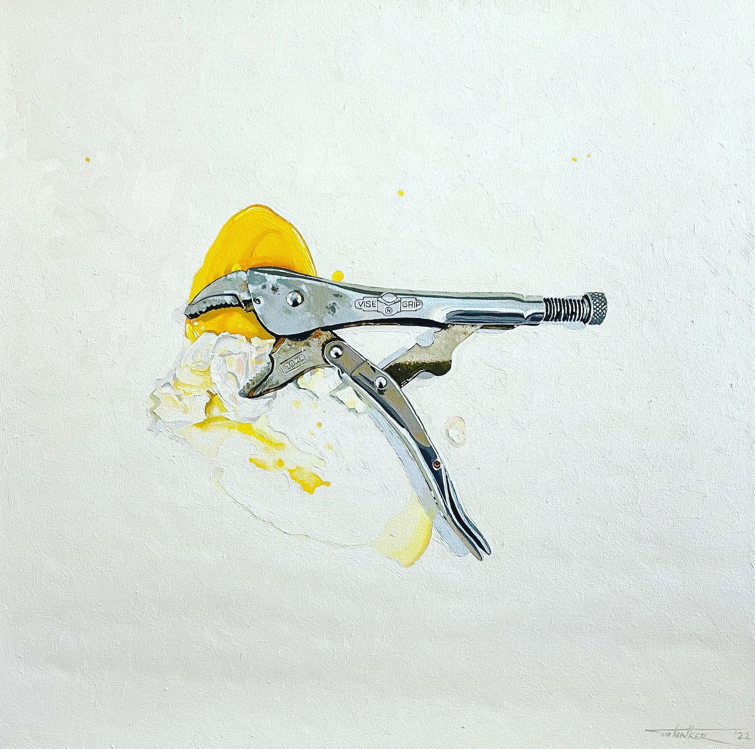
AAS: Another of my favorites is No. 8, Trigger. The theme of fragile/strong really comes through – and it’s beautifully painted. I think it’s also fun that it is impossible not to hear the ‘crack’ when looking at.
Fragile/Strong No. 8, Trigger, 36” x 36”, oil on canvas
TW: Thank you. I’ve really enjoyed the challenge of rendering all of them. I’m interested in contemporary realism as a tool for exploring my ideas, but I’m in no way attempting photorealism or hyper realism. What I most enjoy are the naturally occurring qualities of the paint and trying to deploy those to achieve some degree of realism. I’m ultimately trying to make paintings that look like paintings, though.
Each tool offers some new and interesting challenge, and I’m honestly continuing to learn to paint, too. So, the rendering of a black plastic handle on a trigger clamp, for instance, is an opportunity to truly look at the nature of the light and color in a specific way. Metal surfaces offer another and rusted or worn surfaces another.
AAS: Contrasting concepts like in the Fragile/Strong series are sometimes used in marketing. Has your work at DOXA / VANTAGE influenced your art in any way?
TW: It undoubtedly has influenced me in numerous ways. I think you’ve identified the contrasting of concepts, which is definitely an interest acquired over years of trying to arrest attention with design work. I think the typical formality of my compositions is something that’s informed by a strong interest in layout and design and grid systems for typography and other elements. You may also notice that my pieces often incorporate some form of type, numbers, logos, etc. I can’t really claim any particular strategic reason for that, but those obviously find their way into my work for some reason as well.
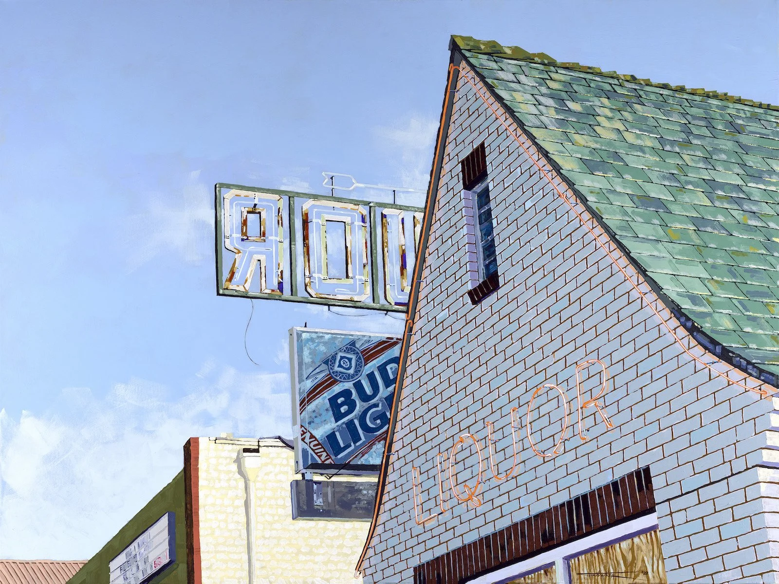
AAS: You’ve done some wonderful paintings of signs, which I really like. Tell me about Smorgasbord.
Smorgasbord, 36” x 48”, acrylic on canvas
TW: Well, related to your previous question about the influence of my design career, signs have always been a part of that. In fact, I spent a few years working for a sign company while I was in college. I suppose I could try to pontificate about signs being a form of art in popular culture, but in truth I just enjoy letterforms and rendering them, both in my design work and in my painting and drawing.
Smorgasbord was a sign I discovered and photographed while on a road trip out west with a friend many years ago. I make photographs a lot as both a form of visual note taking and sometimes as attempts at art in themselves. Sometimes they become references for paintings.
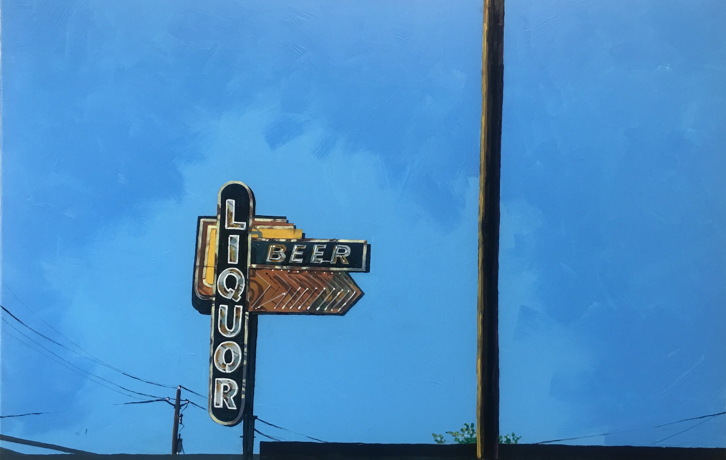
AAS: What I like about your work is its simplicity and directness – finding beauty in form and line. Structure No. 13, Jonesboro is a terrific example of this, I think.
Structure No. 13, Jonesboro, 40” x 30”, acrylic on canvas
TW: Thank you. That is also one of my favorite pieces. I find a lot of satisfaction in exploring the beauty in what might otherwise be considered mundane. I’m really influenced, for instance, by the photographs of William Eggleston, who does exactly that with his work. Sometimes I attempt those explorations with photographs, but painting allows me to spend more time with the attempt. A contemporary painter I’ve been very influenced by is George Shaw, who does this astoundingly well.
In that piece you’re referring to, what I hope is on display are similar qualities to what one sees in a contemporary abstract painting. But when attempting contemporary realism, the content is more readily familiar to the viewer. That’s a telephone pole and that’s a drain pipe, etc. In reality, what you’re looking at is only the color and texture of the paint and how it’s arranged, the same as an abstract painting. I find that idea fascinating.
I think there’s a certain puzzlement that occurs for many viewers when they look at that piece, wondering why it’s the subject of a painting. That particular moment is them experiencing what compelled me to make the painting in the first place. I honestly can’t really articulate it, but then that’s why I paint and make photographs, I suppose, to see where the compulsion leads and to try to articulate it visually in some way.
AAS: I would like to talk about your photography now. Tell me about Hubs. It is a wonderful example of how composition can transform the ordinary into something visually extraordinary.
Hubs, color negative photograph
TW: Thank you. Making photographs has always been as much a part of my artistic life as painting, and you’ve pointed out a photograph that really demonstrates one of the things I love most about it. Finding those moments of naturally occurring patterns or compositions or symbols is a bit like stumbling onto treasure laying out in the open. Sometimes I even call some of my photographs “found paintings”, similar to the concept of found art. My photographs also tend to be very related to my paintings in terms of subject matter.
That particular photo was recently published in Leica Fotographie International, a German magazine dedicated to users of Leica cameras. I’ve mostly used my 30 plus year-old Leica M6 rangefinder over the years, so that was a real honor. It came from a day of wandering around nearby Tahlequah, Oklahoma with a photojournalist friend, admiring the unique signage and typography of the Cherokee Nation and just stumbling onto that scene. I think it reminds me of why I need to constantly have my antenna up, scanning my surroundings so I don’t miss those moments. I often wonder how many such occurrences are never discovered, and for me that’s a uniquely painful loss to imagine.

AAS: When do you find time to paint?
TW: I mostly paint on the weekends, occasionally finding an hour or two on a weeknight. One aspect of my professional career in design and advertising that I’ve had to overcome is the tendency to think of time only in terms of billable hours. In our business we sell our ideas and our time, and it’s been hard for me to shake that feeling that I should be in the office rather than painting. We’re also so deadline driven that forcing myself to slow down and work at whatever pace needed, and free of any pressure about finishing at a certain time, has been transformational.
Painting has saved me in many ways. It’s very much like a form of prayer or meditation for me. When I’m painting it seems to truly clear my mind of all other thoughts and troubles because of the intense concentration it requires, so it’s nearly impossible to be thinking about anything else or worrying about anything. Very few activities do that for me.
AAS: What can we expect next from you, Tim?
TW: I’ve been working fairly steadily to build an inventory of paintings and attempt to get the attention of a gallery and possibly have a show. In the coming months I hope to launch new and discrete websites and Instagram accounts dedicated to my painting and photography work. In the coming years I hope to begin to establish some recognition and transition into a second career as an artist as I move closer to retiring from the company someday. It’s all very exciting to me, and I feel very lucky to have such interests to pursue.
I hope to spend more time getting to know my oldest daughter, Emily, who I’m very proud of and looking forward to watching her continue to grow as a person.
There are so many friends who I feel gratitude toward and who continually support me, many of them are other artists, like my friend and business partner Aaron Bleidt, Sam King, Ray Parker, Jeff Williams. My friend Marlon Blackwell, although known as an architect, is one of the greatest examples of the art spirit I’ve ever known. My friend Ron Chioldi does the same with music.
I think what I hope is mostly in the future for me is just recognizing, appreciating, and truly enjoying the richness of those relationships, and hopefully contributing as much as I take from them.