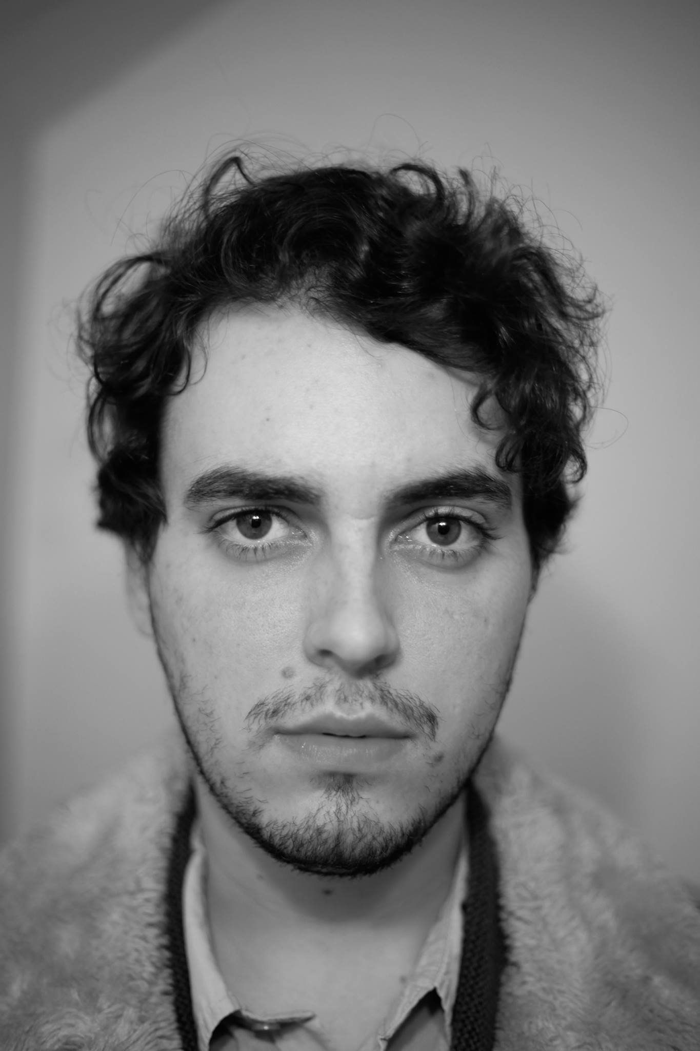
Interview with artist Phillip Rex Huddleston
Phillip Rex Huddleston is digital and ink illustrator in high demand. But he also produces hyper realistic works in charcoal and graphite that are quite amazing – and above all, so interesting. All of this, by the way, while being a full time junior high art teacher. More of Phillip’s work can be seen at Gallery 26 in Little Rock and at his website philliprexhuddleston.com. —2022
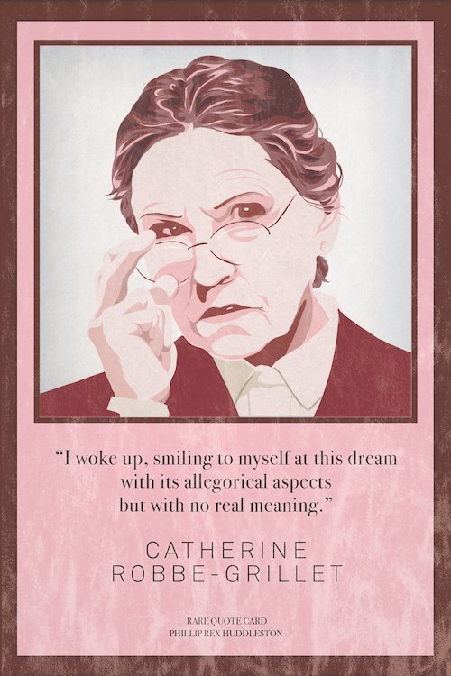
AAS: Phillip, tell me about yourself. Did you grow up in the Little Rock area?
PRH: I grew up in North Little Rock and then went to UCA for my Bachelor’s in Philosophy and Master’s in English Literature. Afterwards, I moved into a big house in Little Rock with many friends and began taking my art more seriously. We called it Garland House and curated a lot of art and music shows during that time. I’m currently in my tenth year of teaching Visual Arts at eStem Downtown Junior High in Little Rock.
AAS: You are an artist, illustrator, writer, teacher, musician – anything I missed? What was it like growing up? Were you encouraged to pursue all the arts growing up?
PRH: I also spend an inordinate amount of time painting miniatures and building terrain for my Dungeons and Dragons group.
I just recently watched Todd Field’s TAR, and there’s a scene in which the interviewer asks Lydia Tar about her varied interests, and she responds: “Well in today’s world varied is a dirty word. Our era is one of specialists.” I’ve been thinking about this line a lot and agree with the idea that multiple interests could be seen as overly stretched. It’s been difficult creating a business card or website. Do you put everything? Are the different media on different pages? I still don’t have an answer, but I do know I’ll never have the mindset to specialize. I try to bring that thinking to my students and remind them you can enjoy many things and will more than likely progress in tandem with that enjoyment.
Luckily, growing up I was allowed to try this or that visual medium for the fun of it. My dad is also an artist (retired now). He’s done political cartoons for the Arkansas Democrat Gazette, murals in church cry rooms, caricatures at events, etc. I spent a lot of my childhood asking him to draw figure poses that I could then decorate with made-up superhero costumes. While both my parents were supportive with visual art, neither thought I should get a guitar since no one was musically inclined in the family. I think this created a mental rift between visual art and music for me—the former being comforting and familial and the latter being rebellious and independent.
“I think a lot of my interests come from combining my love of literature and art.”
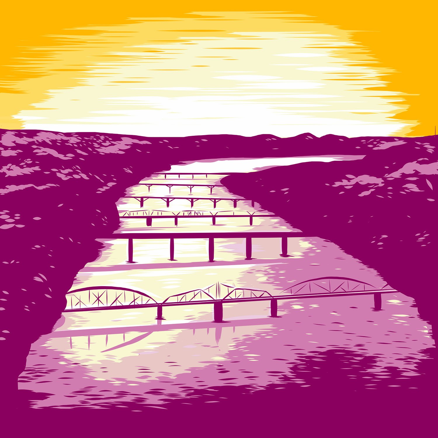
AAS: You are involved with the Central Arkansas Library System and their annual Six Bridges Book Festival. You’ve created the artwork for the event for the last three years and this year’s is a truly wonderful collection of illustrations used in its festival guide and promotion. Tell me about the festival and this year’s illustration.
PRH: Around ten years ago, I was running a zine publishing group called weatethebook. We put out a couple of my comics as well as collections of short stories and poems by local writers. We were asked to be a part of the Six Bridges Book Festival, and I’ve been working with the festival ever since as a moderator and - in the past few years - as a member of the talent committee and illustrator. I think a lot of my interests come from combining my love of literature and art.
I’ve designed the last three festivals, and this year has been my favorite. The process goes something like this: The head of the festival Brad Mooy sends me some inspirational images and we kick around a concept or look. I do a few sketches and communicate what I think would work. The vibrancy of this year’s design is all thanks to Brad. I originally had a lot of lavenders and magentas, but we decided on a more full spectrum look.
Each year, I’m trying to create something that is outside of my illustrative wheelhouse and that contrasts itself to the year before. 2021 had a jarring, destructive design with chunks of bridge scattered about – between COVID and the interstate construction, I think it was appropriate. 2022 nodded at the socializing that was beginning again with books held up mask-like. Also, I’m not above putting my dog Bea into my designs.
Six Bridges Book Festival 2022, digital illustration, 11” x 17”
AAS: As a freelance illustrator, you’ve done work for many online and print magazines and newspapers. For The Idle Class you did an illustration of Little Rock writer and director Jeff Nichols. It is a terrific image. Did the image composition come to you pretty easily?
Jeff Nichols, digital illustration, 11.5” x 9”
PRH: This was one of my first commissions that was a digital illustration. The head of The Idle Class Kody Ford is great at communicating with everyone who works on pieces for the magazine. He called me and we talked about how the article for Jeff Nichols was focusing on his writing process more so than his directing. I knew I wanted some nod to Nichols’ association with this New Americana movement in cinema. So, for the background, I had the idea of paper flying about but for the purpose of a subtle stars-and-stripes imagery (blue background, red desk, paper balanced about like stars).
As one of my first digital commissions, I knew there were a lot of apps and software to choose from. The majority of my friends with tablets were using Procreate, but I wasn’t satisfied with the mark making I was getting - even with all of the bells and whistles that program offers. I got comfortable with Adobe Sketch (now Adobe Fresco). For some technical talk, Fresco allows you to draw in a vector with the thin kind of line I appreciate. This way, I could work on any project and not have to figure out how big or small it needed to be until afterward. When the mark making was complete, I exported it to Photoshop with the correct dimensions and tinkered with the colors, values, textures until I felt it was done. This commission was definitely the guinea pig for what I would digitally illustrate for the next few years. At this point, I can better visualize what the end result will look like before I pull out the tablet.
AAS: And then there is everybody’s friend and culinary advisor, The Mighty Rib. I love the illustration you created for his new column in the Arkansas Times. Another terrific image.
The Mighty Rib, digital illustration, 5” x 10”
PRH: Thank you. I just recently got to meet Kevin Shalin for the first time at my favorite coffee shop Fidel (where I highly recommend everyone go try the best cortado in the area). What happened was Arkansas Times reached out to me about a portrait. I love The Mighty Rib’s writing and social media presence, so I wanted something fun and light-hearted. The image is now going to be used for his ongoing series for AT called Cornucopia. Similar to the previous piece, I drew each portion individually and then began editing in Photoshop. Comparing the two now, I can see how much I’ve started favoring blocking out large areas rather than a multitude of fine lines. Commissions (and art in general these days) can be tricky and even frustrating since we always have to remember the majority of viewership will be on a phone.
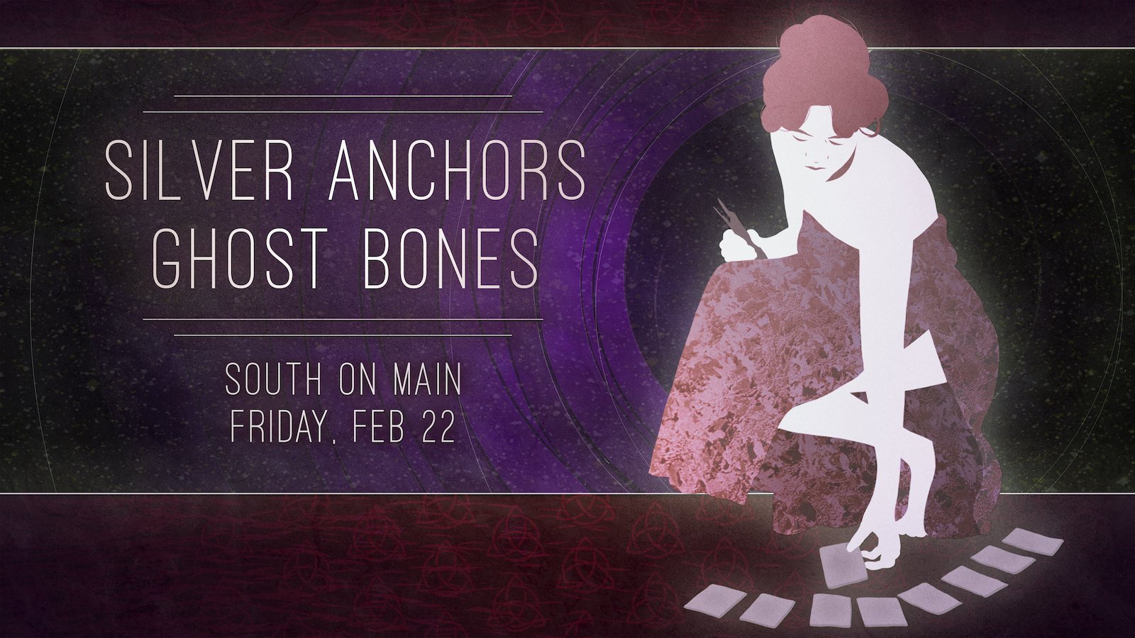
AAS: You also created a wonderful illustration for South On Main when Little Rock musician Joshua Asante played there. In it you used a full range of colors. Tell me about that illustration.
PRH: I was really close with Amy and Matt Bell when they were running South on Main. (They even participated in our Garland House Gilmore Girls-themed art show and dressed as Lorelai and Luke. Amy made a “Patty’s Punch” and Matt cooked diner food including the infamous doughnut burger.) Amy asked me to curate the music lineup for a month of shows and I got excited to help with the marketing. I think this was around the time Joshua started playing his astounding one-man Renaissance shows of guitar, keyboards, saxophone, and singing. When I showed him the illustration, he loved it and said he was going to have to get someone to make him that coat. It was inspired by Lisa Krannichfeld’s use of patterns, so I used a clipping mask to add the coat’s design on top of the values.
Joshua Asante, digital illustration, 5” x 10”
AAS: I know you are a musician yourself. Music inspires many of the artists I’ve interviewed. Do you feel a connection between music and illustration?
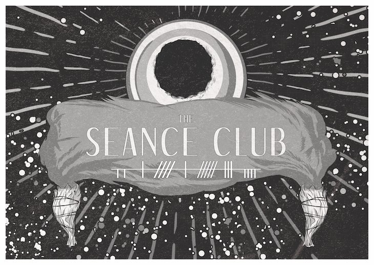
PRH: Tone and texture are key factors in both music and illustration. In our band Silver Anchors, a lot of the songs were intended to associate with some visual. For the song “The Hermit (Consider the Phoenician Pt 1)”, I tried to resolve the crescendo with a feeling of drowning and had sounds muted as if you were underwater and keyboard tones that almost sound like whales echoing somewhere far away. I’m currently working on a collection of folk songs that I’d like to bring to the stage at some point. It’s been almost a decade since I’ve had a harmonica headset on while playing my own songs.
AAS: Writing and literature are also especially meaningful to you. Tell me about your delightful Southern Writers series of illustrations.
Tennessee Williams, digitized ink and copic, 7” x 5”
PRH: I love board and card games and have always wanted to make my own. The Southern Writers series began as illustrations for a card game where you would play as a publisher competing against others to have the most successful publishing group. You earned points by getting their books out with good reviews. It was a very tedious game that my friends were kind enough to playtest with me, but it has been shelved next to some other games I’m working on (The Age of Innocence board game being given priority when I want to work on something like that).
These were also my first Frankensteinian approach to illustration. I began by inking the portraits and then adding the values using Copic markers (an expensive but worthwhile investment for anyone interested in pen and ink works). When the analog portion was complete, I scanned them into Photoshop and overlaid the colors and textures. Last year, I sold the whole set on Etsy and I’ve played with the idea of bringing that back. I also made bookmarks for each one that are sleeved in plastic with a nice, little tassel on top. I’ve been putting a random bookmark in each Etsy order until they run out.
AAS: You are also a fan of graphic novels and comics. Tell me about your Literary Print series. They are wonderful and I think of them as ultimate cliff notes. Italo Calvino’s The Distance of the Moon is one of my favorites.
The Distance of the Moon, ink, 14” x 11”
PRH: I can’t take credit for the idea. Brian James, a longtime friend who is both a Literature professor at UCA and the greatest contractor/house inspector around, asked me to draw a short story as a one-page comic. I ran with the idea and started doing others that I now sell on Etsy. Italo Calvino’s The Distance of the Moon was the latest. Like a lot of these projects, I’ll do one and move on to other things until I get excited to pick it back up. One night, I was talking with writer Jordan Hickey about Calvino’s storytelling, and it snapped: I should do a one page comic wherein all the panels work together as one picture while still going through the major plot points.
After working digitally for the past few years, I miss pen and ink works and the patience required when you’re not relying on an undo button. Each of these prints began on an 11” x 14” sheet of Bristol paper. While penciling, I was wary of hand drawing each panel frame and would measure and re-measure each area to ensure nothing was crooked or off balance. I then would ink with Micron and brush pens in the slowest process I have. After working digitally, ink seems so permanent in a way I value more. Without philosophizing too much, I think all of this AI [artificial intelligence] art is going to create a retroactive shift back to the aura of the original for better or worse. We have to start asking what can’t be copied or quantified through an algorithm? I think we’ll be surprised by the answers.
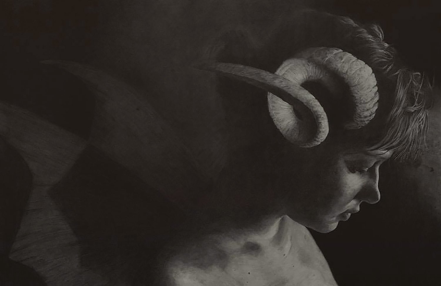
AAS: So that no one thinks you can only work in the digital medium, I want to talk now about your amazing drawings, especially Big Zizek. It is an extraordinary (and large) piece. Tell me about it and the excitement you get drawing with a pencil on paper versus a stylus and pad.
Big Zizek, charcoal on bristol paper, 24” x 36”
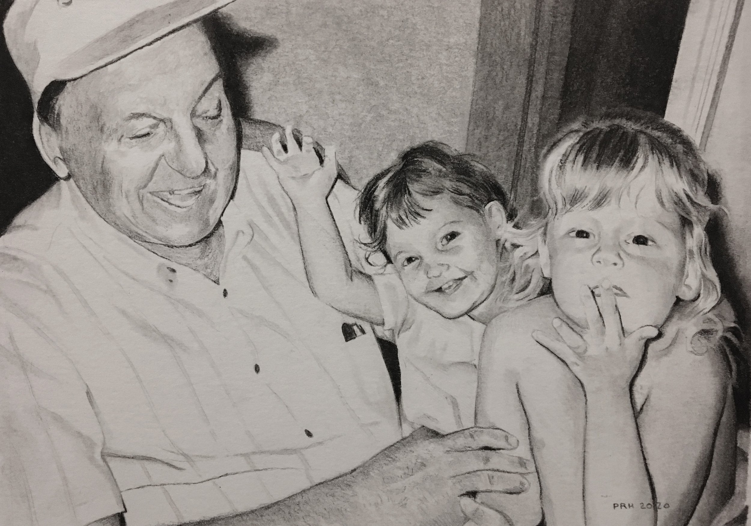
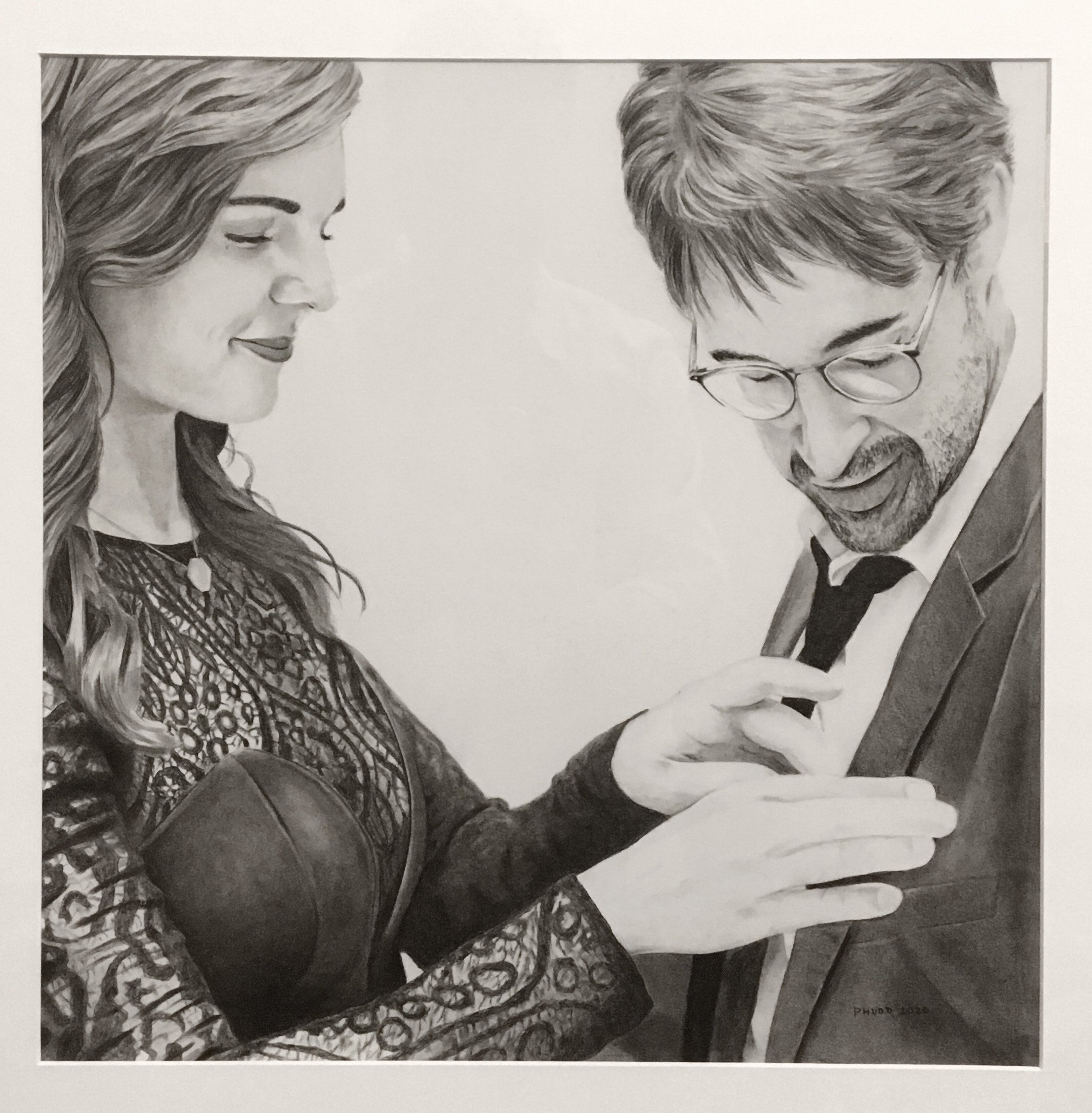
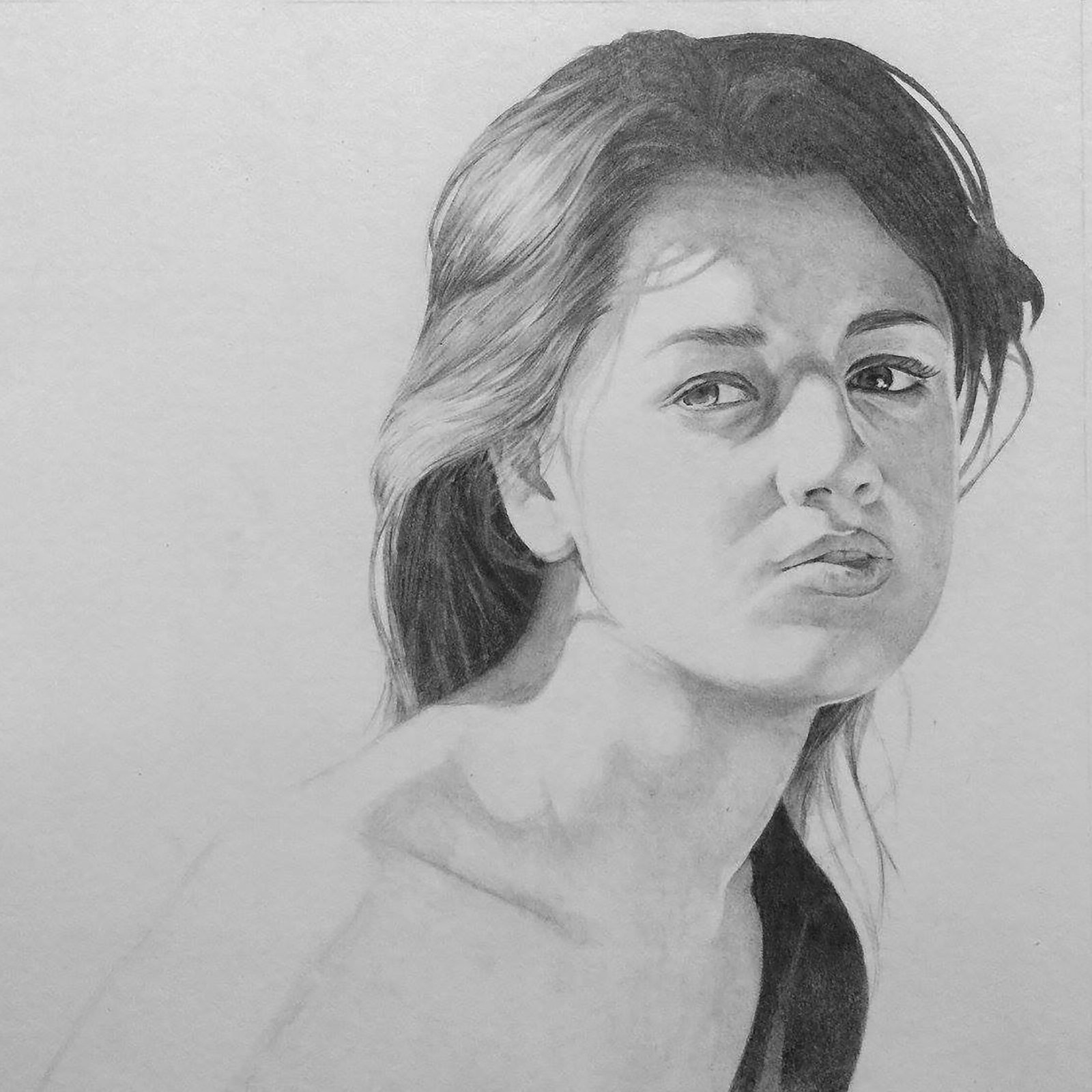
PRH: Big Zizek was my first time to make the switch from graphite to charcoal for my realistic works. I’ve been doing large scale portraiture as commissions for many years now and it is where I feel most at home. There is an inherent paradox in working this large being so much easier to render than the smaller portraits I’ve done in the past. Proportions become obvious and line placement is never a make-it-or-break-it endeavor. Mainly, I like pencil portraits of this size because shading and blending and erasing over and over is such a calming process. I just got done teaching this process to my students, and each year I notice how much this meditative practice benefits us all.
Whenever I am creating a new work to practice a technique or use a new medium, I like to pick a writer I’ve enjoyed. The few oil paintings I’ve done have been of Jorge Luis Borges and Valeria Luiselli. For my first charcoal work here, I chose Slovenian philosopher Slavoj Zizek whose interpretations of Hegelian dialectics and Lacanian psychoanalysis have been a great influence on my life. As an introduction to his ideas, I’d recommend the documentary The Pervert’s Guide to Cinema which offers his takes on the ideologies embedded in many of our favorite films.
AAS: You have been teaching grammar school for many years. What are your students like and how do you keep them excited about art and being creative?
PRH: Each year, my school asks us to pick a word from a long list that is a focal point or virtue that we want to embody and instill in others, and each year I choose the word silence. I think students and people are naturally excited about an innumerable amount of things all at once but rarely are we engaged in a true flow state. For me, the silence that comes from working on one thing with fidelity is the key to promoting creative thinking. When I watch a student hear the bell ring after being singularly honed in on a project and losing track of time, I can see it in their eyes – they really appreciated that experience, and now they know how great it can feel to be that committed to something.
AAS: What can we expect next from you, Phillip?
PRH: I just got married to photographer Lyndsey Huddleston and am hoping for some collaborative pieces if we can ever finish painting our new house (an art project I’m not enthusiastic about). I’m looking forward to more charcoal portraiture, more literary comics (The Library of Babel by Borges next?), and more folk music.
Many of my works can be found at Gallery 26, a cornerstone of our art community. Renee Williams and Daniel Broening support our local scene with the greatest care and charisma, and Daniel always lets me geek out about our role-playing game interests. Big Zizek is in their holiday show that is currently up, and several of the original Southern Writers can be seen sprinkled around the gallery walls.
I’m also excited to see what new portrait and design commissions will come in 2023. I enjoy the process of working with someone’s idea and translating it into a work of art they’ll love. Commissions make the creation of art a little less of a solo endeavor and a little more of a shared experience.
