Interview with artist Lori Weeks
Lori Weeks is an Arkansas native known for her colorful and imaginative impasto floral and landscape paintings. She has earned numerous art awards and enjoys donating her services (on-site painting) and art to raise funds to support charities and organizations that support the community. More of Lori’s work can be found at Art on the Square in Bentonville, Art Group Gallery in Little Rock, her studio gallery at 229 E. Main St. in Gentry, Arkansas, and at her website loriweeksart.com. (Profile photo by Julie Gayler, hair and makeup styling by Jamie Lynn Jones in homage to Frida Kahlo) —2023
AAS: Lori, I know you are an Arkansas native, but where did you grow up?
LW: I grew up on Greers Ferry Lake in Heber Springs and spent my formative years on the water and enjoying the outdoors. After high school I attended Art Institute of Dallas for Graphic Design and then Memphis College of Art focusing on Fine Art.
I have enjoyed a 20+ year career in creative services in advertising with director positions at two of the largest advertising agencies in Arkansas; Combs & Company and CJRW. Accounts included tourism, financial institutions, education, as well as many other industries. The skills I acquired have made it possible to grow my passion in the art scene.
In 2008 I began painting full-time with a group of artists in Maumelle, Arkansas, which has grown into a thriving art gallery in Little Rock with 22 artist partners - Art Group Gallery. In addition, I am one of 17 gallery artists and hosts at Art On The Square in the main downtown square of Bentonville, Arkansas, which is within walking distance of Crystal Bridges Museum.
AAS: Did you have role models growing up who were artists?
LW: I began oil painting lessons with renowned artist Glynda Turley in Heber Springs at the age of 9 soaking up any and all workshops from visiting instructors within reach. My high-school art teacher, JoAn Clark, was amazing and really helped me to think outside the box. She would enter my work in many contests…I still have my winning ribbons.
AAS: How do you think your work in advertising influenced your current painting style?
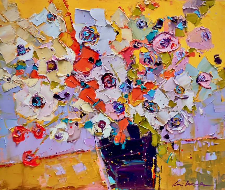
LW: I handled all the printing aspects of marketing materials in my career, so I would say color knowledge as well as overall layout design and perspective. I mostly began painting realistic, but I really wanted my work to look like a painting. It wasn’t until I began painting full time that I started the “impasto” (thick paint with texture) style. At the time I was using acrylics with mediums to build up the texture, then I met Matt Coburn, who came in as an instructor to our art group and eventually joined us. He was using oil paint, and a lot of it. So that began my current style, which is continually evolving.
“I strive for a balance of impressionism with abstraction. ”
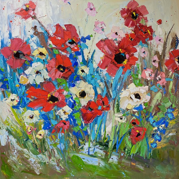
AAS: Your paintings are filled with glorious color. I want to hear first about Flores de Frida!. Impasto gives it such a wonderful volume.
Flores de Frida!, 48” x 48”, oil on canvas
LW: I am mostly known for my bright vivid color schemes and floral works, so this was an obvious collaboration for me. I felt people would recognize the connection. It’s not a comparison, but a sign of admiration for what Frida Kahlo represents to the art community.
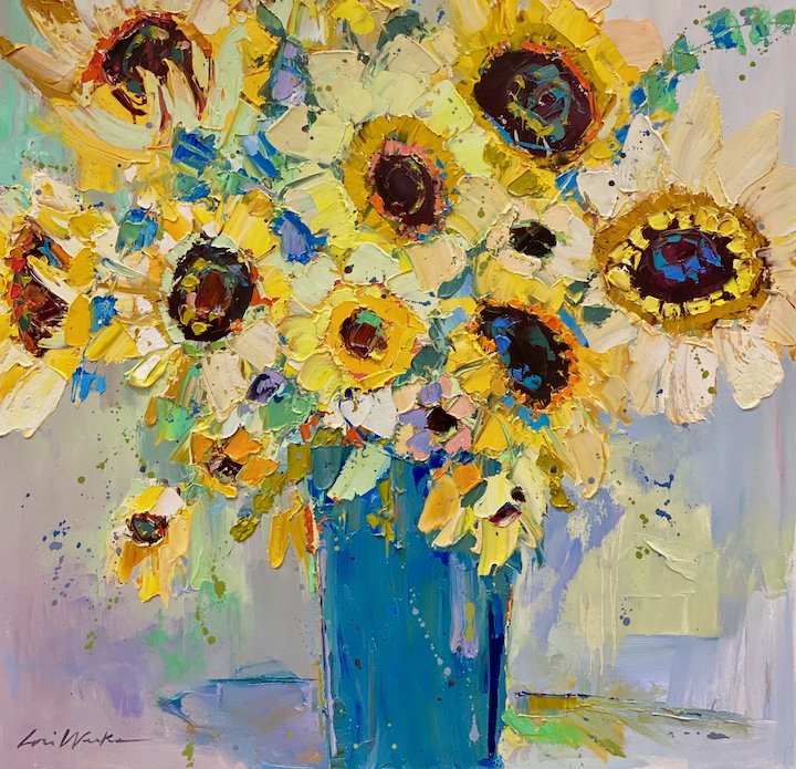
I love to paint florals and poppies and just let my creativity flow while using both palette knives and brushes with loads of oil paint to make my art pop! In my work I strive for a balance of impressionism with abstraction. My collectors tell me my works bring peace and happiness into their homes— it’s a rewarding profession and that’s why I do what I do.
AAS: What is the history behind impasto?
Close-up of Lori’s impasto technique.
LW: Impasto painting is a technique that involves the application of very thick paint, typically applied with a brush or a painting knife. The word impasto comes from the Italian word impasto, which translates as dough, mixture, or paste. The technique was originally used by masters such as Rembrandt, Titian, and Vermeer to represent folds in clothes or jewels. Later, the French Impressionists created pieces covering entire canvases with rich impasto textures. Impasto came into its own in the 17th century, when such Baroque painters as Rembrandt, Frans Hals, and Diego Velázquez used skillfully and minutely worked impastos to depict lined and wrinkled skin or the sparkle of elaborately crafted armor, jewelry and rich fabrics. I love the fact it creates a more ‘painterly’ look. The combination of the impasto technique with using brushes and pallet knives gives my art a unique feeling.
AAS: One of my favorites is Cotton Spotting. In it you take the abstract elements even further. The way the foreground and background contrast but complement the ‘cotton’ is marvelously effective – congratulations on this one. Was it painted from a photograph or from your imagination?
LW: This was a photograph a friend of mine took and posted on social media. I just loved the impressionist aura of the subject matter, so I took it to the next level with a more loose interpretation. If you post photos on social media, you never know if you’ll see something of yours on my canvas!
Cotton Spotting, 12” x 24”, oil on canvas
First Snow, 30” x 30”, oil on canvas
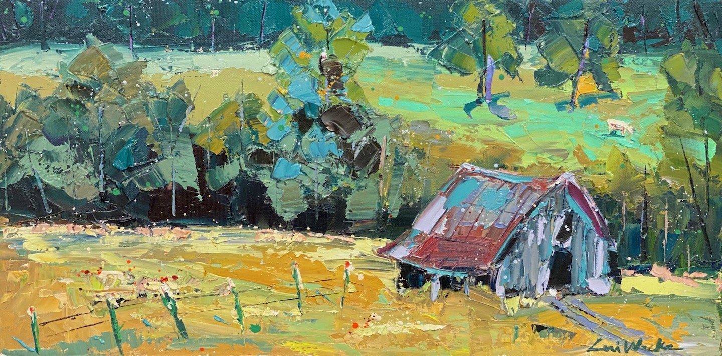
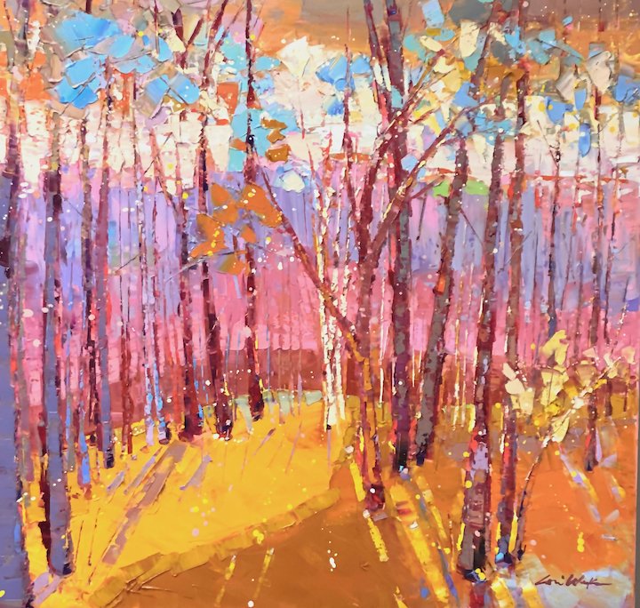
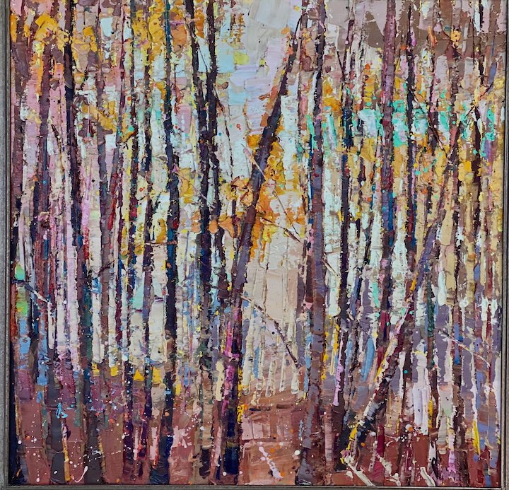
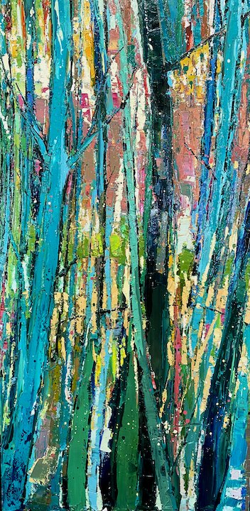
AAS: You have also painted several forest scenes. First Snow is one of my favorites. While color is obviously important in your work, in this one it is not just about the cool pallet. It is the perspective. I feel like I am a skier whooshing past it.
LW: This is one of my favorite tree-scapes. First Snow is one of my more realistic interpretations of the landscape, but I have the flexibility of the freedom to use vivid color pallets and exaggerate the landscape while still being recognized as trees without painting super specific detail. I love birch trees, almost all my treescapes are birch trees.
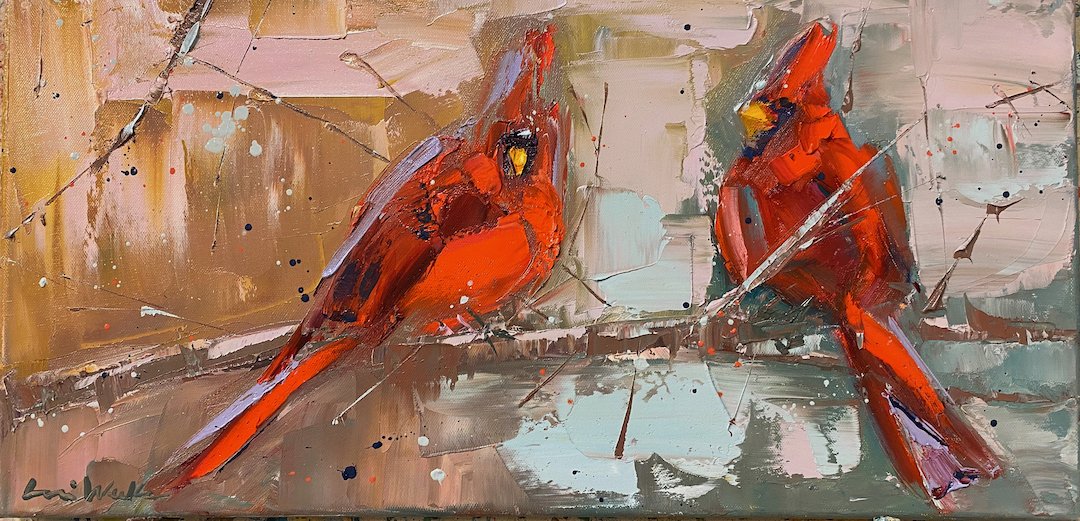
AAS: Home is another wonderful example of your use of color and texture. And it is about cardinals, one of my favorite birds! Tell be about that painting.
LW: My dad got me started painting birds. He sits on his patio and watches them for hours. For many bird lovers, the sight of a cardinal holds special meaning, sometimes evoking emotional or spiritual feelings. They say the vibrant red bird is an uplifting, happy sign that those we have lost will live forever, so long as we keep their memory alive in our hearts. I also paint to represent family members, I had one client that had 5 boys, so I did 6 males and one female for the family. Also, red is one of my signature colors in my work because I paint so many poppies, so it’s a natural for me!
Home, 30” x 60”, oil on canvas
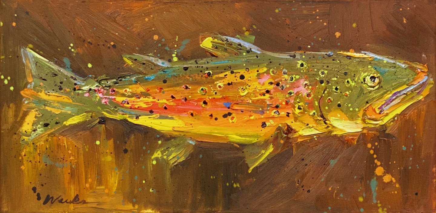
Big Boy, 18” x 24”, oil on canvas
AAS: Big Boy is another terrific painting. Was it a commission?
LW: Thank you, and yes! I have always painted trout, I love playing with the colors - and we love to fish. I was asked by a client to paint a duck to go with a trout. So that started the flight of my duck paintings!
AAS: Lori, what can we expect from you in the next few years?
LW: My husband and I just became empty nesters, and our dream was to own more property, but we wanted to wait until our boys were out of high school. So, we have started a new adventure in Northwest Arkansas! I mentioned that I am currently in two galleries - Art Group Gallery and Art on the Square - and this has worked beautifully because I get to work and collaborate with so many talented local artists across central and northwest Arkansas.